A 103 rejection can feel like a hard stop. You built something new. You filed a patent. Then the patent examiner says your idea looks “obvious” when compared to older patents or papers.
Why a Claim Chart Makes a 103 Rejection Easier to Fight
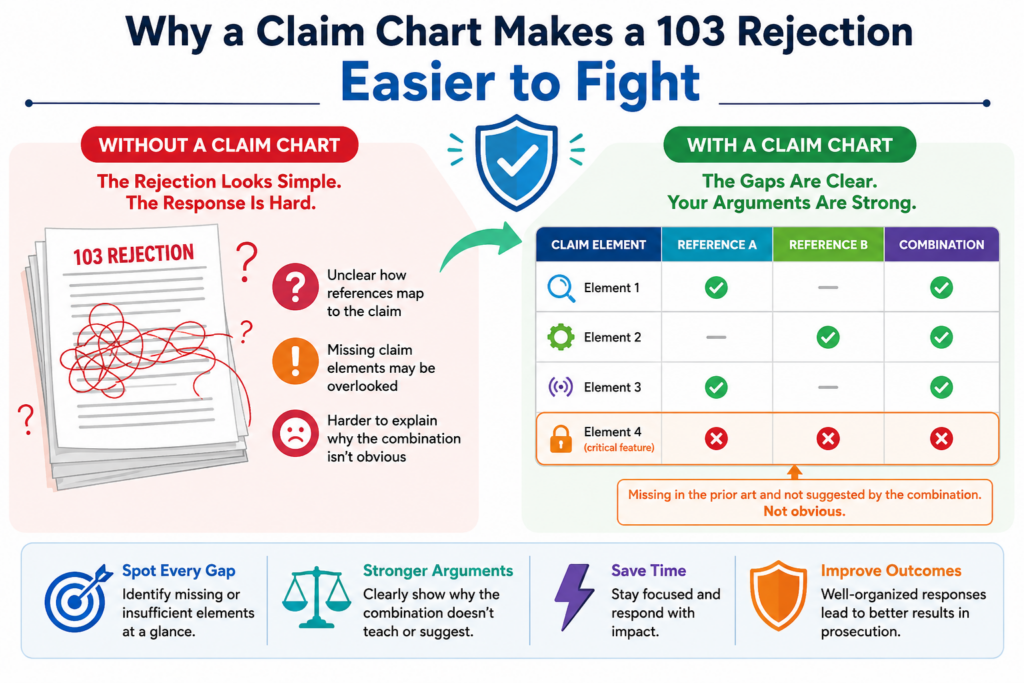
A 103 rejection can look scary because it often comes with many moving parts.
The examiner may point to one old patent for one part of your claim, another old paper for another part, and then say a person in the field would have combined them.
That is a lot to unpack.
The danger is that many inventors respond too fast. They argue from the heart. They say the invention is different. They say the examiner does not understand the product. They say the old patents are not the same.
Those points may be true, but they are not enough by themselves.
A strong response needs structure. It needs to show, in a clean way, what the claim actually says, what the examiner says the old references teach, and why the examiner’s logic does not hold up.
That is the job of a claim chart.
A claim chart does not make the argument for you. It gives you the room to see the argument clearly. Once you can see it, you can decide where to push back, where to amend, and where to explain the real technical gap.
For a founder, this is powerful. You do not need to become a patent expert. You need a clear way to understand the issue so you can make better choices with your patent team.
PowerPatent was built for this exact kind of moment. It helps teams move from confusion to action by pairing smart patent tools with real attorney oversight. You can see how that works here: https://powerpatent.com/how-it-works
How a 103 Rejection Usually Gets Built by the Examiner
A 103 rejection is usually built in layers. The examiner starts with your claim. Then the examiner breaks that claim into parts. Each part is matched to something found in older references.
The examiner may say one reference shows the main system. A second reference shows one missing feature.
A third reference shows another feature. Then the examiner explains why someone would have combined those pieces.
This is where many weak rejections hide.
The issue is not only whether the old references mention the same words.
The deeper issue is whether the examiner has shown a real reason to combine them in the way your claim requires. There must be a clear path from the old references to your claimed invention.
That path is often thin.
Sometimes the examiner uses broad language. Sometimes the examiner points to a part of a reference that does not do the same job as your claim.
Sometimes the examiner treats your invention like a simple mix of parts, even though your system works because the parts interact in a special way.
A claim chart helps you spot those problems without getting lost.
A good claim chart slows the rejection down enough to expose weak logic
The best thing a claim chart does is force the argument to slow down.
A rejection may sound strong when it is written in paragraph form. The examiner may say that Reference A teaches your main system, Reference B teaches a missing feature, and the combination would have been obvious.
That can sound complete.
But when you place each claim element in a chart, gaps become easier to see. You may notice that Reference A does not really teach the claimed step.
You may find that Reference B teaches a feature, but not in the same setting. You may see that the examiner never explains why the two references would work together.
This is not just neat paperwork. It is a practical way to protect claim value.
A patent claim is only as strong as the words that survive review. If you respond without care, you may give up more than needed.
If you chart the rejection, you can look for the smallest useful change or the strongest clean argument.
That can save time, money, and claim scope.
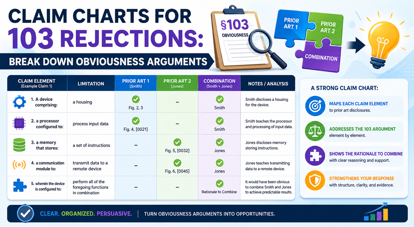
What Should Go Into a Claim Chart for a 103 Rejection
A claim chart for a 103 rejection should be simple enough to read, but deep enough to guide a real response.
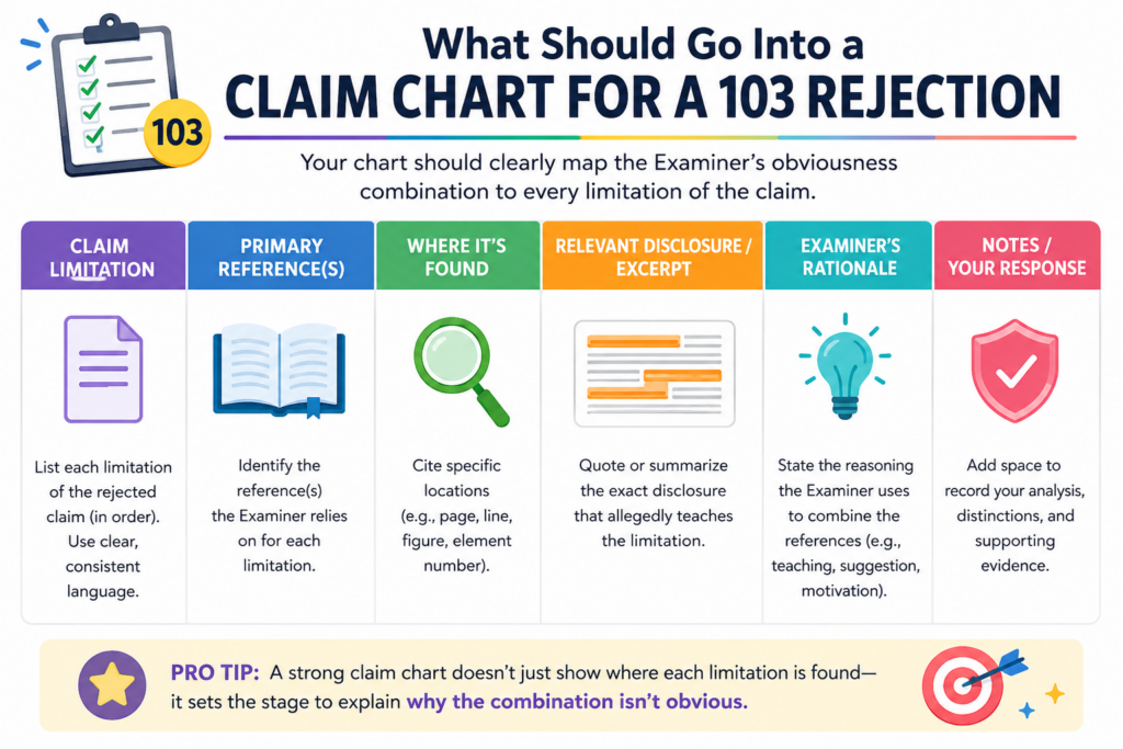
It should not be a wall of copied text. It should not be a messy dump of examiner notes. It should be a working tool.
The basic idea is simple. One side shows the exact claim language. Another side shows where the examiner says that language appears in the old references. Another part captures your response, concern, or possible amendment.
This setup helps everyone speak from the same facts.
Founders often bring deep product knowledge to the table. Engineers know why the system works. Patent attorneys know how to shape the argument.
A claim chart lets those groups meet in the middle. It turns the office action into something a technical team can review without needing to decode every patent rule.
That is especially helpful for software, AI, robotics, chips, medical devices, data systems, and other hard tech fields.
In these areas, the real invention may live in the flow, timing, training method, data path, control logic, architecture, or feedback loop. A plain rejection may miss that. A chart can bring it out.
Start with the Exact Claim Language Before You Add Any Argument
The first rule is to start with the claim as written. Do not paraphrase it too early. Do not shorten it to make it easier to read. Use the exact claim language first, because every word matters.
This may feel slow, but it prevents a common mistake.
When people summarize a claim too quickly, they often lose the point that makes the claim patentable. A phrase that seems small may be the key.
Words like “based on,” “in response to,” “before,” “after,” “trained using,” “without,” “ranked by,” or “sent to” can change the whole meaning.
In a 103 rejection, the examiner may map those words too loosely. The chart gives you a way to test that mapping.
For example, imagine a claim says a model is updated after a user action and before a control signal is sent.
The examiner may point to an old system that updates data and sends control signals, but not in that order. That order may matter. If the timing creates the benefit, the chart should make that clear.
This is why exact claim text is the anchor. It keeps the response tied to what you actually claimed, not to a rough idea of the product.
The chart should show the examiner’s mapping without making it look stronger than it is
When you add the examiner’s position, be fair but careful. Capture what the examiner actually said. Do not improve it. Do not fill gaps for the examiner. Do not write a better rejection than the one you received.
This matters because founders and engineers are natural problem solvers. When they see a missing link, they may mentally fill it in. That is useful when building a product. It is not useful when answering a rejection.
If the examiner only points to a broad paragraph in an old patent, the chart should say that. If the examiner does not explain how a reference teaches a claim element, the chart should show that gap.
If the examiner relies on a figure but the figure does not include the required feature, the chart should make that visible.
The goal is not to be unfair. The goal is to keep the record clean.
A clean record helps the attorney decide whether to argue, amend, or ask for an interview. It also helps the founder understand the tradeoffs.
This is where PowerPatent can make the process feel less foggy, because the platform is built to help teams turn technical details into clear patent work with attorney guidance along the way. You can explore the process here: https://powerpatent.com/how-it-works
How to Break the Obviousness Argument Into Parts You Can Actually Attack
A 103 rejection is not one big thing. It is made of smaller claims by the examiner. When you break those smaller claims apart, you can often find the best place to respond.
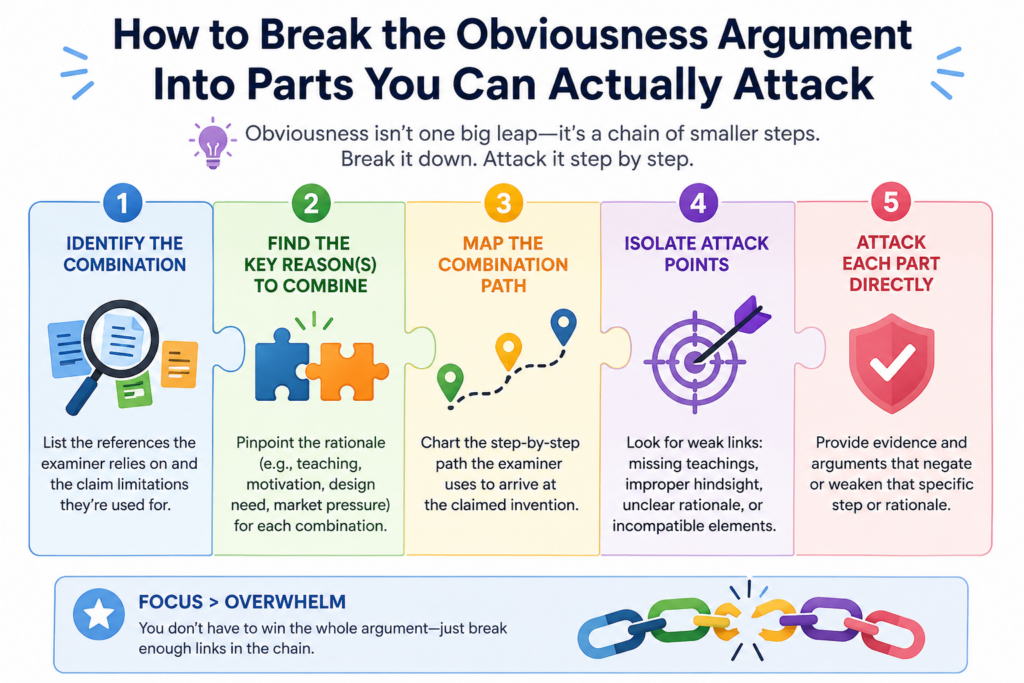
The examiner usually has to show several things. The old references must teach or suggest the claim parts. The references must be able to fit together in a sensible way.
There must be a reason why someone would combine them. The final mix must lead to what your claim actually says.
If one of those pieces is weak, your response may have room.
This is why a claim chart should not only ask, “Where did the examiner find this feature?” It should also ask, “Does this reference use the feature in the same way?” and “Would the combination still work if changed to match the claim?”
Those questions matter because obviousness is often argued at a high level. But inventions are usually valuable at the detail level.
A strong patent response brings the discussion back to those details.
Look for Missing Claim Elements Before You Argue About the Whole Invention
The simplest attack is often the strongest one. If the examiner has not shown every part of the claim, you may not need a broad speech about why the invention is brilliant. You may need to show that a required element is missing.
This is where the chart earns its keep.
Go row by row. Read one claim element. Then read the examiner’s cited text. Ask whether that old reference really teaches the same thing.
Not something close. Not something that could maybe be changed. The same claimed thing.
If the claim requires a trained model that changes a threshold based on live sensor data, a reference that uses a fixed threshold may not be enough.
If the claim requires a secure handoff between two devices, a reference that only stores data on one device may not teach the handoff. If the claim requires ranking outputs based on a specific feedback signal, a general ranking method may not be enough.
The missing element does not always have to be flashy. Sometimes a small missing step is the key to the whole system.
The strongest response often comes from showing why a cited feature does not do the same job
A feature is not just a word. It has a role in the claim.
This is a major point in 103 rejections. The examiner may find a similar word in the old art, but that word may not perform the same job. Your claim may use a module, model, signal, layer, score, rule, or device in a very specific way.
The chart should capture that job.
For example, an old reference may disclose a “score.” Your claim may also use a “score.” But the old score may measure user interest, while your score may control whether a machine action is blocked.
Those are not the same use. The difference may affect how the system works, what data it needs, and what result it creates.
This is where engineers can add huge value. They can explain why a cited part would not behave the same way inside the claimed system. They can show why the old setup would fail, slow down, produce bad data, or miss the core benefit.
That kind of input can turn a weak response into a strong one.
How to Use the Claim Chart to Find the Examiner’s Weakest Link
Once the claim chart is filled in, do not rush to write the response. Study the pattern first. A good chart will often show one row that matters more than the rest.
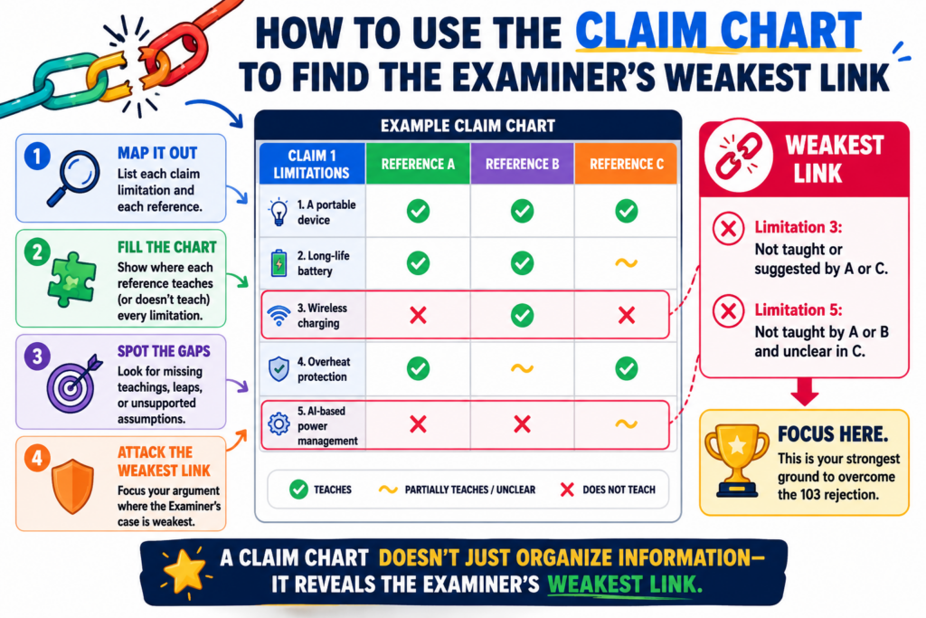
That row is the weak link.
It may be the claim element the examiner barely addressed. It may be the part supported by the second reference.
It may be the reason to combine two references. It may be the place where the examiner uses broad language instead of a clear technical explanation.
This is important because not every issue deserves equal time.
A response that argues everything can feel unfocused. It can also bury the strongest point. A better response often leads with the clearest gap, then supports it with other points if needed.
That does not mean you ignore the rest. It means you use the chart to choose the best path.
The Weakest Link Is Often in the Reason to Combine the References
In many 103 rejections, the examiner can find pieces of the claim across several references. The harder part is explaining why someone would combine those pieces in the claimed way.
This is a common place to push back.
A proper combination should make sense in the real technical setting. It should not be based only on hindsight. Hindsight means looking at your invention first, then searching backward to find pieces that could be stitched together.
Inventors know this problem well. After someone sees the answer, the answer looks simple. But before the invention existed, the path may not have been clear at all.
A claim chart can help show that.
In the chart, create space to capture the examiner’s stated reason for the combination. Then test that reason against the actual references. Does the first reference have the problem the second reference solves?
Would the second reference change the first reference in a way that breaks its purpose? Does the examiner explain why the specific claim arrangement would result?
These questions can expose a shallow rejection.
A weak reason to combine can be more useful than a missing word
Many teams look only for missing words in the old references. That is a good start, but it is not the whole game.
Sometimes the words are there, yet the rejection is still weak because the combination does not make sense.
This is especially true in technical inventions.
A software system may depend on speed. An AI model may depend on training data quality. A device may depend on power limits. A chip design may depend on layout.
A medical tool may depend on safety steps. If the examiner’s combination hurts the thing the first reference is trying to do, that can be a strong point.
The chart should make that conflict easy to see.
For example, if Reference A is built to reduce processing load, and Reference B adds a heavy real-time process, the combination may not be simple.
If Reference A avoids sending raw data for privacy, and Reference B depends on sending raw data, there may be tension. If Reference A uses fixed rules because it needs stable behavior, and Reference B adds constant model updates, the fit may be poor.
These are the kinds of details that can matter. They are also the kinds of details founders often know best.
A strong patent process should pull that knowledge out of the team and turn it into a clean record.
That is part of why PowerPatent combines guided software with real attorney review, so the product team’s insight does not get lost in legal back-and-forth. Learn more here: https://powerpatent.com/how-it-works
How to Spot When the Examiner Is Using Hindsight
Hindsight is one of the biggest problems in a 103 rejection. It happens when the examiner starts with your invention, looks backward, and then picks pieces from older references to make your claim seem easy.
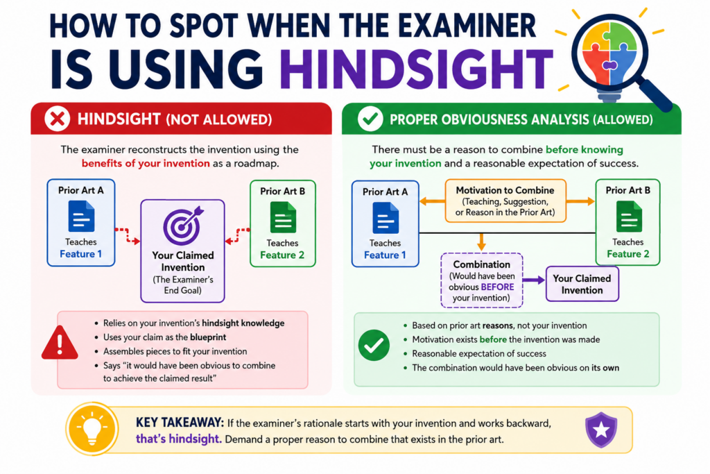
That may sound simple, but it is not always easy to prove. The examiner will not say, “I used hindsight.” The rejection will usually sound clean.
It may say one reference teaches one part, another reference teaches another part, and a skilled person would have combined them.
The claim chart helps you slow that down.
When you chart the rejection, you can see whether the examiner found a real reason inside the old references, or whether the examiner seems to be using your own claim as the roadmap.
This difference matters. A 103 rejection should not be built from your invention backward. It should show why someone would have moved toward your invention before seeing it.
That is a much harder thing to show.
For startup teams, this is where the technical story becomes very important. Your invention may look simple after it works.
But the road to that result may have involved hard choices, failed tests, strange edge cases, or a new way to connect parts that were not meant to work together.
A chart gives you a place to capture those facts.
A Rejection May Be Weak When the Claim Looks Like the Only Roadmap
A strong obviousness rejection usually has a clear reason to combine references. That reason should come from the references themselves, the known problem in the field, or the normal skill of a person working in that space. It should not come only from your claim.
This is where the chart can reveal a major flaw.
Read the examiner’s reason for combining the references. Then cover up your claim for a moment. Ask whether that reason would still make sense.
Would someone reading Reference A have any reason to look for Reference B? Would Reference B solve a problem that Reference A actually has? Would the final system be something the old references point toward?
If the answer is not clear, the rejection may depend too much on hindsight.
This is common in deep tech cases. Older references may contain pieces that can be forced together on paper. But the real question is whether a skilled person would have made that move at the time.
In AI, hardware, data systems, biotech tools, and robotics, the wrong mix can create more problems than it solves.
That is why the claim chart should not only compare words. It should compare purpose, structure, flow, and result.
The chart should show when the examiner is using your claim as a shopping list
A weak 103 rejection often feels like a shopping trip through old references. The examiner picks one feature from one place, another feature from another place, and another from a third place. Then the examiner states that the mix would have been obvious.
A claim chart makes this visible.
If each row of the chart points to a different reference, and the examiner gives only a broad reason for tying them together, that is a sign to look closer.
The more references the examiner needs, the more important the reason to combine becomes. A large stack of references is not always wrong, but it can signal that the rejection is being built with your claim in mind.
That does not mean you should argue hindsight every time. A bare claim of hindsight is usually weak. The better move is to show facts from the chart.
You can show that Reference A solves a different problem. You can show that Reference B works in a different setting.
You can show that the proposed combination changes the way the first system operates. You can show that the examiner has not explained why the specific claimed order, link, or control path would result.
That kind of argument is stronger because it is grounded in the record.
This is also where a platform like PowerPatent can help founders stay sharp. The goal is not to bury the examiner in noise.
The goal is to find the cleanest technical point and turn it into a clear response, with real attorney oversight. You can see how PowerPatent supports this process at https://powerpatent.com/how-it-works
How to Turn Technical Differences Into Strong Patent Arguments
A claim chart is only useful if it leads to action. Once you find the gaps, you need to turn them into clear arguments. This is where many teams struggle.
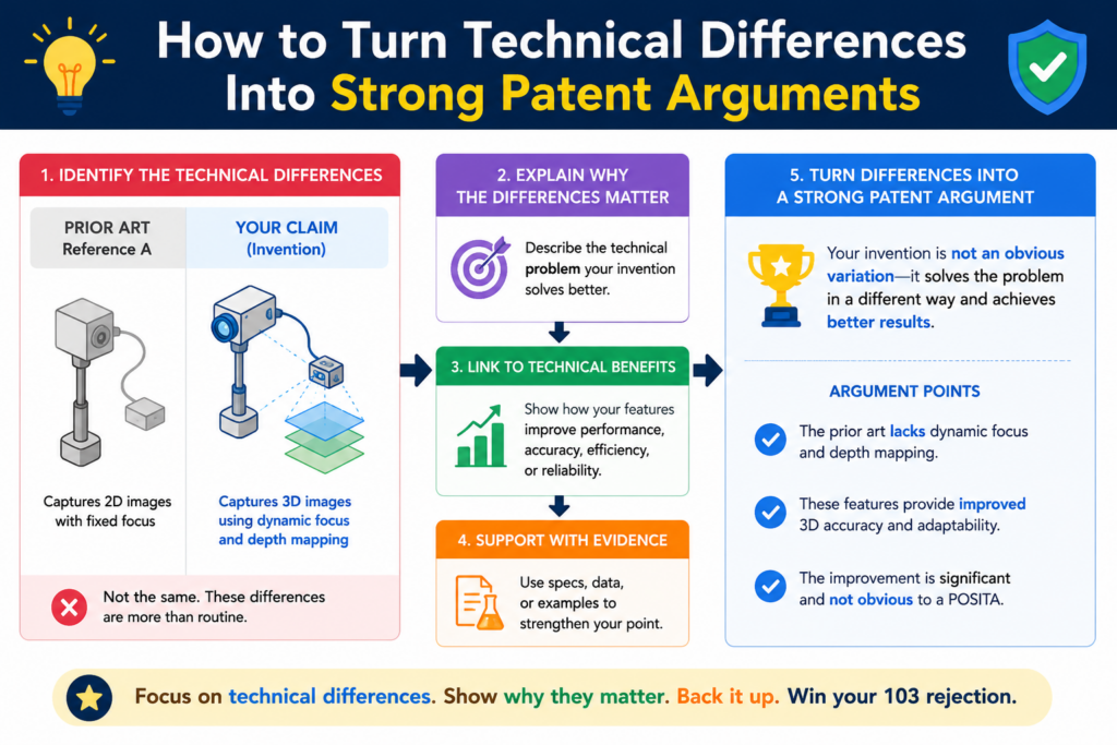
Founders and engineers often explain the invention in product terms. They talk about speed, customer pain, model accuracy, uptime, user flow, or cost savings. Those points are useful, but they need to be tied back to the claim.
A patent response should not sound like a product demo. It should show why the claim is not taught or suggested by the cited references.
The good news is that your product knowledge can still drive the response. You just need to translate it into claim language.
A strong technical argument often explains what the old reference does, what your claim requires, and why those two things are not the same. The best arguments are clear, calm, and specific. They do not insult the examiner. They do not overstate the point. They simply show the gap.
That is why the chart matters. It lets the team move from “our invention is different” to “this claim element requires this specific action, and the cited reference does not teach or suggest it.”
That shift can change the whole tone of the case.
Tie Every Technical Difference Back to the Claim Words
The claim is the center of the response. Not the product. Not the pitch deck. Not the roadmap. The claim.
This can feel strange for founders because the product is usually richer than the claim. Your actual system may include many smart details that are not written in the claim yet. But in the patent office, the claim language controls the fight.
So when you find a technical difference, ask one key question: where does this difference appear in the claim?
If the difference is not in the claim, it may not help much unless you amend the claim to include it. If the difference is already in the claim, it may become a strong argument.
If the difference is partly in the claim, you may need to decide whether a narrow amendment would make the point clearer.
This is a tactical decision.
You do not want to narrow the claim more than needed. But you also do not want to keep fighting with vague language if a precise change can move the case forward while still protecting the business value.
For example, suppose your system does not just “rank alerts.” It ranks alerts using a live machine state, a risk score, and a user role before sending a control signal.
If the old references only show basic ranking, then your claim chart may show that the deeper logic is the real point. The response can then focus on that logic.
A useful argument explains why the difference changes the result
Not every difference matters equally. Some differences are cosmetic. Some are small wording issues. Some change the way the system works.
The strongest arguments usually focus on differences that change the result.
If your invention reduces delay because it performs a step before data leaves a device, say that. If your model avoids false positives because it updates a threshold only after a certain signal is verified, say that.
If your device saves power because it changes the sensor schedule based on predicted need, say that.
But keep the explanation tied to the claim.
The point is not just that your system is better. The point is that the cited references do not teach or suggest the claimed setup that creates that better result.
This is where simple writing wins. You do not need dense legal phrasing. You need a clear chain of thought. The claim requires X. The cited reference does Y. X and Y are different because of Z. That difference matters because it changes how the system operates.
That structure is easy for a founder to understand, easy for an attorney to shape, and easier for an examiner to follow.
PowerPatent helps teams capture these invention details early, so the strongest technical points do not get lost when a rejection arrives.
It brings smart software and attorney review into one workflow, which can help founders respond with more confidence and less back-and-forth. Learn more at https://powerpatent.com/how-it-works
How to Decide Whether to Argue, Amend, or Do Both
After the claim chart is complete, the next move is not always obvious. Sometimes the best move is to argue. Sometimes it is to amend. Often, it is a careful mix of both.
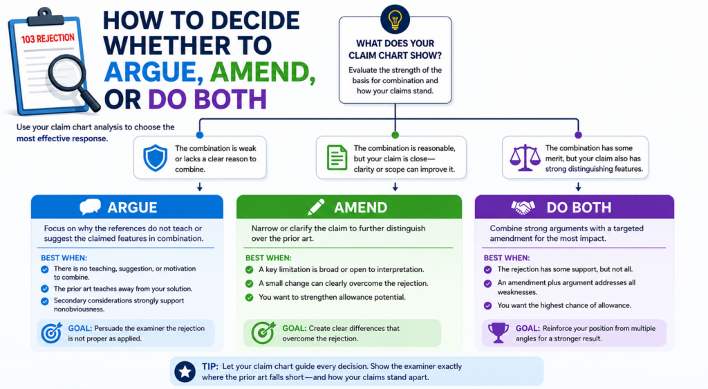
This decision matters because every response shapes the future patent.
If you argue only, you may keep broader claim scope, but you may also risk a longer fight. If you amend too much, you may get faster progress, but you may give up coverage that could matter later.
The right answer depends on the claim, the rejection, the business goal, and the strength of the prior art.
This is where founders should stay involved.
A patent is not just a legal document. It is a business asset. The claims should protect what makes the company hard to copy.
If an amendment gives away the part competitors are most likely to copy, that can hurt. If an amendment focuses the claim around the true technical edge, it may make the patent stronger.
A claim chart helps make this choice less emotional.
Instead of asking, “Should we fight?” the team can ask, “What is the cleanest path to meaningful protection?”
That is a better question.
Use the Chart to Find the Smallest Change That Creates the Biggest Distance
A good amendment should not be random. It should create clear distance from the cited references while keeping the claim useful for the business.
The claim chart helps you find that line.
Look at the rows where the examiner’s mapping is weakest. Then look at the real invention. Is there a feature already described in the patent application that makes the difference clearer?
Does that feature match what customers value? Does it block likely copycats? Does it avoid the old references without making the claim too narrow?
This is how strong amendments are chosen.
For example, adding a broad phrase like “using artificial intelligence” may not help if the old references already mention AI. But adding a specific model update trigger, data flow, validation rule, or device-side processing step may create real distance.
The best amendment is often not the flashiest one. It is the one that captures the inventive move in plain, precise terms.
This is why early patent drafting matters so much. If the application includes rich technical detail, you have more room to respond later. If the application is thin, your options may be limited.
That is one reason PowerPatent focuses on turning real technical work into stronger patent filings from the start.
The platform helps founders bring in code, system details, workflows, and invention notes, with attorney oversight to shape them into useful protection. You can see how it works at https://powerpatent.com/how-it-works
A smart response can argue first and amend only where it helps
You do not always need to choose between arguing and amending. In many cases, the best response does both.
The response may explain why the examiner’s current rejection is wrong. Then it may amend the claim to make the difference even clearer. This can be useful when you want to avoid a long fight but still preserve a strong record.
The order matters.
If you amend, you should still think carefully about what you say. You do not want to make broad statements that limit the claim more than needed.
You also do not want to describe the invention in a way that creates confusion later. The response should stay focused on the actual issue shown in the chart.
A strong response might say that the references do not teach the claimed timing, and the amendment clarifies that timing.
Or it might say that the references do not teach the claimed data path, and the amendment makes that path explicit. This keeps the argument clean.
Founders should ask how each amendment affects real-world coverage. Would the amended claim still read on the current product?
Would it cover the next version? Would it cover a competitor who builds the same core idea in a slightly different way?
Those questions are not side issues. They are the whole point.
How to Use Examiner Interviews With Your Claim Chart
An examiner interview can be a powerful tool after a 103 rejection. It gives your patent team a chance to speak with the examiner, understand the concern, and test possible ways forward.
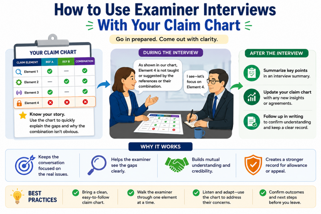
But an interview without preparation can waste time.
This is where the claim chart becomes very useful. It gives the conversation a clear path. Instead of speaking in broad terms, your team can focus on the few claim elements that matter most.
The goal of an interview is not to win a debate on the spot. The goal is to learn what the examiner sees, explain the technical gap, and find out whether an argument or amendment may move the case forward.
That can save months.
For founders, this matters because delay has a cost. A pending patent can still have value, but a stronger allowed patent can support fundraising, partnerships, licensing, and investor confidence.
The faster you understand the examiner’s real concern, the faster you can make a smart move.
Bring the Weakest Claim Chart Rows Into the Interview
A good interview should not cover every row of the chart. It should focus on the rows that drive the rejection.
Before the interview, identify the main pressure points. These may be the missing claim element, the weak reason to combine, the reference that does not fit, or the amendment that could create clear distance.
Then shape the interview around those points.
The chart helps keep everyone honest. If the examiner says Reference A teaches a feature, your team can point to the exact claim language and ask where that feature appears.
If the examiner says Reference B would be combined with Reference A, your team can ask what problem in Reference A would have led a skilled person to use Reference B.
If the examiner is open to an amendment, your team can discuss language that captures the real difference.
This kind of focused discussion is often better than sending long written arguments without first testing the examiner’s view.
It also helps the founder understand the case. After the interview, the team can update the chart with what was learned. That makes the next response sharper.
The interview should help you learn what the examiner actually cares about
Sometimes the written rejection does not show the examiner’s real concern clearly.
The office action may cite several references, but the examiner may care most about one feature. Or the examiner may be open to allowing the case if a certain point is clarified.
You may not know that unless you ask.
A claim chart gives you a way to ask with precision. It helps avoid vague questions like “What do you think is patentable?”
Instead, the team can ask whether a specific claim feature is missing from the cited art, whether a proposed amendment would overcome the reference, or whether the examiner is relying on a certain paragraph for a certain limitation.
That creates a more useful record for decision-making.
Of course, the interview is not a shortcut around careful work. You still need a strong written response. But the interview can help you avoid guessing. It can help you choose the right path before spending time drafting.
PowerPatent is designed for founders who want that kind of clarity. Instead of treating patents like a black box, it helps teams understand the work, collaborate with attorneys, and protect inventions faster. To see the process, visit https://powerpatent.com/how-it-works
How to Build a Claim Chart That Your Team Can Actually Use
A claim chart should not be made only for a patent attorney. It should also help the founder, the engineer, and the product lead understand what is happening.
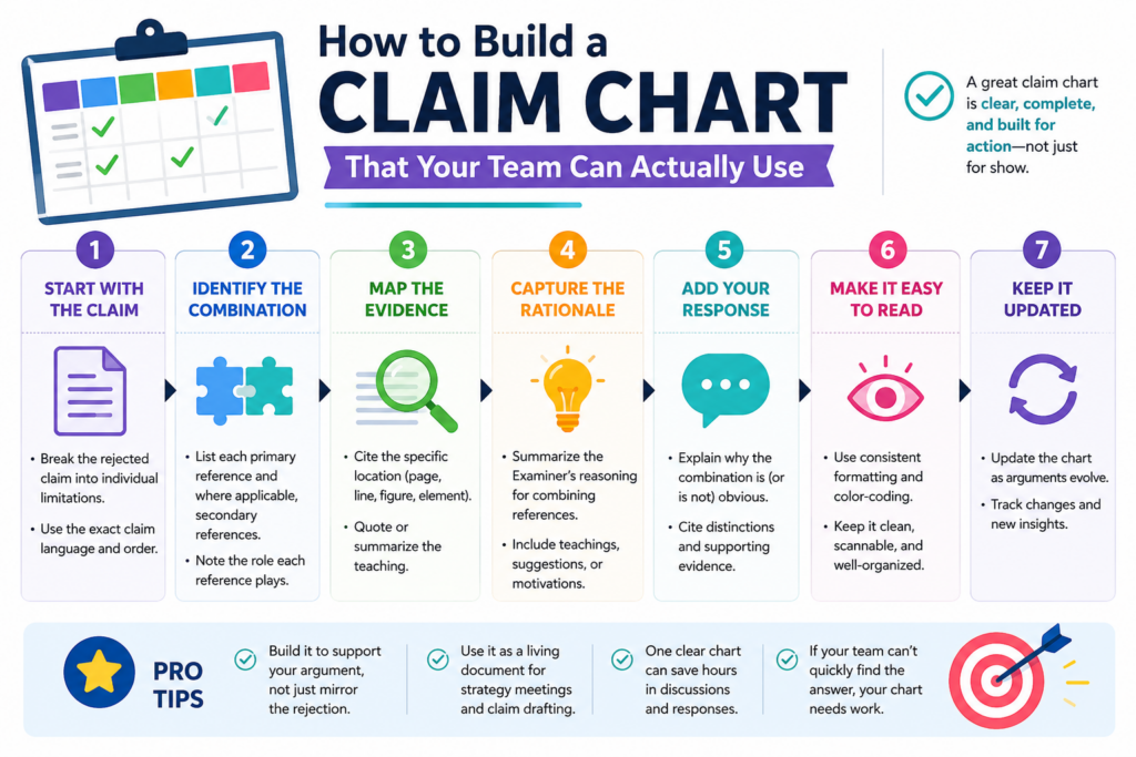
If the chart is too dense, the people who know the invention best may stop reading it. That is a lost chance.
The best chart feels plain. It has the claim language, the examiner’s cited support, and a space for the team’s notes. Those notes should explain what is missing, what is wrong, or what needs more review.
This simple setup can change the whole response process.
Instead of sending long emails with scattered thoughts, the team can work from one shared view.
The engineer can explain how the system really works. The founder can explain what parts matter for the business. The attorney can decide which points are useful for the official response.
That is how a claim chart becomes more than a table. It becomes a working room for the rejection.
The Best Claim Charts Use Plain Words Alongside Exact Patent Words
You still need the exact claim language. That part should not be changed. But next to it, it helps to add a simple explanation of what that claim part means in real product terms.
This is very useful for technical teams.
For example, a claim may say “generating a control signal based on a validated risk score.” In plain words, that may mean the system blocks an action only after it checks that the risk score is real and trusted.
That simple note helps the team understand the claim without losing the legal wording.
This also helps catch bad mappings.
If the examiner points to an old reference that creates a score but never validates it, the plain-word note makes the gap easy to see. The team does not need to argue about every word at once. It can focus on the action that matters.
This is especially helpful for software and AI inventions, where small process steps can change the entire result. A claim chart should help those details rise to the surface.
A useful chart should separate facts from strategy
The chart should not mix everything together. It should keep the examiner’s position separate from your team’s view. It should also keep possible arguments separate from possible claim changes.
That matters because facts and strategy are different.
A fact may be that Reference A does not show a validation step. A strategy may be to argue that missing step, amend the claim to make the step clearer, or discuss it in an examiner interview. If those ideas are mixed together too early, the team can lose focus.
A clean chart gives each idea its own place.
This also helps avoid overreacting. When a rejection arrives, it is easy to feel pressure to do something fast. But a chart helps the team pause and see the problem clearly. That pause can lead to a better answer.
PowerPatent is built around this kind of clear, guided process. It helps founders bring their technical work into the patent flow while real attorneys help shape the result. See how the process works at https://powerpatent.com/how-it-works
How to Read the Prior Art Without Getting Lost in It
A 103 rejection often sends inventors into a rabbit hole. The examiner cites old patents, long papers, figures, paragraphs, and claims. It can feel like you need to read everything before you can respond.
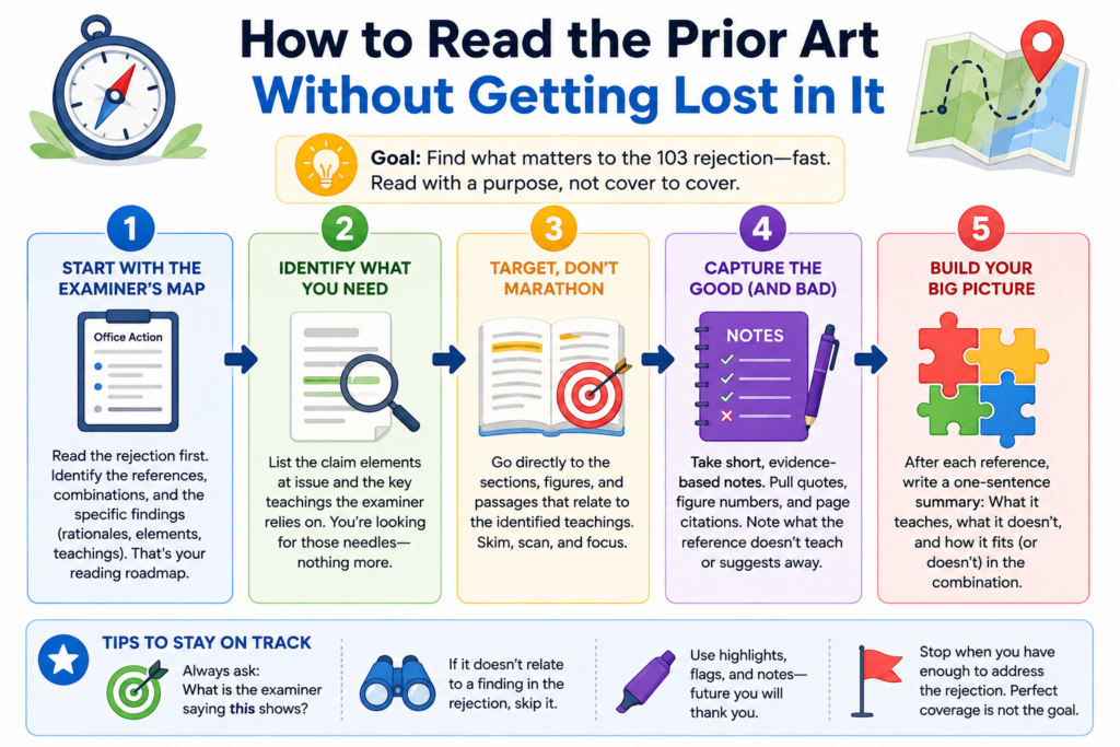
You do not.
You need to read with purpose.
The claim chart tells you what to look for. You are not reading the old reference like a book. You are reading it to answer specific questions. Does it teach this claim element?
Does it use the feature in the same way? Does it solve the same problem? Does it support the examiner’s reason to combine?
That makes the work more manageable.
Founders and engineers are busy. They do not have time to study every old patent from start to finish.
A chart lets them focus on the parts that matter most. That is where the best technical insights often come from.
Start With the Examiner’s Cited Passages, Then Check the Surrounding Context
The examiner usually points to certain paragraphs, figures, or columns in the old references. Start there. Read the exact part the examiner cited.
Then read around it.
This is important because a single sentence can be misleading when pulled out of context. A reference may mention a feature, but the surrounding text may show that it is used for a different purpose.
A figure may look similar at first, but the description may show that the flow is not the same. A word may match your claim, but the system around it may work in a different way.
That surrounding context can become very useful.
For example, the examiner may cite a paragraph that mentions a “model update.” But the next few paragraphs may show that the update happens offline, not during live operation.
If your claim requires live updating in response to a real-time event, that difference may matter.
The chart should capture that context in simple words.
The old reference may teach away from your claim without saying so directly
Sometimes a prior art reference does more than fail to teach your claim. It may point in a different direction. It may prefer a setup that avoids the step your claim requires.
It may warn that a certain approach creates problems. It may build the whole system around a different design choice.
This can be valuable.
A reference does not need to use dramatic language to create tension with the examiner’s combination. The tension may be technical.
If the old system depends on keeping data local, and the examiner wants to combine it with a reference that sends that data away, there may be a real conflict.
If the old system is built for low power use, and the proposed combination adds constant processing, the fit may be poor.
This is where engineers can help a lot.
They can explain why the proposed mix would not be simple in the real world. They can show what would break, slow down, or stop working. That kind of detail can help turn a chart into a stronger response.
This is also why strong patent support should not treat the invention as just paperwork. The real value is in the technical story.
PowerPatent helps capture that story early and connect it with attorney review, so the response is based on how the invention truly works. Learn more at https://powerpatent.com/how-it-works
How to Use Product Knowledge Without Making the Response Too Narrow
Your product can help you fight a 103 rejection, but it can also create risk if used the wrong way. This is a key point for startups.
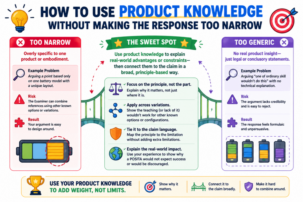
The patent claim should protect the invention, not just one version of your product. Your current product may have extra settings, screens, tools, or design choices that are not required for the core invention.
If you add too many of those details into the claim, you may end up with a patent that is easy to design around.
That is not the goal.
A claim chart helps the team separate the core invention from the product wrapper. It lets you ask which features truly create the technical edge and which features are just one way to ship it.
This is a business decision as much as a patent decision.
The best response should protect what competitors would want to copy. It should not trap the claim inside a narrow product detail unless that detail is truly important.
Use the Product to Explain the Invention, Not to Shrink It by Accident
The product is often the easiest way to understand the invention. It shows how the system works in real life. It gives examples, data flows, user actions, model behavior, device states, or control steps.
That is useful.
But the response should be careful not to say the invention always requires every product detail. For example, your app may display a dashboard, but the claimed invention may not need a dashboard.
Your system may use a certain cloud provider, but the invention may work across many cloud systems. Your model may use a specific training set, but the key idea may be the way the model is updated.
The chart can help mark which details are core and which are examples.
That distinction matters when deciding whether to amend. A good amendment should come from the core technical difference, not from a random product feature that happens to be present today.
The right claim detail should make copying harder, not easier
When choosing claim language, ask whether the detail makes the patent stronger in the market. A detail is useful if it captures the part a competitor would likely need to copy to get the same benefit.
A detail is risky if it gives competitors an easy path around the claim.
For example, if the invention is a way to update a machine learning threshold only after a verified signal, that may be important.
But if the claim is narrowed to one exact screen flow used in your current app, a competitor may avoid the claim by changing the screen.
That is why the chart should include business input.
The attorney may know how to shape the legal response. The engineer may know what is technically true.
The founder may know what competitors are likely to copy. When those views come together, the response is often much stronger.
This is one reason founders should not stay outside the patent process. Your judgment matters.
PowerPatent makes that collaboration easier by giving teams a clearer way to work with real patent attorneys while keeping the process moving. You can explore it at https://powerpatent.com/how-it-works
How to Turn the Chart Into a Clear Office Action Response
Once the claim chart is done, the written response should become much easier. You are no longer starting with a blank page. You are turning the best parts of the chart into a clean argument.
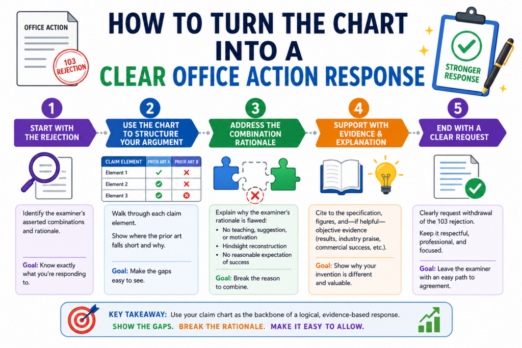
The response should be direct. It should not wander. It should not repeat every detail from the chart. The chart is the workshop. The response is the final message.
A strong response usually begins by identifying the claim issue. Then it explains why the cited references do not teach the claim as arranged.
If there is an amendment, it explains how the amendment clarifies the difference. The tone should be firm, respectful, and simple.
The goal is not to sound clever. The goal is to be understood.
That is especially important in technical cases. Dense writing can hide the best point. Clear writing can make the gap obvious.
The Response Should Lead With the Cleanest Argument From the Chart
The strongest point should not be buried near the end. If the chart shows that the examiner missed a required claim element, lead with that.
If the reason to combine is weak, make that clear early. If the proposed combination would change how the main reference works, explain that before moving to smaller issues.
This makes the response easier to follow.
Think of the examiner as a busy reader. The response should show the problem quickly and then support it with facts. Long background sections are usually not needed.
The claim chart already did the heavy lifting for your team. The official response should use that work with care.
For example, the response may state that the cited references do not teach a model update that occurs after a verified event and before a control action.
Then it can show what each reference actually does. Then it can explain why the proposed combination still does not reach the claim.
That is simple, but strong.
The best response avoids broad claims that are hard to defend
A common mistake is to argue too much. The response may say that the references are completely unrelated, that the invention is totally different, or that no skilled person would ever combine them.
Sometimes that may be true, but broad statements can be hard to defend.
A better response is often narrower and sharper.
Say exactly what is missing. Say exactly why the cited passage does not teach the claim.
Say exactly why the combination does not produce the claimed setup. Clear, limited points are often more persuasive than sweeping statements.
This also helps protect the record.
What you say during patent review can matter later. Overly broad statements may create problems if the patent is ever studied by an investor, partner, buyer, or competitor. A careful response keeps the argument strong without saying more than needed.
This is where attorney oversight matters. Smart tools can help organize the facts, but experienced review helps shape the words.
PowerPatent brings both together so founders can move faster without treating patents like guesswork. See how it helps at https://powerpatent.com/how-it-works
How to Handle Multiple References Without Losing the Main Point
A 103 rejection often uses more than one old reference. This is normal. The examiner may use a first reference for the main system, a second reference for a missing feature, and sometimes a third reference for another detail.
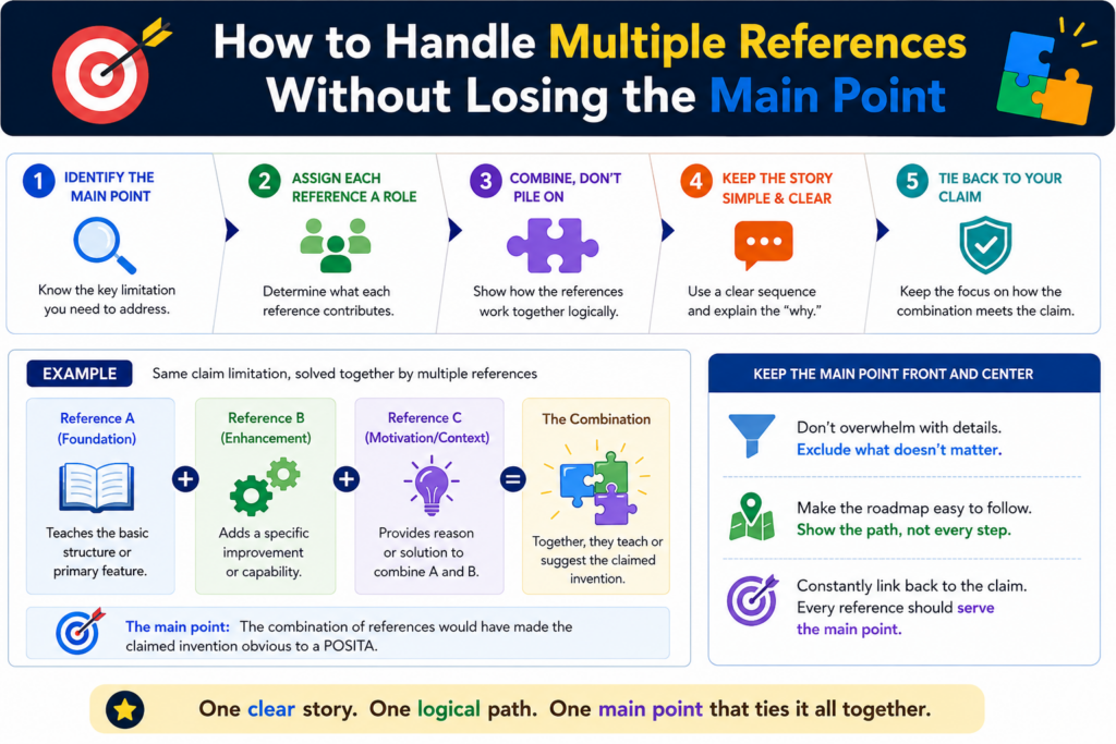
This can make the rejection feel bigger than it is.
The key is to remember that more references do not always mean a stronger rejection. In fact, more references can create more weak spots.
Each added reference needs a reason for being there. Each added feature needs to fit into the main system. Each proposed change needs to lead to the actual claim, not just to something that sounds close.
A claim chart helps keep this under control.
Without a chart, the response can become a messy fight against every paragraph in every reference. With a chart, you can see which reference is being used for which claim part.
You can then ask whether that part is really taught, whether the reference fits the main system, and whether the examiner explained the connection clearly.
That is how you avoid wasting energy.
The main reference should be treated as the base of the examiner’s story
In many 103 rejections, one reference does most of the work. This is the main reference. It usually shows the broad system or method that the examiner thinks is closest to your claim.
Start there.
Ask what the main reference is really about. Look at its goal. Look at the problem it tries to solve. Look at how its system is built. Then compare that to your claim.
This matters because every added reference must usually be placed into that base system. If the second reference does not fit the base system in a sensible way, the rejection may be weak.
If adding the second reference would change the main reference so much that it no longer works as intended, that may also be useful.
This is where your chart should include a short note about the role of each reference. Do not just copy citations. Explain what the reference is being used for.
That small step can make the whole rejection easier to read.
A second reference should not be allowed to magically fix the first reference
Sometimes the examiner uses a second reference as a patch. The first reference does not teach an important part of your claim, so the examiner brings in another reference that mentions something similar.
That may be fine in some cases. But it still needs a real explanation.
The second reference should not be treated like a magic box. The examiner should explain why a skilled person would take that feature and add it to the first system. The examiner should also explain why the result would match your claim.
This is often where the chart shows the gap.
For example, the second reference may teach a data filter. But your claim may require that filter to run before a model update, inside a local device, based on a verified sensor event.
If the second reference only teaches a general filter in a cloud system, the match may be weak.
Your response can then focus on the real issue. The question is not whether filters existed.
The question is whether the cited art teaches or suggests the claimed filter in the claimed place, at the claimed time, for the claimed purpose.
That is a much stronger way to argue.
How to Use Claim Charts to Protect the Business Value of the Patent
A patent is not just a document. It is a business tool. It can help protect your market, support investor trust, create leverage in deals, and give your team more confidence as you build.
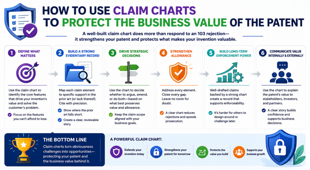
That means a 103 response should not be handled like a form letter.
Every argument and amendment can affect what the patent covers later. If the response is too broad and unclear, the case may stay stuck.
If the response gives away too much, the final patent may be too narrow. The claim chart helps you find a better path between those two risks.
This is very important for startups.
A startup does not file patents just to collect paperwork. It files patents to protect what makes the company hard to copy.
That may be a model pipeline, a chip layout, a data method, a device workflow, a robotics control loop, or a new way to turn signals into action.
The claim chart should help you keep that value in view while responding to the examiner.
The response should protect what competitors would actually copy
When you study the claim chart, do not only ask what will get allowed. Ask what will still matter after allowance.
This is where business thinking belongs in the patent process.
A narrow claim that avoids the old references may still be weak if competitors can step around it with a small change.
A broader claim may be worth fighting for if it covers the core method competitors would need to use. The goal is not to win the fastest allowance at any cost. The goal is to get useful protection.
This requires a clear view of the invention.
Ask what part of the system creates the real advantage. Ask what a competitor would need to copy to get the same result.
Ask what details are optional and what details are central. Then use the chart to see whether those central details are already in the claim or can be added without making the claim too small.
That is how the chart becomes a business tool.
PowerPatent helps founders stay close to these decisions instead of feeling locked out of the patent process.
The platform brings smart software and real attorney oversight together, so your team can protect what matters without slowing down the company. See how it works here: https://powerpatent.com/how-it-works
A patent response should not trade long-term value for short-term speed
Speed matters. Startups move fast. Investors ask questions. Product teams ship new versions. A delayed patent can feel like a drag.
But speed without strategy can be costly.
If you amend too quickly just to get past a rejection, you may end up with claims that do not protect the full invention.
That can hurt later when a competitor enters the space or when a buyer reviews the company’s IP. A fast allowance is not always a strong asset.
The claim chart helps slow the decision down in the right way.
It lets you see whether the rejection can be beaten with argument, whether a small amendment would be enough, or whether a broader claim should be kept alive in another filing. It gives the team a way to make a smart choice instead of a rushed one.
That is the kind of care that strong patent work needs.
How to Work With Engineers When Building the Claim Chart
Engineers often hold the most important facts in a 103 rejection. They know why the invention works. They know what was hard. They know which design choices were not obvious when the product was being built.

But those facts do not always make it into the patent response.
This is usually not because people do not care. It happens because the process is unclear.
The attorney may send a long office action. The engineer may not know what to look for. The founder may be too busy to translate between legal language and product language.
A claim chart solves much of this problem.
It gives engineers a focused way to help. Instead of asking them to read the full rejection and “send thoughts,” you can ask them to review specific rows.
Does this old reference really show this step? Would this combination work? Is the cited feature doing the same job as our claimed feature?
Those questions are much easier to answer.
Engineers should explain the real system behavior in plain words
The best engineering input is often simple. It does not need to sound legal. It needs to be clear and true.
An engineer can say that the old reference updates data after the control action, while the claim updates the model before the control action.
An engineer can say that the old system uses fixed rules, while the claim changes a threshold based on live signals. An engineer can say that combining two references would break the low-power design of the first system.
These points can be powerful.
The attorney can then turn them into the right response language. But the raw insight should come from the people who understand the system.
A good claim chart makes space for that insight. It should have room for plain notes, not just citations.
It should invite engineers to explain what is different, why it matters, and what would happen if the examiner’s proposed combination were actually built.
That is often where the best arguments come from.
The founder should help connect technical differences to market risk
Engineers can explain how the invention works. Founders can explain why the invention matters.
Both views are important.
A founder may know that a certain claim detail maps to the product’s core moat.
The founder may know that competitors are likely to copy a certain workflow, not another one. The founder may know which future product versions need to stay covered.
This input can guide the response.
For example, an engineer may say there are three possible ways to distinguish the claim from the old references.
The founder may know that one of those ways is too tied to the current product screen, while another covers the deeper platform logic. That second path may be better for the business.
The claim chart becomes the place where these views come together.
This is why PowerPatent is built for modern technical teams. It helps founders and engineers stay part of the patent process while attorneys guide the legal strategy.
That mix can lead to stronger filings and smarter responses. You can learn more at https://powerpatent.com/how-it-works
How to Avoid Common Mistakes When Using Claim Charts
A claim chart is simple, but it can still be used poorly. The goal is not to create a pretty table. The goal is to create a useful tool that leads to a strong response.
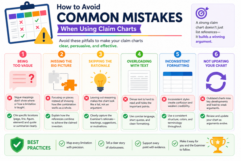
One common mistake is copying too much text into the chart. When every row is packed with long quotes, the chart becomes hard to read. Another mistake is writing conclusions without support.
A note that says “not taught” is not enough. The chart should explain why the cited reference does not teach the claim element.
A third mistake is treating the chart as the final response.
The chart is a working document. It helps the team think. The final office action response should be cleaner, shorter, and more focused. It should use the best points from the chart, not every thought the team had.
When used well, the chart creates clarity. When used poorly, it creates more noise.
Do not let the chart become a dumping ground for every possible argument
It is tempting to put everything in the chart. Every complaint. Every small difference. Every idea for an amendment. Every possible issue with every reference.
That can backfire.
Too many weak points can hide the strong point. The team may spend hours debating small details while missing the argument that actually matters. A better chart separates important points from minor ones.
After the first pass, review the chart again. Look for the rows that truly affect the rejection.
Find the differences that change how the system works. Find the missing elements that are clear. Find the combination logic that feels thin.
Those are the points that deserve attention.
The rest may still be useful as backup, but they should not control the response.
A strong chart should make the next step obvious
When the chart is finished, the team should have a clearer view of what to do next. It should show whether the best path is argument, amendment, interview, continuation planning, or some mix of those choices.
If the chart does not help with that, it may need to be cleaned up.
A useful chart answers practical questions. It shows where the examiner’s mapping is strong. It shows where it is weak.
It shows which technical facts support your position. It shows which claim changes may create distance from the old references.
That is why a good chart is not busy for the sake of being busy. It is focused.
For founders, this kind of focus can make the patent process feel much less painful.
Instead of reacting to a rejection with stress, you can respond with a plan. Instead of guessing what the examiner means, you can see the argument row by row.
PowerPatent helps make that kind of clarity possible. With smart tools and real attorney review, founders can move through patent work with more speed, more control, and fewer costly mistakes. See how it works at https://powerpatent.com/how-it-works
How to Use Claim Charts When the Examiner Says the Change Is Just a Design Choice
Sometimes an examiner will say your claimed feature is only a design choice. That can feel frustrating because it makes the invention sound like a simple option, not a real technical move.
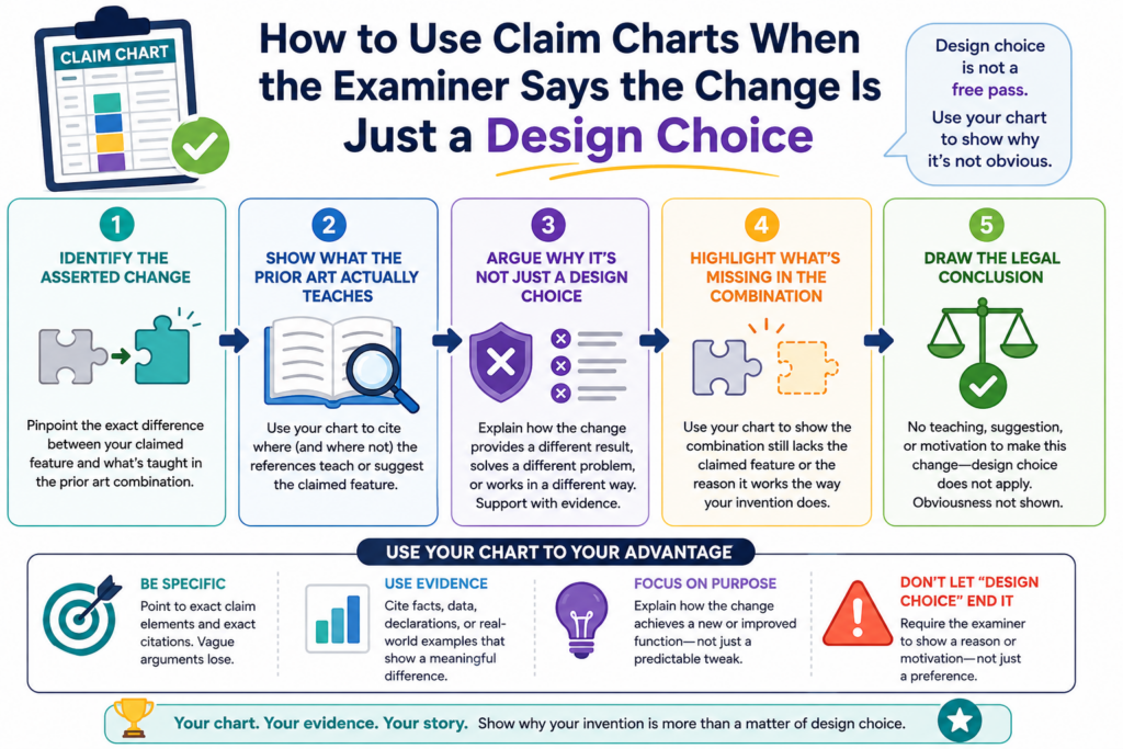
A claim chart can help you push back with care.
The key is to show that the claimed feature is not just a random choice. It does something. It changes how the system works. It solves a real problem. It creates a result that the older references did not teach or suggest.
This matters because many inventions look simple after they are built. A clean user flow, a smart model trigger, a better sensor rule, or a faster data path may seem obvious in hindsight.
But if that choice creates a real technical benefit, it should not be brushed aside.
The chart should help you show why the claimed feature matters inside the full system.
A design choice argument is weaker when the choice changes system behavior
The first step is to identify what the examiner calls a design choice. Then place that exact feature in the chart.
Look at the old reference and ask whether it treats that feature as optional, useful, or even related to the same problem.
This is where the facts matter.
If your claim uses a certain order of steps because that order reduces delay, then the order is not just cosmetic. If your system places a filtering step on a local device because that protects private data, then the location of that step matters.
If your model updates only after a verified event because that reduces bad outputs, then the trigger matters.
A strong response should explain that link in simple terms.
The feature is not important because it sounds different. It is important because it changes the operation of the claimed system. That is the point the chart should make clear.
The best answer is to show the problem, the choice, and the result
When facing a design choice argument, do not only say the examiner is wrong. Show why.
A good chart note can explain the technical problem the inventors faced, the choice they made, and the result that came from that choice. This gives the attorney a strong base for the response.
For example, the problem may be that live sensor data creates too many false alerts.
The choice may be to update a threshold only after a second signal confirms the event. The result may be fewer false actions without slowing the system down.
That story is clear. It is not fluff. It helps show why the claim feature has technical weight.
This is also why founders should capture invention details early. When the patent application includes the problem, the design path, and the result, later 103 responses become much easier.
PowerPatent helps teams collect those details while real patent attorneys guide the work, so important invention facts are not lost. See how it works at https://powerpatent.com/how-it-works
How to Use Claim Charts When the Examiner Says the Result Was Predictable
Another common 103 argument is that the result would have been predictable. In plain words, the examiner is saying that if someone combined the old references, they would have expected your result.
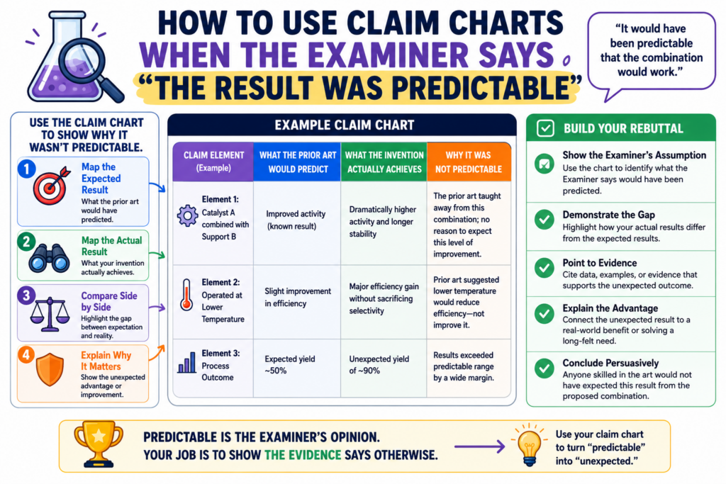
This can be a serious point, but it is not always correct.
A claim chart can help you test whether the result was truly predictable or whether the examiner is making that claim too quickly.
This is especially important in fields where small changes can create big effects. AI systems, medical tools, battery systems, robotics, chips, and security software often behave in ways that are not simple.
Even in software, the final result may depend on timing, data type, model behavior, user state, network limits, or device limits. A small change can alter the whole system.
So when the examiner says the result was predictable, the chart should ask a simple question: predictable from what?
The chart should compare the old expected result with your claimed result
Start by looking at what the old references actually promise. Do they promise the same result your claim delivers? Do they solve the same problem? Do they measure success the same way?
This matters because the examiner may use broad language. The rejection may say both systems improve speed, accuracy, safety, or efficiency. But those words can hide major differences.
Your claim may improve speed by moving a step before transmission. The old reference may improve speed by compressing data after transmission. Those are not the same approach.
Your claim may improve accuracy by validating live feedback. The old reference may improve accuracy by using a larger training set. Again, the path is different.
The chart should make those differences easy to see.
A strong argument does not need to say your result was magical. It only needs to show that the cited references did not make the claimed result predictable in the claimed way.
Evidence from testing, failures, or tradeoffs can make the argument stronger
Founders and engineers often know things that do not appear in the office action. They may know that the team tried other paths and they failed.
They may know that a certain design created a tradeoff that had to be solved. They may know that the claimed setup worked only after a special condition was added.
Those facts can matter.
Not every internal fact can or should go into a patent response. But the team should surface them during claim chart review. The attorney can decide what is useful and how to present it.
For example, if moving a process to the edge device created power issues, and the claimed invention solved that with a timing rule, that may support the idea that the result was not simply predictable.
If a model update step caused unstable outputs until the inventors added a validation gate, that may also be useful.
This is why a good claim chart should have space for engineering notes. The rejection may look like a paper exercise, but the best response often comes from real building experience.
How to Use Claim Charts to Keep the Patent File Clean
A patent file is the written history of the case. It includes the claims, the rejections, the responses, and the arguments made along the way. That history can matter later.
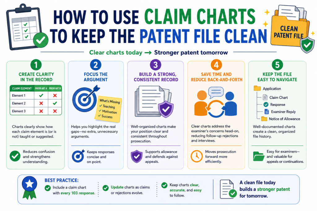
This is why careless responses are risky.
When a team is upset about a rejection, it may want to say too much. It may want to explain every reason the product is better.
It may want to make broad claims about what the old references cannot do. But broad statements can create problems later if they are not needed.
A claim chart helps prevent that.
Because the chart breaks the rejection into exact parts, it helps the response stay focused. You can argue the point that matters without adding extra statements that may narrow the patent by accident.
This is a quiet benefit, but it is very important.
A clean record says only what needs to be said
The strongest patent responses are often clear and limited. They answer the rejection. They do not turn into essays about the whole product.
This does not mean the response should be weak. It means the response should be precise.
If the issue is that the cited reference does not teach a verified event before a model update, say that.
If the issue is that the examiner’s combination would change the purpose of the main reference, say that. If the issue is that the proposed amendment clarifies a timing step, say that.
Do not add extra limits unless they help.
The chart helps because it separates useful facts from extra facts. It lets the team see which details support the response and which details are not needed.
The chart can stop the team from making emotional arguments
A rejection can feel personal. It can feel like the examiner missed the whole point. But an emotional response rarely helps.
The claim chart brings the team back to the record.
Instead of saying, “This is nothing like our invention,” the team can say, “The cited reference does not teach this claimed validation step.”
Instead of saying, “No one would ever combine these,” the team can say, “The examiner has not shown why a skilled person would modify the first system with the second reference in this specific way.”
That is a stronger tone.
It is calm. It is factual. It is easier for the examiner to address. It also protects the long-term value of the patent.
PowerPatent helps founders keep this kind of focus by pairing smart patent workflows with real attorney review.
That means your team can move fast without turning important patent responses into guesswork. Learn more at https://powerpatent.com/how-it-works
How to Use Claim Charts Across a Whole Patent Family
Many startups do not file just one patent. They build a patent family. That may include related filings that cover different parts of the same technology.
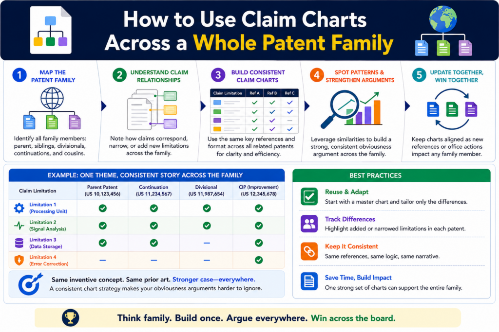
A claim chart can help with more than one response. It can also help shape the whole family.
When you chart a 103 rejection, you learn a lot. You learn what prior art the examiner thinks is close.
You learn which claim features are strong. You learn which technical points create distance. You learn which parts of the invention may need better coverage in future claims.
That information should not be wasted.
A smart team uses the chart to improve the current case and guide the next filing. This is how a patent portfolio gets stronger over time.
The rejection can show where your next claims should go
A 103 rejection is not only a problem. It is also feedback.
The examiner is showing you how the patent office views the space. That view may reveal gaps in your claim strategy.
Maybe your first claim was too broad in one area and too thin in another. Maybe the real technical edge was described in the application but not claimed strongly enough. Maybe a second invention deserves its own claim set.
The chart helps you see that.
For example, the current case may focus on a data flow, but the chart may show that the stronger point is actually the validation logic.
Or the current claim may focus on a model update, but the chart may reveal that the device-side trigger is what truly sets the invention apart.
Those insights can guide continuation claims or future filings.
A family strategy helps protect the invention from different angles
A single claim cannot always do all the work. A strong patent family may protect the system, the method, the device, the model workflow, the data path, and the control logic in different ways.
The claim chart can help decide which angles matter.
If the examiner finds strong prior art against one angle, another angle may still be powerful. If a claim has to be narrowed in one case, a related case may preserve broader coverage around a different inventive feature.
This is not about filing more paperwork for the sake of it. It is about protecting the parts of the invention that matter most.
For founders, this is where patent strategy becomes real business strategy.
You are not just trying to get one patent allowed. You are building a moat around the value of the company.
PowerPatent helps startups think this way from the start by combining software that understands technical inventions with attorney oversight that keeps the filings practical and strong. See how PowerPatent works at https://powerpatent.com/how-it-works
Conclusion:
A 103 rejection can feel heavy, but it becomes much easier to handle when you turn it into a claim chart and break it down piece by piece.
Instead of reacting with stress, your team can see exactly what the examiner is saying, where each old reference is being used, which claim parts are missing, where the logic is weak, and whether the better move is to argue, amend, request an interview, or plan a stronger follow-on filing.
For founders and engineers, this is the smart way to protect the real value of what you are building without getting buried in patent back-and-forth.