A 102 rejection can feel harsh. The patent examiner is saying, in simple terms, “Someone already showed this before.” For a founder, engineer, or inventor, that can sting. You know your invention is new. You know the real work behind it. But the patent office does not judge what you meant. It looks at what your claims say.
A 102 Rejection Is A Claim-Level Problem, Not A Feeling Problem
A 102 rejection is not the examiner saying your whole product is old. That is a key point. Many founders read the rejection and think the patent office missed the big picture.
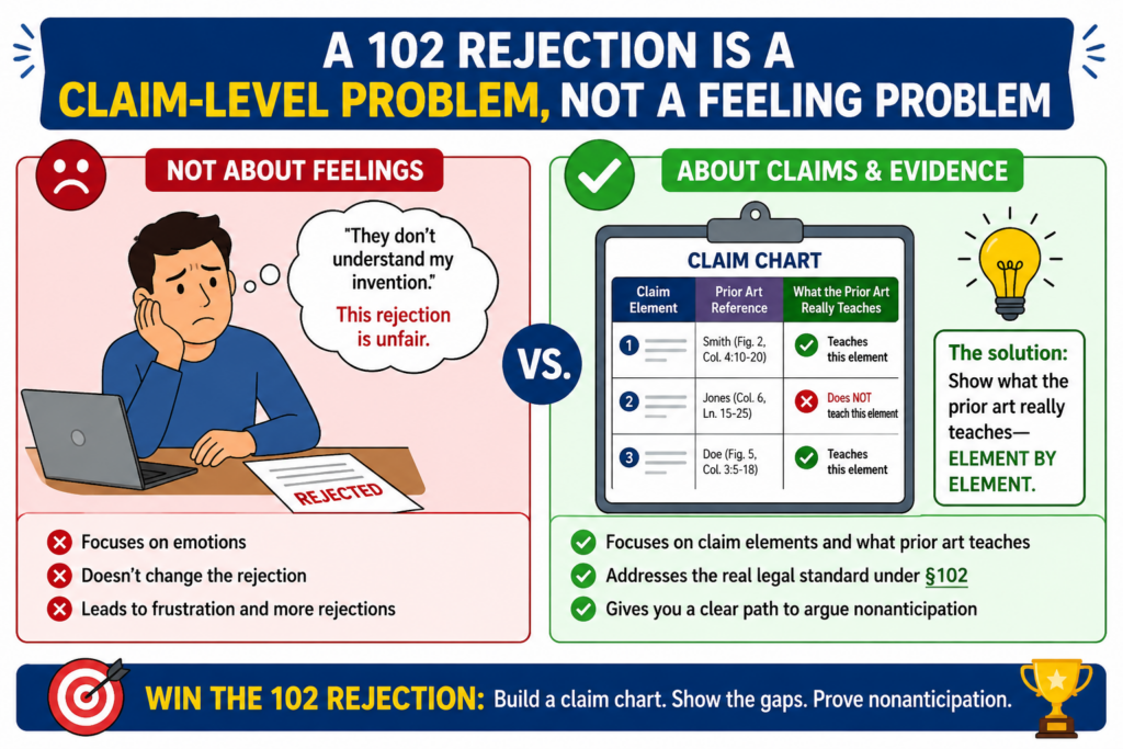
Sometimes that is true. But the examiner is not reading your pitch deck. The examiner is reading your claims.
Your claims are the lines at the end of the patent application that say what you want to protect. If one prior art reference shows every part of one claim, the examiner may reject that claim under 102.
That word “every” matters.
A 102 rejection should not stand unless the same prior art reference shows each required part of the claim.
Not a rough idea. Not a similar goal. Not something that could maybe be changed to work the same way. The reference must teach the claim as written.
Why founders often lose time after a 102 rejection
Founders often respond too fast. They read the prior art, see that it is in the same space, and start changing the claim.
That can be a mistake. Before you narrow the claim, you need to know if the rejection is actually right.
This is where a claim chart helps. It stops panic. It turns a broad rejection into a clean comparison. You take the claim apart, place each piece in a chart, and ask a simple question for each piece: where does the prior art show this?
Many weak rejections hide in broad words. The examiner may point to a paragraph and say it teaches a claim feature.
But when you read that paragraph closely, it may teach only part of the feature. Or it may teach a different step. Or it may use a different structure. A claim chart makes that gap easy to see.
The goal is not to argue louder, but to show the missing part
A strong response does not say, “The examiner is wrong” and leave it there. A strong response shows why the mapping does not work. It points to the claim language, points to the cited text, and explains the gap in plain terms.
For example, your claim may require a model that updates a control signal based on live sensor input.
The prior art may show a model trained on sensor data, but not one that updates a control signal in real time. Those are not the same thing. A claim chart helps you make that difference clear.
That is the kind of work PowerPatent is built to support. It helps technical teams organize the invention, claims, prior art, and attorney input in one focused workflow, so the response is based on what the reference really says. You can explore the process here: https://powerpatent.com/how-it-works
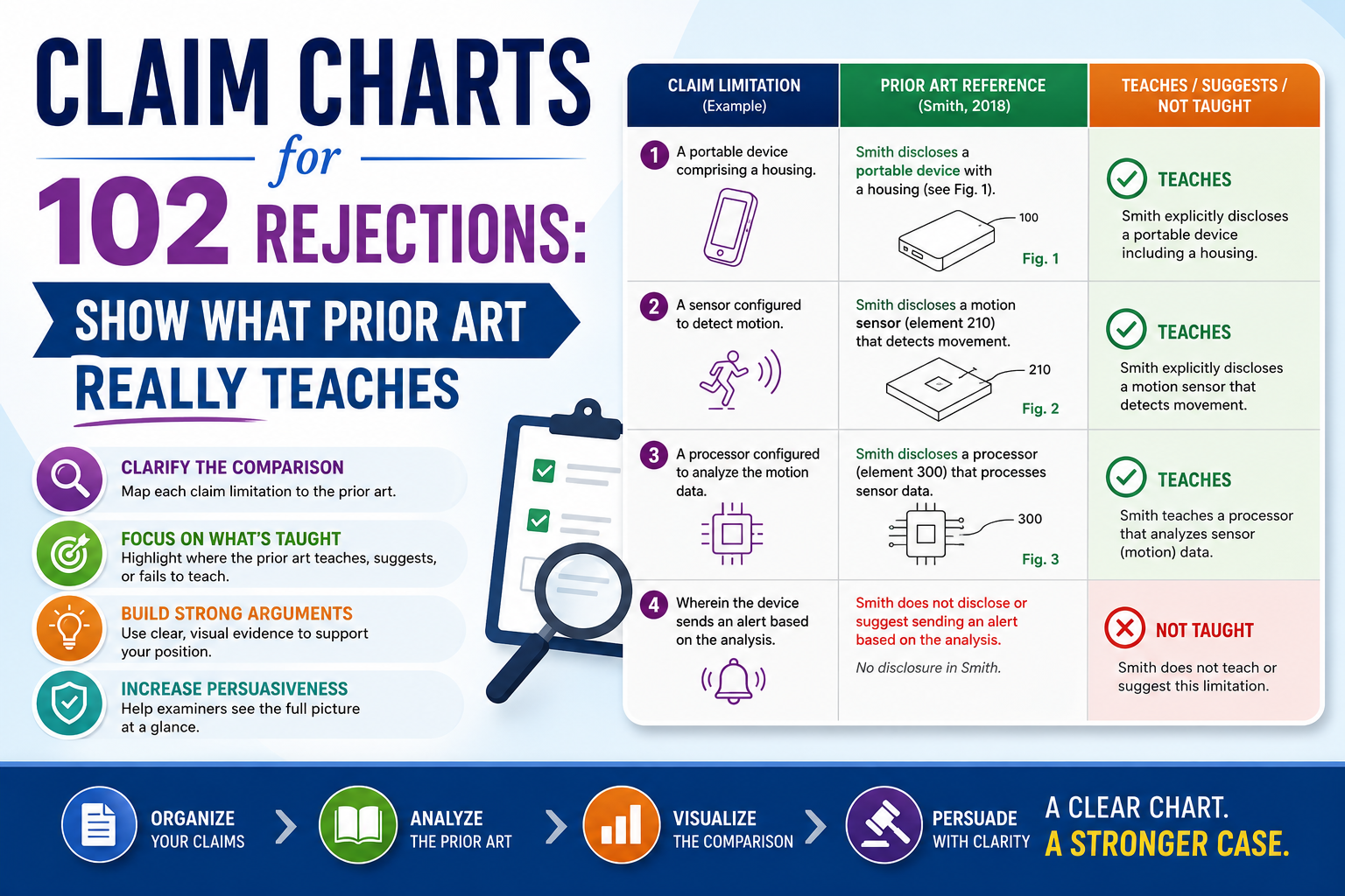
A Claim Chart Forces The Rejection To Become Specific
A vague rejection can feel hard to fight because it sounds complete. The examiner may cite a block of text, a figure, or a column from a patent and state that it teaches your claim. But when the mapping is loose, the rejection can look stronger than it is.
A claim chart forces the issue.
It breaks the claim into smaller parts. Each part is placed in its own row. The prior art citation goes next to it. Then you add a clear note that explains whether the cited part truly matches the claim language.
This is not busy work. It is how you find the heart of the rejection.
The best claim charts are simple enough for a busy person to read
A good chart does not need fancy words. In fact, fancy words often make it worse. The chart should make the story obvious.
Anyone reading it should be able to see the claim part, see what the examiner used, and see why the match works or fails.
For a 102 rejection, this matters because the legal test is strict. The same reference must disclose every claim part. If the examiner needs to combine two references, that is not a true 102 issue.
If the examiner needs to assume a missing step, that is not enough. If the examiner points to a feature that only becomes clear after changing the prior art, that is not the same as the reference teaching it.
The chart turns those points into proof.
The chart should make the examiner’s burden visible
A claim chart is not just a work tool. It is a persuasion tool. It shows the examiner that you are not arguing from emotion. You are giving a direct, careful reading of the record.
When a chart is done well, it can make the next step much easier. You may decide to argue without changing the claim.
You may decide to amend one term to make the difference clearer. You may see that one claim is weak but another claim has a stronger path. The point is that you are no longer guessing.
This is very important for startups because each response costs time. A rushed amendment can make the patent smaller than it needs to be.
A vague argument can lead to another rejection. A strong chart helps the team make a better decision before giving up claim scope.
Start By Reading The Claim Like A Machine Would Read It
Before you compare anything to the prior art, you need to understand your own claim. That sounds basic, but it is where many responses go wrong. People read the claim with the invention in mind. The patent office reads the words on the page.
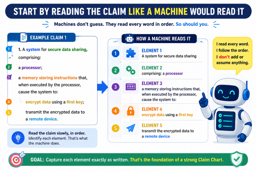
You need to slow down and read the claim as if you have never seen the product before.
Every word that limits the claim matters. A method step matters. A system part matters. A timing rule matters. A data flow matters. A relationship between parts matters.
If the claim says “based on,” that phrase matters. If it says “in response to,” that phrase matters. If it says “before,” “after,” “during,” or “without,” those words can decide the whole rejection.
Do not treat the claim as one big idea
A claim is not one blob. It is a set of required parts. If even one required part is missing from the cited reference, the 102 rejection has a problem.
This is why the first draft of a claim chart should focus only on the claim language. Do not rush to the prior art yet. First, split the claim into clean pieces. Each piece should be small enough that you can test it against the reference.
For example, a claim might describe receiving sensor data, filtering that data, generating a ranked output, and changing a device setting based on the ranked output.
Those are separate pieces. If the prior art shows receiving and filtering, but does not show the ranked output being used to change the device setting, that gap may matter.
The small words often carry the strongest argument
In many software and deep tech inventions, the key difference is not the broad field. It is the way the system works. A prior art reference may be in the same industry and still fail to show your actual claim.
Maybe it predicts a result but does not adjust a system. Maybe it stores data but does not train a model. Maybe it sends an alert but does not change access.
Maybe it uses a static threshold while your claim requires a dynamic one. These differences can be easy to miss if you only read at a high level.
A claim chart helps you protect those details. It gives your attorney and technical team a shared view of what matters.
PowerPatent’s workflow is designed for this kind of founder-led clarity, with attorney oversight so you are not left trying to read patent office language alone. See how that works here: https://powerpatent.com/how-it-works
Read The Prior Art For What It Actually Says, Not What It Could Become
A common trap in a 102 rejection is treating the prior art like a pile of possible ideas. That is not how anticipation should work.
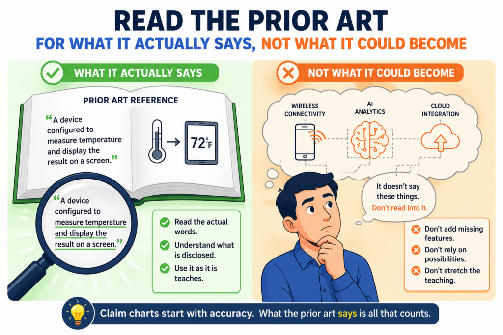
The question is not whether the old reference could be modified to reach your claim. The question is whether it already teaches the claim.
This difference is simple, but powerful.
If the examiner reads extra meaning into the reference, your claim chart should expose that. If the reference suggests a broad concept but never gives the required claim feature, your chart should show that too.
If the examiner uses a figure for one part and an unrelated passage for another part, the chart can help test whether the same system is actually being described.
The cited passage must match the claim language
When you review the prior art, do not just look for similar words. Look for the same function, the same relationship, and the same required result. Patent references often use words that sound close but mean something different in context.
For example, a reference may say it “selects” data. Your claim may require that the system “ranks” data based on a model score.
Selection and ranking may overlap in normal speech, but they are not always the same in a patent claim. The reference may choose one item without creating a ranked list. If your claim requires ranking, that gap matters.
The same is true for “training,” “updating,” “detecting,” “validating,” “matching,” “authorizing,” and many other common technical words. The chart should make clear whether the prior art does the specific thing your claim requires.
Do not let broad labels replace real teaching
Prior art often lives in the same category as your invention. That does not mean it teaches your invention. A paper about machine learning in medical images does not automatically teach every machine learning workflow for medical images.
A patent about battery control does not automatically teach your battery control method. A reference about fraud detection does not automatically teach your risk scoring pipeline.
This matters because founders often sell the big idea, but patents protect the working details. A claim chart keeps the focus on those details. It shows that the old reference may share the same problem space while still missing the claimed solution.
That is the move. You are not saying, “Our invention is better.” You are saying, “This reference does not teach this claimed feature.” That is much harder to ignore.
The Strongest 102 Responses Are Built Before The Amendment
Many teams treat amendment as the first move. They see a rejection and start adding more limits to the claim. Sometimes that is the right move. But not always.
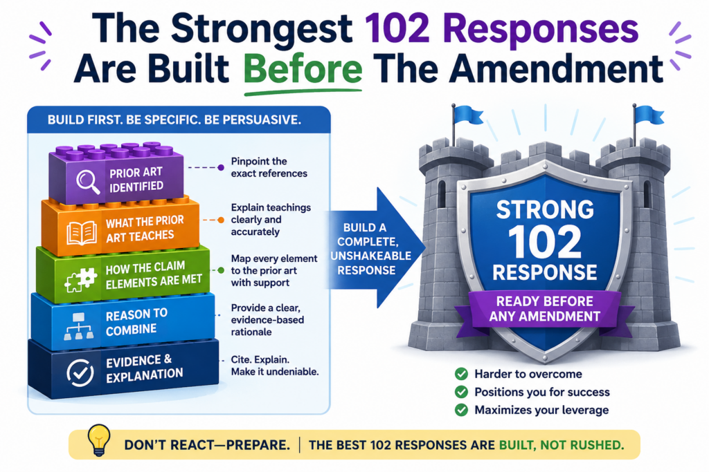
If the rejection is weak, an argument may be enough. If the examiner has mapped the wrong feature, you may not need to narrow the claim at all.
If only one term is being read too broadly, a small amendment may be better than a large one. The claim chart helps you choose with care.
A bad amendment can cost more than the rejection itself. Once you add a narrow feature, you may give up space that could have been useful later.
For a startup, that can affect funding, licensing, exits, and defense against copycats.
Chart first, amend second
The chart gives you a clean view before you touch the claim. It shows where the rejection is strong, where it is weak, and where the examiner may have stretched the reference too far.
This is especially useful when the invention is complex. In AI, robotics, chips, clean tech, biotech tools, and advanced software, one claim can include many linked parts.
A small misunderstanding in one step can change the whole rejection. A chart lets the team see those links.
For example, the prior art may show collecting inputs and producing an output. Your claim may require that the output changes how later inputs are weighted.
That feedback loop may be the real invention. If the examiner cites only a normal output step, the rejection may miss the point. A chart helps make that visible.
A careful chart can protect claim scope
Patent scope is business value. It is the space around your invention that others cannot easily enter. When you amend too fast, you may shrink that space without needing to.
A strong claim chart helps avoid that mistake. It gives your attorney a better basis for deciding whether to argue, amend, or do both.
It also helps founders understand the tradeoff in plain terms. You can see what is being protected, what is being changed, and why.
This is one reason PowerPatent focuses on both smart software and real attorney review. Software can help organize the details. Attorneys help turn those details into a strong filing strategy.
For technical founders who want speed without blind spots, that mix can make a real difference. Learn more here: https://powerpatent.com/how-it-works
A Good Claim Chart Starts With The Exact Claim Words
The first rule is simple: do not rewrite the claim in your head. Use the exact words from the claim.
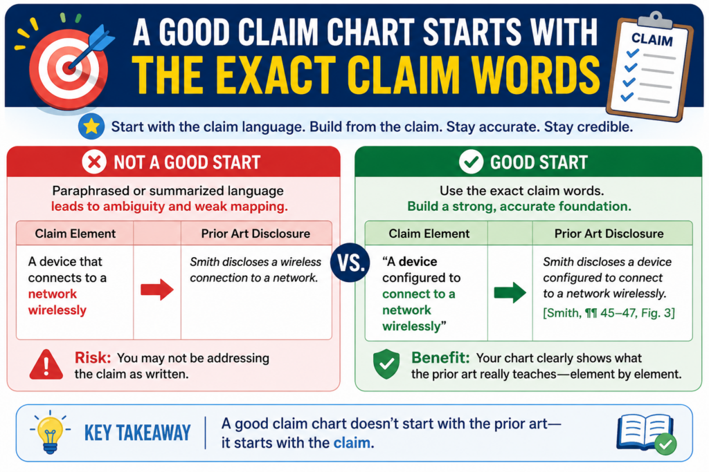
This may feel slow, but it is the safest way to respond to a 102 rejection. The examiner is judging the claim as written, so your chart should start with that same claim language.
When you copy the claim into the chart, keep the meaning tight. Do not turn a detailed claim part into a broad summary.
If the claim says the system “generates a confidence score based on a comparison between a current input and a stored baseline,” do not shorten that to “generates a score.” That shortcut can erase the part that makes your invention different.
The claim language controls the whole fight
A 102 rejection can only stand if the prior art teaches each required part of the claim. That means each claim part must be tested with care.
If you weaken the claim language in your own chart, you may accidentally help the rejection look stronger than it is.
This is why a founder should sit with the claim before touching the prior art. Read each phrase slowly. Ask what the phrase requires.
Ask what must happen first. Ask what depends on what. Ask whether the claim requires a certain kind of data, a certain type of action, or a certain link between two steps.
The strongest chart often comes from small, careful choices. You are not trying to sound clever. You are trying to show the truth of the comparison.
The chart should preserve every limit that gives your claim power
A claim limit is a required part of the claim. Some limits are easy to see, like a sensor, processor, model, interface, database, or signal.
Other limits are hidden in the relationship between parts. These hidden limits often matter more.
For example, a claim may require that a first model detects a condition and a second model changes a control value based on that condition.
The prior art may show two models, but not that relationship. If your chart only says “first model” and “second model,” the gap may disappear. But if your chart keeps the full relationship, the gap becomes clear.
That is why claim charts are so useful for technical inventions. They protect the fine detail. They help your team avoid broad, weak arguments. They also help your attorney see where the best response may be found.
PowerPatent helps founders capture these details before they get lost in legal back-and-forth. The platform is built to help technical teams move fast while still getting real attorney oversight. You can see how the process works here: https://powerpatent.com/how-it-works
The Prior Art Column Should Not Become A Dumping Ground
A weak chart often copies long blocks from the prior art and hopes the reader will find the point. That does not help.
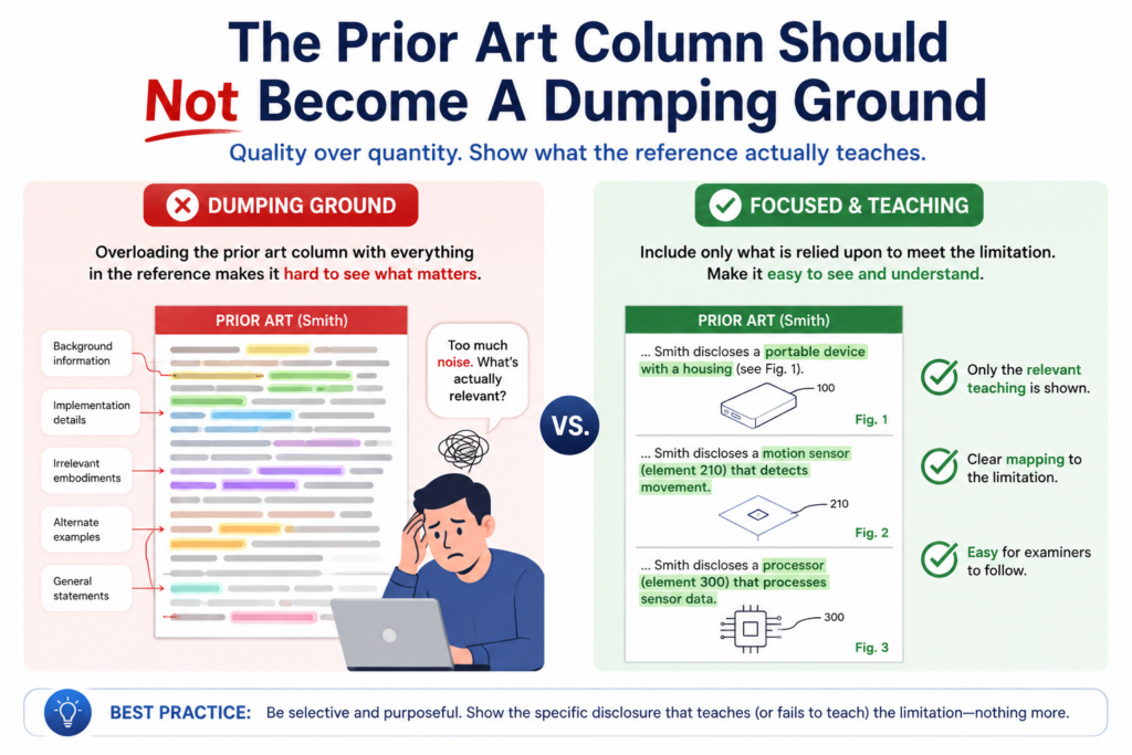
It can make the rejection feel cloudy. A good chart is not a storage place for text. It is a focused comparison.
The prior art column should show the exact part the examiner relied on, but it should also be handled with care. Long quotes can bury the issue. A short citation with a clear note is often stronger than a wall of text.
The best charts make the mismatch easy to see
When reviewing the examiner’s mapping, ask whether the cited passage really teaches the claim feature. Not whether it is close.
Not whether it sounds related. Not whether a skilled person could build something similar after reading it. For a 102 rejection, the key question is whether the reference itself shows the claimed feature.
This is where many strong arguments begin.
The examiner may cite a passage that teaches collecting data, while your claim requires changing a control action based on that data.
The examiner may cite a passage about storing user settings, while your claim requires generating a new setting through a model.
The examiner may cite a diagram that shows connected boxes, while your claim requires a specific flow of data between those boxes.
These are not tiny word games. These are real technical differences. A claim chart helps show them without drama.
The cited text must do the same job as the claim feature
A common mistake is matching words instead of matching function. Two systems can use the same word but do different things.
A reference can mention a “profile,” a “model,” a “score,” or a “rule,” but the real question is what that item does in the system.
If your claim requires a score that decides whether a device takes an action, and the prior art score is only used for display, the match may fail.
If your claim requires a model that updates during operation, and the prior art model is fixed after setup, the match may fail.
If your claim requires a rule that is changed based on live data, and the prior art rule is manually set by a user, the match may fail.
This is the work that wins patent arguments. You show that the reference is not doing the same thing. You show that the examiner’s broad reading skips over the actual claim requirement.
Founders should care about this because a broad reading can shrink the value of the patent before the patent ever issues.
When you accept a loose match, you may end up making unnecessary changes. Those changes can make it easier for others to design around your patent later.
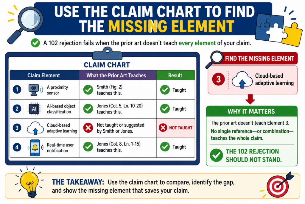
Use The Claim Chart To Find The Missing Element
The missing element is the heart of many 102 responses. If one required part of the claim is missing from the prior art, the rejection has a serious weakness. Your job is to find that missing part and explain it clearly.
This does not mean you should hunt for tiny wording differences that have no real meaning.
The best missing-element arguments are grounded in how the invention works. They show that the prior art does not teach a real part of the claimed system or method.
The missing element should be tied to the invention’s real value
A strong argument does more than say, “This word is not in the reference.” It explains why the cited prior art does not teach the claim feature as claimed.
For example, suppose your invention helps a robot update its path based on changing floor conditions. The prior art may show a robot with a stored path and a sensor. At first, that sounds close.
But your claim may require the robot to change the path based on a detected surface type during movement. If the prior art only detects obstacles and does not change the path based on surface type, that missing element matters.
The point is not to argue that your robot is cooler. The point is to show that the old reference does not teach the specific claimed behavior.
The best missing-element argument is plain and direct
A good response might say, in plain terms, that the cited paragraph teaches detecting an obstacle, but the claim requires changing a route based on a detected surface condition.
The response then explains that obstacle detection is not the same as surface-based route change.
That kind of sentence is powerful because it is easy to follow. It does not hide behind complex words. It gives the examiner a clear reason to reconsider the rejection.
This is also where claim charts can help founders work better with patent counsel. The technical team often knows the real difference right away, but that difference must be placed into the language of the claim.
A chart creates a bridge between engineering truth and patent response strategy.
PowerPatent is designed around that bridge. It helps capture what the invention actually does, then supports the path toward stronger patent work with real attorney involvement.
For teams that want protection without slowing down the build cycle, that matters. You can learn more here: https://powerpatent.com/how-it-works
Do Not Let The Examiner Split One Claim Feature Across Unrelated Parts
Sometimes a 102 rejection looks complete because the examiner pulls pieces from different parts of one reference.
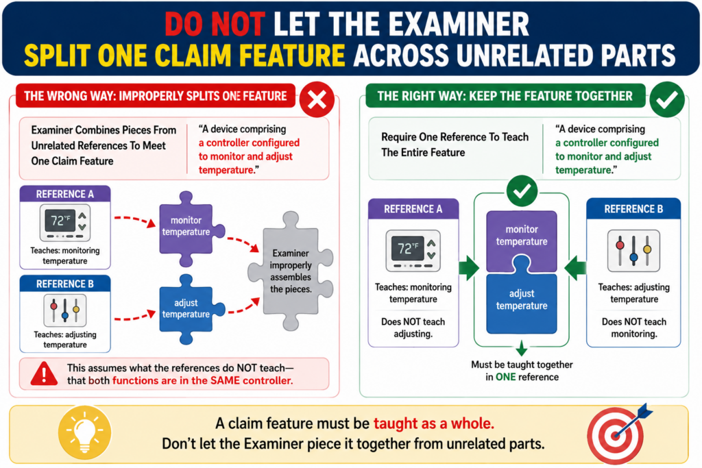
This can be allowed in some cases, but it becomes a problem when the pieces do not belong to the same embodiment or do not work together in the way the claim requires.
In simple terms, the examiner cannot always take one part from one version of a system, another part from a different version, and treat them as if the reference clearly taught the full claimed setup.
The chart helps you see when that is happening.
The question is whether the reference teaches the claimed combination
Many technical references describe several options. They may show different examples, different modes, different versions, or different use cases.
A 102 rejection should be based on what the reference actually teaches, not on a custom mix that only exists after the examiner stitches pieces together.
Your chart should track where each cited part comes from. If one claim feature is mapped to Figure 2, another to a separate embodiment in Figure 7, and another to a broad background statement, you should ask whether those pieces are truly part of the same disclosed system.
This is not about being difficult. It is about keeping the rejection honest.
A stitched-together reference may be a sign that 102 is the wrong rejection
If the examiner needs to combine separate teachings to reach your claim, the issue may be more like obviousness than anticipation. That does not mean the application is automatically allowed. It means the 102 rejection may not fit.
This distinction matters because the response strategy can change. For a 102 rejection, you focus on what one reference teaches.
For an obviousness rejection, you may need to address why a person would or would not combine teachings, and whether the combination would actually lead to your claim.
A claim chart helps you spot that line. It shows whether the prior art has every claim part in one clear teaching, or whether the rejection depends on a patchwork reading.
For founders, this is a big deal. A patchwork reading can make an old reference look more dangerous than it really is.
Without a chart, your team may assume the examiner found your invention. With a chart, you may see that the examiner found pieces that do not add up.
Use The Chart To Decide Whether To Argue, Amend, Or Both
A claim chart is not the final response. It is the tool that helps you choose the final response. Once the chart is done, you can make a better decision about the next move.
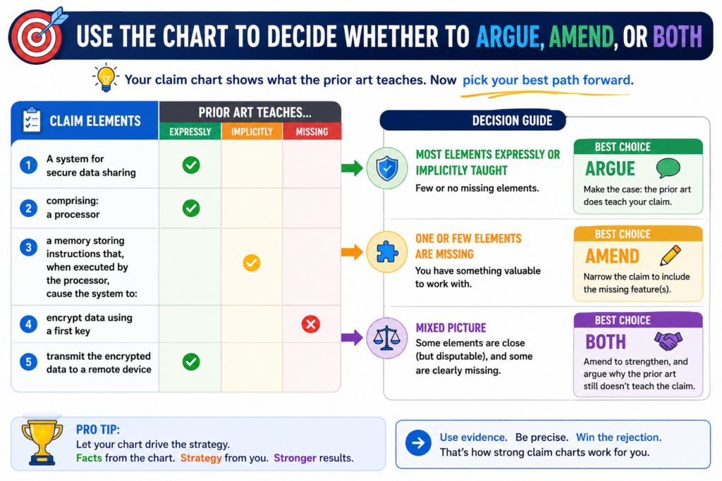
Sometimes the best move is to argue. If the chart shows a clear missing element, and the claim already says what it needs to say, an argument may be the cleanest path. You explain the gap and ask the examiner to withdraw the rejection.
Sometimes a small amendment can make the difference clearer
There are times when the claim is right in spirit but too easy to read broadly. In that case, a small amendment can help.
The amendment should be based on the real invention, not fear. It should make the difference clearer without giving away more scope than needed.
For example, if the prior art shows a model that creates a prediction, but your invention uses the prediction to automatically update a control value, the amendment may focus on that control update.
If the prior art stores sensor data, but your invention changes a threshold based on the sensor data, the amendment may focus on that changing threshold.
The chart helps keep the amendment focused. It shows the exact gap. That way, the amendment answers the rejection instead of randomly adding weight to the claim.
The response should protect the business, not just win the round
A patent office response is not only about getting past the examiner. It is about building a patent that still matters after it issues. A narrow claim may be easier to allow, but it may also be easier for a competitor to avoid.
This is why founders should not treat patent prosecution as paperwork. Each response can shape the value of the patent.
Each amendment can affect what the company owns. Each argument can create a record that may matter later.
A good claim chart supports better choices because it makes the tradeoffs visible. It helps the founder, technical team, and attorney stay focused on the same question: what do we need to protect, and what does the prior art really teach?
That is exactly the kind of work PowerPatent helps make easier. It gives founders a faster, clearer way to work with patent tools and real attorneys, so strong ideas do not get lost in slow, confusing process. See how it works here: https://powerpatent.com/how-it-works
A 102 Claim Chart Should Show The Full Chain Of Meaning
A strong claim chart does more than place words side by side. It shows how the claim works as a chain. This is important because many inventions are not defined by one part alone. They are defined by how parts work together.
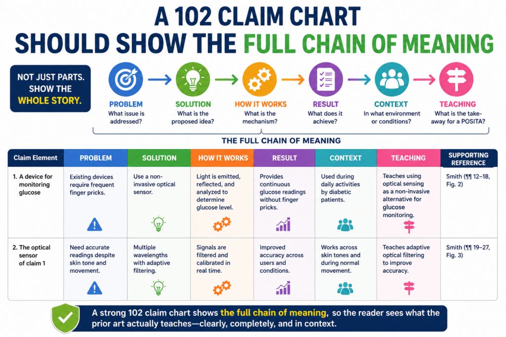
The USPTO’s own guidance says a 102 rejection needs a prior art reference to teach every required part of the claim under the broadest reasonable reading.
That is the core reason a claim chart matters. It helps you test whether every part is truly present, instead of letting a broad summary stand in for a real match.
The order of steps can change the whole answer
In many inventions, the order matters. The claim may require that one step happens before another step.
It may require that one result is used to trigger a later action. It may require a loop, where the system takes an output and feeds it back into a later decision.
A prior art reference may show the same pieces, but in a different order. That can be a real gap. For example, an old system may collect data, store it, and later review it.
Your claim may collect data, score it right away, and change a machine setting before the next cycle starts. Those are not the same workflow.
A chart can make this difference clear. One row may show the data collection. Another row may show the scoring step.
Another row may show the control change that happens after scoring. When the prior art does not follow that chain, the chart gives you a clean way to explain the problem.
The chart should make cause and effect easy to see
Many valuable startup inventions live in cause and effect. One thing happens, so the system does another thing. A sensor sees a change, so a model updates a value.
A user action crosses a risk line, so access changes. A battery signal drops below a live limit, so charging behavior shifts.
Do not let the chart flatten that cause-and-effect link. If the claim says one action happens “in response to” another action, preserve that language.
If it says one value is generated “based on” a certain input, keep that link visible. If it says one module sends data to another module, do not reduce that to “data is used.”
That kind of care can turn a vague response into a strong one. It shows the examiner that your point is not about word choice. It is about how the claimed system actually works.
For founders, this is where claim charts become more than legal paperwork. They become a way to protect the real engine of the product.
PowerPatent helps teams capture that engine early, before key details get lost. See how smart software and attorney oversight work together here: https://powerpatent.com/how-it-works
Inherency Should Be Treated With Care, Not Fear
Sometimes an examiner may say a missing claim feature is “inherent” in the prior art. In plain words, that means the examiner believes the feature must be present, even if the reference does not directly say it.

This can sound hard to fight. But inherency is not magic. It is not a way to fill every blank. If the feature is only possible, likely, or easy to add, that is not the same as being necessarily present.
A claim chart can separate what is required from what is assumed
When inherency appears in a 102 rejection, the chart should slow everything down. The key question becomes simple.
Does the cited prior art necessarily include the missing feature, or is the examiner assuming it?
For example, suppose your claim requires a system that stores a time-stamped model update after each prediction cycle. The prior art may show a model that makes predictions.
The examiner may say the storage must be inherent because systems often log data. But unless the reference makes that storage a necessary part of the disclosed system, the argument may be too broad.
The claim chart should mark that row clearly. It should show the claim feature, the examiner’s cited support, and the reason the cited support does not prove the feature must be there.
The word “must” is often the key
When dealing with inherency, train your eye to look for “must.” Not “could.” Not “might.” Not “would be useful.” The question is whether the prior art system necessarily has the claim feature.
This is especially important in software, AI, and connected devices. A system could log data, but that does not mean it must. A model could retrain, but that does not mean it does.
A server could send a live update, but that does not mean the reference teaches live updates. A device could run locally, but that does not mean the old reference requires local processing.
These differences matter because founders often build the exact missing step as the breakthrough.
The old system may look close from far away, but the claimed feature may be what makes the product faster, safer, cheaper, or more useful.
A strong chart helps you defend that line. It gives your attorney the proof needed to say, in clear terms, that the examiner has not shown the feature is actually taught by the reference.
The Best Charts Use The Examiner’s Words Against The Rejection
A good response does not ignore the examiner’s mapping. It uses it. The rejection tells you where the examiner thinks each claim feature appears in the prior art. That is useful. It gives you the map you need to test.
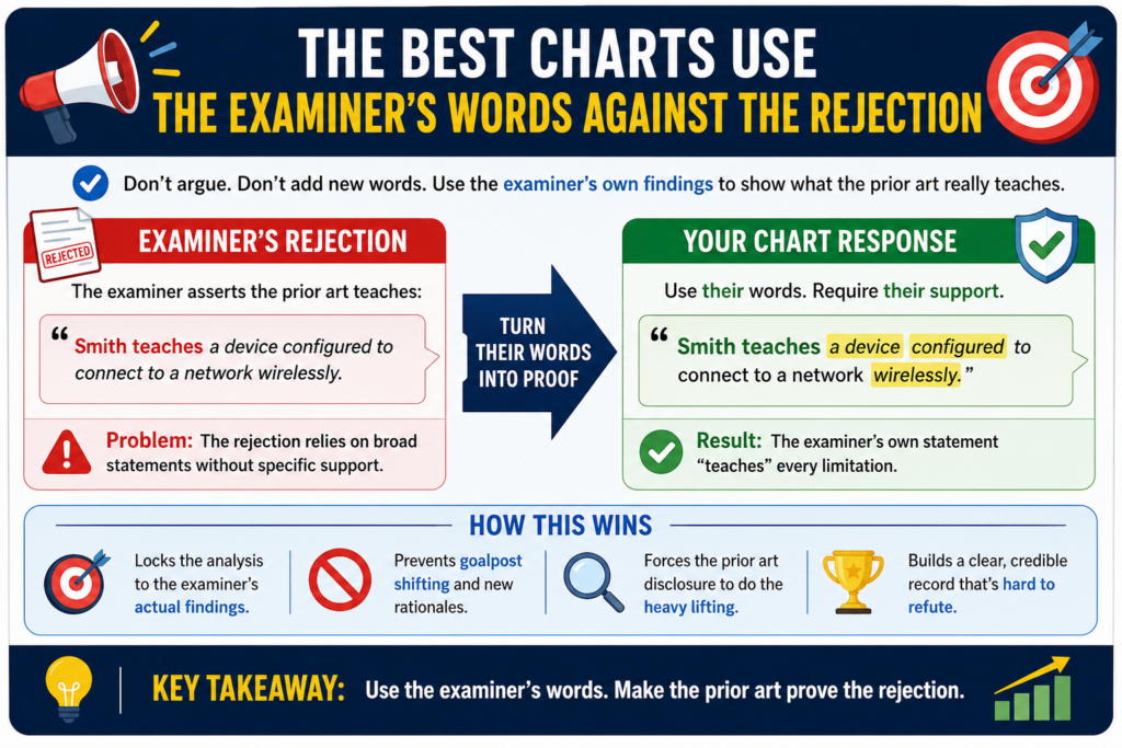
Do not start by writing a general defense of your invention. Start with the examiner’s own citations. Put them in the chart. Then read them with care. Many times, the weakness is already inside the rejection.
The response should meet the examiner at the exact point of dispute
If the examiner cites paragraph 42 for a claim feature, your chart should focus on paragraph 42. If that paragraph teaches something different, say so.
If it teaches only part of the feature, say so. If it belongs to a different version of the system, say so.
This keeps the response focused. It also makes the examiner’s next move harder. A broad statement can be repeated. A precise gap must be answered.
For example, if the examiner says a prior art “alert” teaches your claimed “control command,” your response should not wander into the whole invention story.
It should explain that an alert tells a person something, while the claimed control command changes operation of the device. That is a clean difference. The claim chart should make it visible.
Do not attack the reference when you only need to attack the mapping
The goal is not to prove the prior art is bad. The goal is to prove it does not teach the claim. That is a more focused point, and usually a stronger one.
A prior art reference can be smart, useful, and real while still not teaching your claimed invention. You do not need to insult it. You only need to show the mismatch.
This tone matters. A formal, calm response often carries more weight than a response that sounds frustrated.
That same tone should show up in the chart. Use direct language. Say what the cited text teaches. Say what the claim requires. Say why those are different. Avoid long speeches. Avoid vague words. Let the comparison do the work.
This is the kind of clarity founders need when patents start to feel slow or confusing.
PowerPatent helps turn complex invention details into a cleaner patent workflow, with real attorneys involved so the response is not just fast, but careful. Learn more here: https://powerpatent.com/how-it-works
A Claim Chart Can Reveal When The Claim Itself Needs Cleaning Up
Sometimes the chart shows that the examiner is stretching the prior art. Other times, it shows that your claim is too open. That is not a failure. That is useful information.
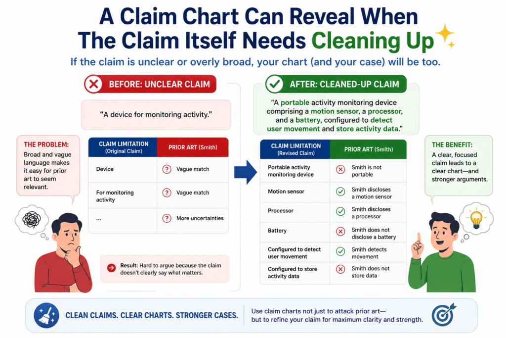
A claim may use a word that is broader than the invention you meant to protect. It may leave out a link between two steps.
It may describe a result but not the action that creates the result. When that happens, the prior art may be easier to map than it should be.
The chart helps you fix the right problem
Without a chart, a founder may think the examiner misunderstood the invention. With a chart, the team may see that the claim did not fully say the invention. That is a different problem, and it needs a different response.
For example, your product may use a local AI model on a device, but the claim may only say “a model.”
If the prior art shows a server-side model, the examiner may have room to read it onto the claim. If local processing is important to the invention, the claim may need to say that.
Or your invention may update a threshold automatically based on live data, but the claim may only say “setting a threshold.”
If the prior art shows a manually set threshold, the examiner may cite it. The chart can show that the claim does not yet capture the automatic update that makes the invention different.
Clean claims often come from clean charts
A clean chart helps you amend with purpose. You are not adding random limits. You are making the claim say what the invention already does.
This is important because not every narrowing change is equal. A careless amendment can shrink the claim in ways that hurt later.
A focused amendment can make the claim clearer while still protecting meaningful space.
The best amendments often come from asking a simple question. What exact feature does the prior art fail to teach, and is that feature truly part of our invention? If the answer is yes, the chart may guide a smart amendment.
This is where founder input matters. The attorney may know the patent rules, but the founder and engineers know why the system was built that way. When those views come together, the response gets stronger.
The Chart Should Support The Story You Want The Examiner To Accept
A patent response is not a sales pitch, but it still needs a clear story. The story should be simple.
The claim requires a specific thing. The prior art does not teach that thing. Because of that, the 102 rejection should be withdrawn or changed.
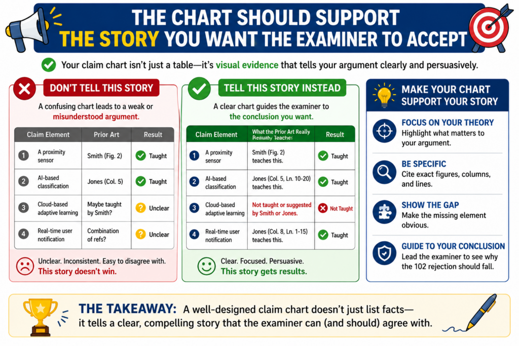
The claim chart is the evidence behind that story. It gives structure to the response. It keeps the argument from drifting. It helps the examiner see the invention through the claim language, not through a loose summary of the field.
The story should be narrow enough to be believable
Do not try to prove that every part of the rejection is wrong if one strong gap is enough. A response with ten weak arguments can feel less convincing than a response with two strong ones.
This is hard for founders because you may see many differences between your product and the prior art.
But not every product difference matters to the claim. The response should focus on the differences that are claimed.
For example, your product may have a better interface, faster setup, nicer reports, and smarter alerts.
But if the claim is about model-based control, the response should stay near model-based control. That is where the patent fight is.
The chart should lead to a clear closing point
At the end of the chart, the reader should know exactly why the rejection fails or why the claim has been amended. The closing point should not feel like a surprise. It should feel like the natural result of the comparison.
A strong close may say that the cited reference teaches storing sensor values, but it does not teach generating a control signal from a live comparison between the sensor values and an adaptive baseline.
That sentence works because it is specific. It names what the prior art does. It names what the claim requires. It shows the gap.
This is how founders can make patent work feel less like a black box. The chart turns confusion into a direct review. It gives the team a way to see what is being argued and why it matters.
PowerPatent was built for founders who want that kind of control. You can move faster, stay closer to the invention, and still have real attorney oversight where it counts.
See how PowerPatent helps technical teams protect what they are building here: https://powerpatent.com/how-it-works
Your Claim Chart Should Separate Real Gaps From Small Wording Gaps
A strong 102 response is not built on tiny word fights. It is built on real gaps.
This matters because not every difference between your claim and the prior art is worth arguing. Some differences are just wording. Other differences change how the invention works.
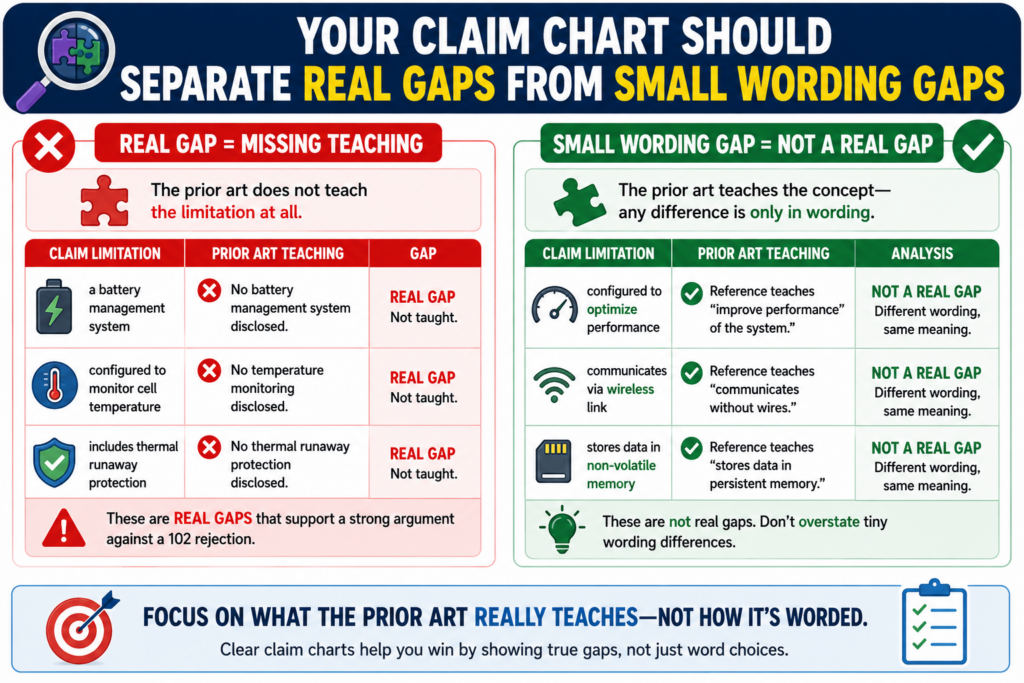
A claim chart helps you tell the difference.
When you review each row, ask whether the difference changes the system, the process, the result, or the way one part depends on another part. If it does, you may have a strong point. If it does not, the argument may be too thin.
A useful gap changes what the old reference actually teaches
A weak gap sounds like this: the claim says “device,” but the reference says “unit.” That may not matter if both words point to the same thing.
A stronger gap sounds like this: the claim requires the device to change operation based on a live score, but the reference only shows a device that displays a score to a user.
That is a real difference. One system acts. The other system informs. That difference can matter a lot.
The best claim charts keep this kind of distinction clear. They do not overstate every small mismatch. They focus attention on the gaps that change the technical meaning of the claim.
The goal is to be firm without sounding strained
Patent examiners read many responses. They can usually tell when an argument is reaching too far. If your chart treats every tiny wording change like a major issue, the stronger points may get buried.
A better move is to be selective. Let the minor points stay in the background. Put the main gap in sharp focus. Make it easy for the examiner to agree with you.
For example, you may write that the cited reference may teach collecting device data, but it does not teach changing a control setting based on a live comparison between that data and an adaptive baseline.
That is clear. It is fair. It does not sound forced.
This is one reason founders should not treat claim charts as busy paperwork. A good chart can shape the whole response.
It helps the team choose the argument that has the best chance of moving the case forward while keeping the claim as strong as possible.
PowerPatent helps founders and engineers keep this work focused. It gives teams a clearer way to turn technical details into stronger patent work, with real attorney oversight built in. You can see how it works here: https://powerpatent.com/how-it-works
Your Chart Should Explain Why The Prior Art’s Feature Is Not The Same Feature
Many 102 rejections depend on words that sound close. The examiner may say the old reference has a “score,” a “model,” a “profile,” a “rule,” a “signal,” or a “processor.” But matching a word is not the same as matching the claim.
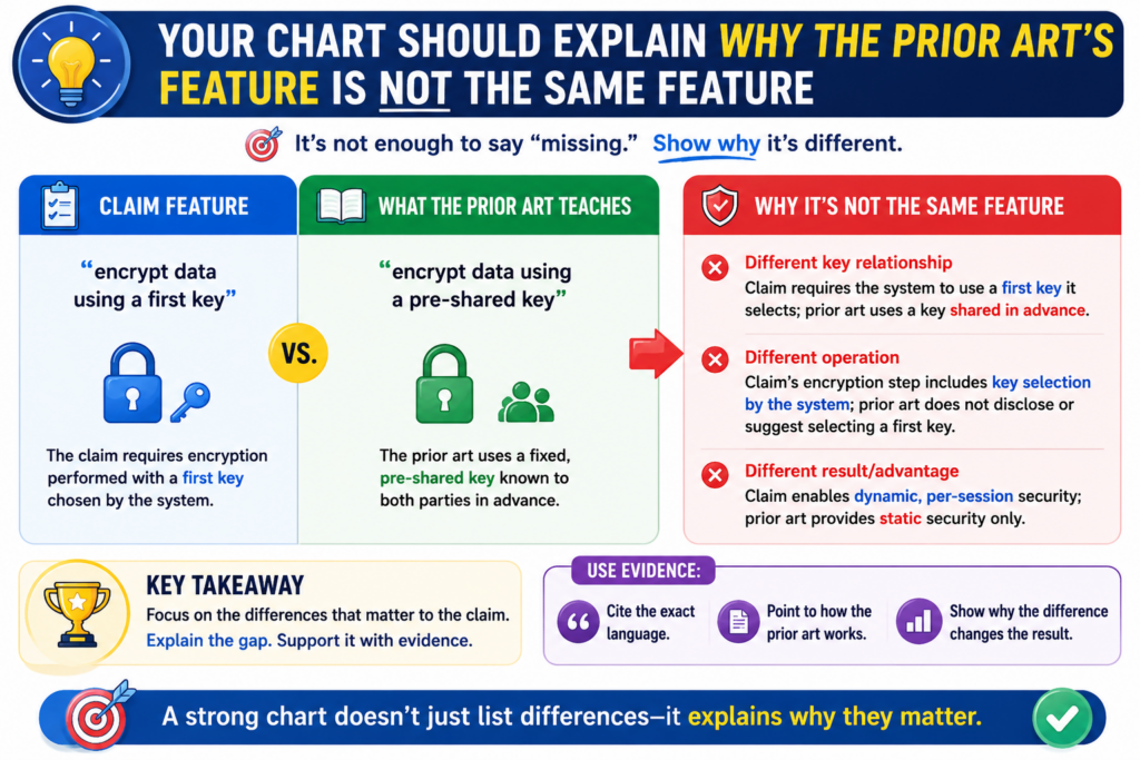
The real question is what that feature does.
A “score” used for sorting is not always the same as a “score” used to control a machine. A “model” used for display is not always the same as a “model” used to update a live decision.
A “profile” that stores user choices is not always the same as a “profile” that is generated from behavior data.
The function of the feature matters more than the label
Your chart should not stop at the label. It should explain the job of the feature in the prior art and compare that job to the job required by the claim.
For example, if the claim requires a risk score that triggers a change in access rights, and the prior art shows a score that appears on a report, the chart should say that clearly.
The old score may describe risk, but it does not perform the claimed access-control function.
That kind of plain comparison is often stronger than a long legal argument. It gives the examiner a simple reason to reconsider the mapping.
The best charts make the wrong match feel obvious
A strong chart helps the reader see the mismatch right away. It does not make the reader hunt for the problem. It does not rely on tone or emotion. It lays out the claim feature, the cited teaching, and the difference in a clean way.
This is especially useful in fast-moving fields like AI, robotics, chips, clean energy systems, and automation.
Many inventions in these fields use common words. The value often comes from the exact role those pieces play in the system.
A prior art reference may include a model, but not your model workflow. It may include a controller, but not your control rule.
It may include a sensor, but not your sensor-based feedback loop. It may include a database, but not your update path.
Founders should care about this because competitors can live in small gaps. If your patent response gives up those gaps too early, you may lose space that should have stayed yours.
A careful claim chart helps stop that. It protects the real feature, not just the broad idea.
The Chart Should Help Your Team Avoid Accidental Admissions
A patent response can create a record. That means the words you use may matter later. This is why a claim chart should be careful, direct, and disciplined.
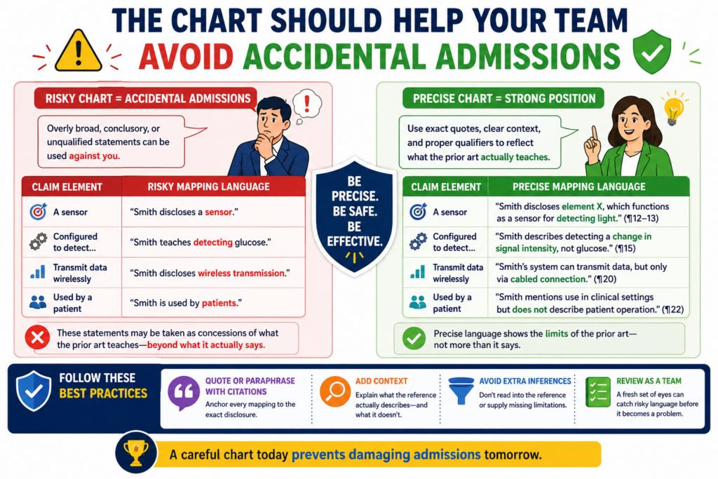
Do not say more than you need to say. Do not describe the prior art as broader than it is.
Do not admit that a reference teaches a feature unless it truly does. Do not call something “similar” when the important point is that it works in a different way.
This does not mean you should be vague. It means you should be exact.
Careful wording protects future patent value
A founder may casually say, “This old reference is basically the same, but it misses our improvement.” That may feel harmless in a team meeting, but it is not the kind of tone you want in a formal response.
A better way is to say that the reference is in the same general field, but it does not teach the claimed feature. That is more accurate and safer.
The claim chart should follow that same rule. It should not overpraise the prior art. It should not stretch the prior art for the examiner. It should not fill in missing details. It should only say what the cited text actually teaches.
The chart should be written like someone may read it years from now
A patent can matter long after the office action is closed. It may matter during fundraising, diligence, licensing, acquisition talks, or a dispute with a competitor.
The response history may be reviewed by people who were not there when the chart was made.
That is why clean language matters.
Write the chart so a future reader can understand it without guessing. The claim requires this. The reference teaches that. The gap is here. That simple pattern makes the record easier to defend.
This is another place where PowerPatent can help technical founders. The platform helps teams organize invention details early and work with attorneys who know how to protect scope, not just push papers.
When your startup is moving fast, that kind of structure can help you avoid mistakes that are hard to fix later. Learn more here: https://powerpatent.com/how-it-works
A Claim Chart Should Turn Engineer Knowledge Into Patent Language
Engineers often see the real difference before anyone else does. They know why the system was built a certain way. They know what the old tools could not do. They know which step changed the outcome.
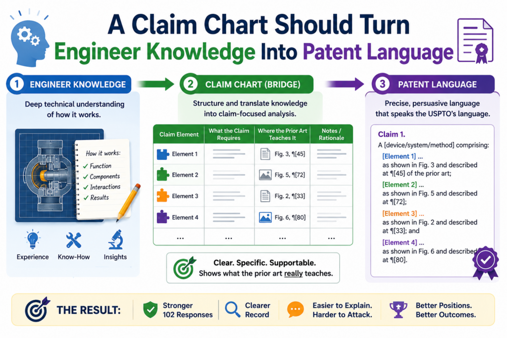
But that knowledge must be translated into claim language.
A founder may say, “Our model is smarter because it adapts.” That may be true, but it may not be enough for a patent response. The response needs to explain what “adapts” means in the claim.
Does the model update weights? Does it change a threshold? Does it choose a different control rule? Does it retrain after a new event? Does it change a score used by another part of the system?
The chart should capture the technical reason in plain words
A useful chart gives the technical team a place to state the real difference clearly. It then helps the attorney connect that difference to the claim.
For example, the engineer may explain that the prior art only checks a value once, while the claimed system keeps updating a baseline after each event.
That can become a strong argument if the claim requires an adaptive baseline.
The key is to avoid vague praise. Do not say the invention is better, smarter, faster, or more modern unless the claim language supports the point. Say what it does differently. Say where the prior art stops. Say what the claim requires next.
The best responses are built by both the builder and the patent team
A patent attorney can read the office action and craft the response. But the founder and engineers often hold the missing facts.
They can explain how the product works, why the prior art does not match, and what detail should stay protected.
The claim chart brings those views together. It gives the builder a way to show the difference. It gives the attorney a way to turn that difference into a response that fits the patent rules.
This is exactly the kind of founder-friendly patent process PowerPatent is built for. It helps technical teams move faster without losing the detail that makes their invention valuable.
The software helps organize the work, and real attorneys help guide the legal strategy. You can see the workflow here: https://powerpatent.com/how-it-works
The Chart Should Make The Next Examiner Interview More Useful
A claim chart is also a strong tool before an examiner interview. An examiner interview is a conversation with the patent examiner. It can help clear up confusion, test a possible amendment, or find a path forward.
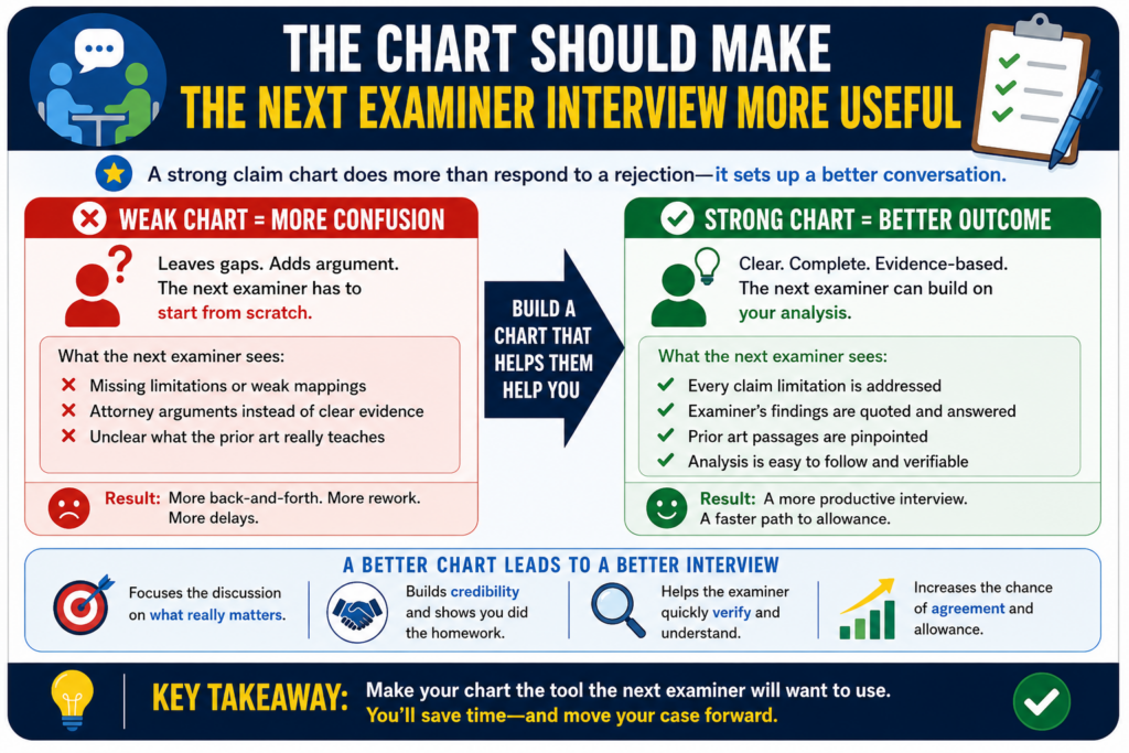
But an interview without a clear plan can waste time. A claim chart gives the call structure.
It lets your team walk through the exact point of disagreement. Instead of saying, “We think the reference is different,” you can say, “The claim requires this feature, and the cited paragraph teaches something else.” That is much easier to discuss.
A focused interview can save rounds of delay
Patent prosecution can drag when each side talks past the other. The examiner may think the issue is one thing.
The applicant may think the issue is another. A chart helps both sides look at the same row, the same claim words, and the same cited text.
That can make the interview more useful. The examiner may agree that the cited passage does not teach the feature. The examiner may point to a different passage.
The examiner may suggest claim language that would overcome the issue. Even if the rejection does not go away right then, the team often leaves with better information.
That information can shape the next response.
The best interview chart is short, clean, and built around the key gap
Do not bring a giant chart into the conversation if only two rows matter. For an interview, the most useful chart is often a focused version. It should show the claim feature, the cited art, and the reason the mapping fails.
Keep the point simple. The reference does not teach the claimed feedback loop. The reference does not teach the claimed live update.
The reference does not teach the claimed control action. The reference does not teach the required order of steps.
That kind of focus respects the examiner’s time. It also helps your team sound prepared, calm, and serious.
For founders, this can be the difference between another slow cycle and a smarter path forward. When you know what the prior art really teaches, you can make better calls about argument, amendment, continuation strategy, and claim scope.
PowerPatent helps make that process less painful for teams that build complex technology.
It gives founders a better way to work with patent tools and attorneys without losing speed or control. See how it works here: https://powerpatent.com/how-it-works
Conclusion
A 102 rejection is not a reason to give up claim scope too soon. It is a reason to slow down, chart the claim, and show what the prior art really teaches. A strong claim chart makes the missing pieces clear, keeps the response focused, and helps your team decide whether to argue, amend, or do both.
For founders, this can protect real business value. PowerPatent helps you turn complex invention details into stronger patent work with smart software and real attorney oversight. See how it works here: https://powerpatent.com/how-it-works