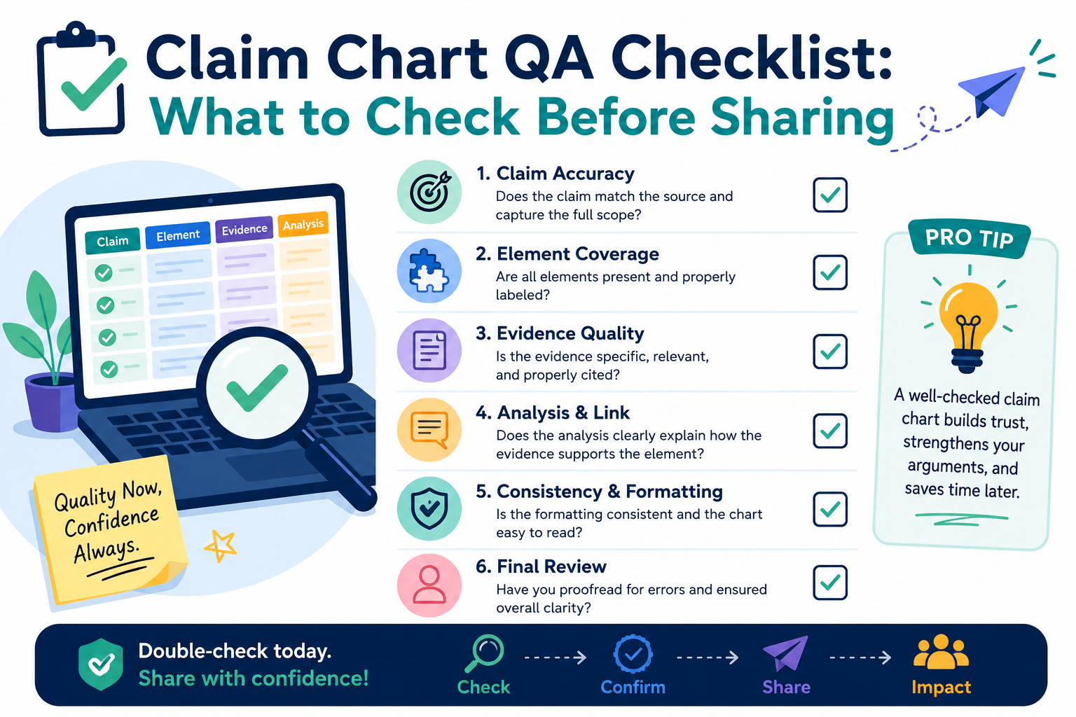
A claim chart can help your team see how an invention matches a product, paper, system, or market need. It can also create risk when it is rushed. One unclear row, one weak source, or one broad statement can confuse the reader and make strong work look shaky.
Check whether the claim chart has a clear job before anyone reads it
A claim chart should not feel like a pile of copied text. It should have one clear job. Before you share it, ask what the reader is supposed to learn from it. Is the chart meant to compare a claim to a product?
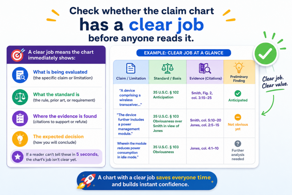
Is it meant to show how a new invention works? Is it meant to help an attorney review support? Is it meant to help a founder understand what is strong, weak, missing, or risky?
When the job is not clear, the chart becomes hard to trust. The reader has to guess why each row matters.
That slows everyone down. It also makes the work look less careful, even when the research behind it took many hours.
The reader should know the purpose within the first few rows
A strong claim chart makes the purpose obvious. The title, notes, sources, and row comments should all point in the same direction. If the chart is for internal review, it can be more direct and rough.
If it is going to an outside party, it should be cleaner, calmer, and more exact. If it is going to a patent attorney, it should show where the support comes from and where the gaps may be.
The mistake many teams make is treating every chart the same. A chart for an engineer is not the same as a chart for an investor.
A chart for a product review is not the same as a chart for a patent filing plan. Each one needs a slightly different level of detail.
Make the chart serve the decision, not the other way around
Before sharing, write a short purpose note in plain words. It should explain what the chart covers, what it does not cover, and what kind of review is needed. Keep it simple.
The goal is not to sound formal. The goal is to remove guesswork.
For example, a useful note may say that the chart maps each claim part to features found in the current product build, based on the available technical documents and screenshots reviewed.
That kind of note gives the reader a frame. It tells them what they are looking at and what limits apply.
This is where PowerPatent can help technical teams move faster. Instead of letting claim work sit in messy docs, PowerPatent helps founders organize invention details, code notes, system flows, and attorney review in one cleaner process. To see how that works, visit https://powerpatent.com/how-it-works.
Check that every claim part is broken down the right way
A claim chart works only when the claim is split with care. If the parts are too large, the chart hides weak spots.
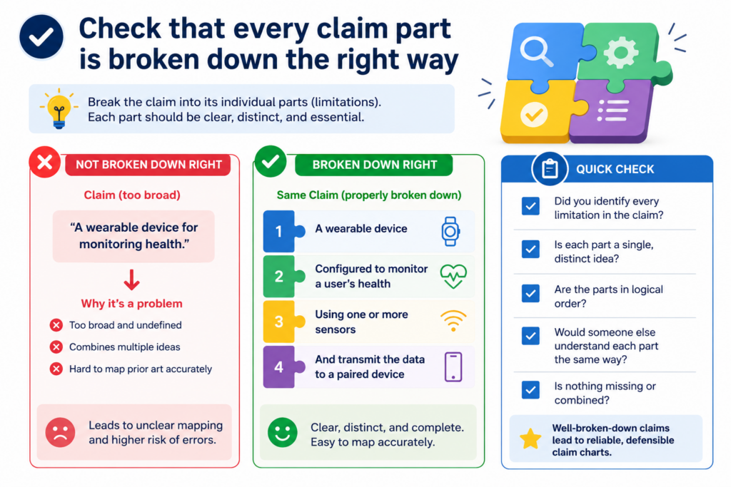
If the parts are too small, the chart becomes hard to read. The right split should make the claim easy to check, one idea at a time.
This step is simple, but it is where many errors begin. A team may copy a full claim into the left column and then place a long product description beside it.
That may look full, but it does not help much. The reader cannot see which feature supports which words. They also cannot see where support is thin.
Each row should answer one clean question
Each claim part should create a clear check. The row should help the reader ask, “Do we have support for this exact point?” If the answer is yes, the right column should show where.
If the answer is unclear, the note should say that. If the answer is no, the chart should not hide it.
Good claim chart QA means you do not let vague matches pass just because the overall story feels right. You slow down and test each part. That is how you catch weak links before someone else does.
Do not let one strong feature cover too much
A common problem is overusing one strong feature. For example, a system may clearly use a trained model, so the chart leans on that model for many claim parts.
But one model feature may not support every step in the claim. The chart still needs to show each action, each input, each output, and each connection.
This is especially important for software, AI, robotics, medical tools, chips, clean energy systems, and other deep tech work.
The invention may be complex, but the chart must still be clear. Each part should be checked in plain words.
At PowerPatent, this is one of the main reasons we believe founders should not wait until the last minute to think about patents.
The best support often lives in early design notes, code comments, model diagrams, test plans, and product choices.
When those details are captured early, the patent work becomes stronger and less painful. You can learn more at https://powerpatent.com/how-it-works.
Check that the evidence actually supports the exact words
A claim chart should never rely on almost-right support. The source should match the claim words as closely as possible.
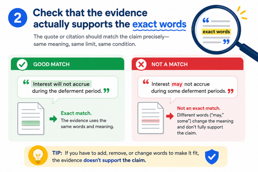
If the claim says one thing and the evidence shows a related thing, the chart should make that clear. It should not stretch the source to fit the claim.
This does not mean every source must use the same words. Product docs, code files, diagrams, papers, and screenshots may describe the same idea in different ways.
But the chart should explain the link in a way a careful reader can follow.
The support should be direct enough to stand on its own
When you review a chart, read each row without assuming anything from the other rows. Ask whether that row makes sense by itself.
Can the reader see why the evidence supports the claim part? Can they find the source quickly? Is the support real, or is the chart making a jump?
If a row needs too much explanation, it may need better evidence. If the source does not say what the row says, the row should be fixed.
If the match is based on an inference, say so in plain words. A careful chart is not weaker because it admits limits. It is stronger because it is honest.
Be careful with words that sound close but mean different things
Some words look harmless but can change the meaning of a claim part. Words like “generate,” “receive,” “select,” “train,” “rank,” “store,” “detect,” “compare,” and “send” can matter a lot.
If the claim says the system “generates” an output, evidence that a user manually enters the output may not be enough. If the claim says the model “selects” an item, evidence that it only displays items may not be enough.
This is why QA should include a word-level check. Do not only ask whether the general idea is present. Ask whether the action is present.
Ask who or what performs the action. Ask whether the source shows that action happening in the right order.
Founders often move fast and use shorthand when they talk about their product. That is normal. But claim charts need less shorthand and more care.
PowerPatent helps teams turn fast-moving technical work into patent-ready detail without forcing founders to become patent experts. See the process here: https://powerpatent.com/how-it-works.
Check that each source is named, dated, and easy to find
A claim chart is only as useful as its sources. If the reader cannot find the source, the chart loses value.
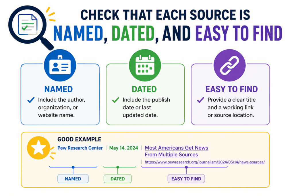
If the source is not dated, the reader may not know which version it reflects. If the source name is unclear, the reader may waste time hunting for the right file.
This is not a small admin task. Source hygiene is part of quality control. It shows that the chart was built with care.
It also helps your team avoid confusion later, when memories fade and files change.
Every cited item should point to a real place
Before sharing, check every source reference. Open the file. Confirm the page, section, screenshot, line number, timestamp, commit, slide, or figure. If the source is a webpage, save the access date.
If it is a product screen, capture the version. If it is code, name the file and commit when possible. If it is a model card, research note, lab result, or test log, make sure the title is clear.
A reader should not need to message three people to understand where a source came from. The chart should do that work for them.
Old versions can create quiet risk
Version control matters because technical products change. A feature may exist in one build and be removed in another. A model may use one process in a prototype and another in production.
A diagram may show the plan, while the code shows what was actually built. These differences can be fine, but the chart should not blur them.
If the chart uses older material, say why. Maybe the old document shows the first version of the invention. Maybe it shows the core concept before the product changed.
Maybe it supports the patent story better than the current marketing page. That can be useful, but it should be clear.
Startups often have strong invention records hiding across tools. The problem is that those records are scattered.
PowerPatent helps teams pull invention details into a smoother flow, with software that supports the work and real attorneys who review the result. Learn how at https://powerpatent.com/how-it-works.
Check that the chart does not overstate the match
A good claim chart should be confident, but not careless. It should not make the evidence sound stronger than it is.
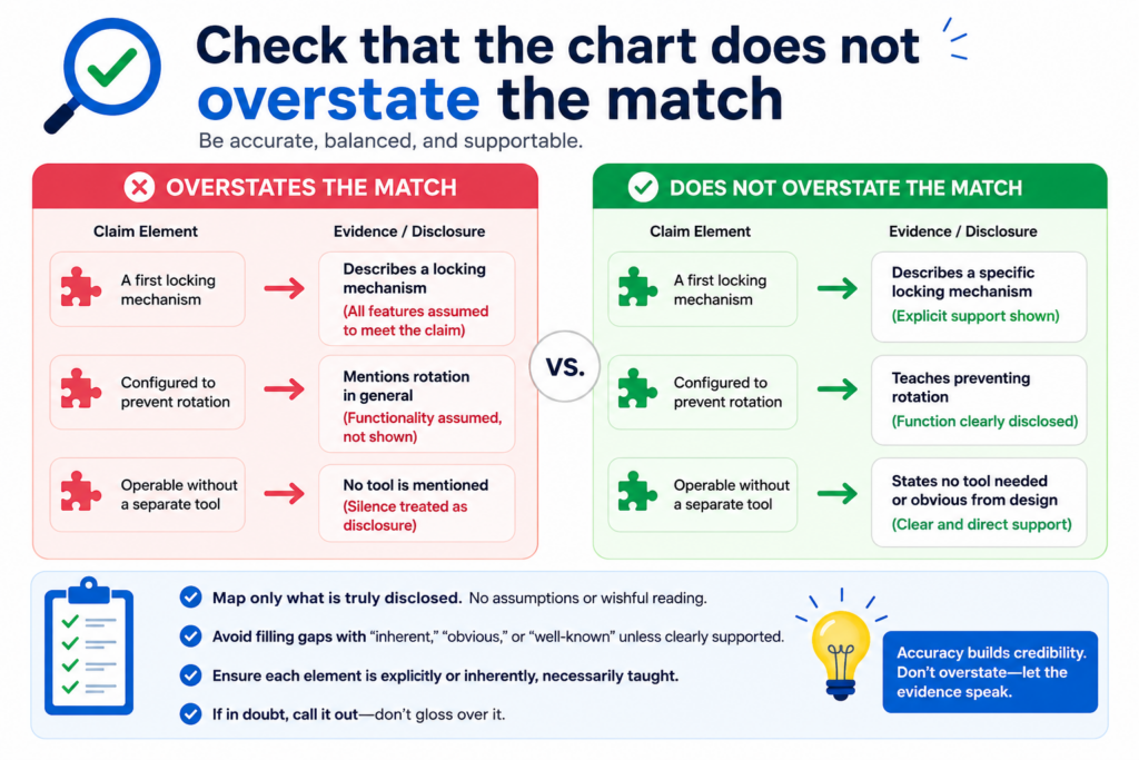
If the source shows a partial match, call it partial. If the feature is likely present but not clearly shown, say that. If more review is needed, flag it.
Overstating the match may feel helpful in the moment, especially when a team wants the chart to look strong. But it can backfire.
A smart reader will notice when the chart makes claims that the sources do not support. Once trust drops, even the strong rows may get questioned.
Strong charts use careful language without sounding weak
Careful language does not mean timid language. It means clean language. A row can say that a source “shows,” “describes,” “appears to show,” or “may support” a claim part, depending on the strength of the match.
Those words should not be used at random. They should reflect the actual support.
If the evidence is clear, use direct language. If it is not clear, do not pretend. The goal is to help the reader make a sound decision, not to win a writing contest.
Mark gaps early so they can be fixed
Gaps are not always bad news. Sometimes a gap means the team needs another source. Sometimes it means an engineer should confirm how the feature works.
Sometimes it means the claim language should be adjusted. Sometimes it means the invention record is missing a key detail that should be captured while the team still remembers it.
The danger is not the gap itself. The danger is hiding the gap until it causes delay. For founders, delay can be costly.
It can slow fundraising, product launches, partner talks, or patent filings. A clean QA process helps surface problems while there is still time to fix them.
This is one reason PowerPatent is built for startup speed. The platform helps founders move from invention capture to attorney-backed patent work with less drag and fewer dropped details.
See how PowerPatent supports faster, cleaner patent work here: https://powerpatent.com/how-it-works.
Check that the chart is readable by someone who was not in the room
A claim chart often starts inside a small team. Everyone knows the product. Everyone knows the shorthand.
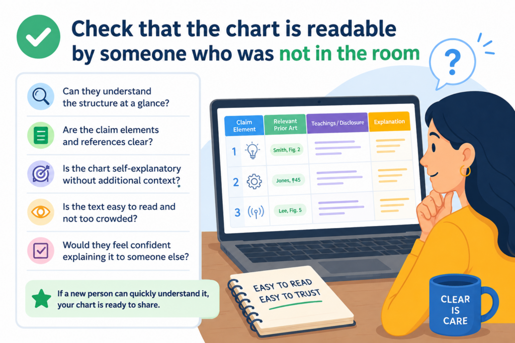
Everyone remembers the meeting where the feature was explained. But the person reading the chart later may not have that context.
That reader may be a patent attorney, a founder, a buyer, an investor, an engineer on another team, or a future version of your own team. They need the chart to make sense without a live tour.
Plain words make the chart stronger
Simple writing is not less professional. It is more useful. Replace long, dense notes with clear statements. Avoid internal nicknames unless they are explained.
Define product names, module names, model names, and feature names the first time they appear. Use the same term throughout the chart unless there is a reason to change it.
A reader should not feel lost in a maze of acronyms. They should feel guided. The chart should reduce mental effort, not add to it.
Remove clever wording and keep the proof easy to see
During QA, read the chart out loud. If a sentence feels too long, cut it down. If a row has three ideas packed together, split the thought. If a source note tries to explain too much at once, rewrite it so the key point comes first.
This matters because claim charts are often read under time pressure. A founder may review it between meetings.
An attorney may use it to spot filing issues. An engineer may use it to confirm a technical point. A clear chart helps each person do their part faster.
PowerPatent is built around this same idea. Patents should not feel like a black box.
Founders should be able to see what is happening, understand the key points, and work with real attorneys without getting buried in old-school process. To see the workflow, visit https://powerpatent.com/how-it-works
Check that the chart keeps facts separate from opinions
A claim chart should make it easy to tell what is known, what is believed, and what still needs review.
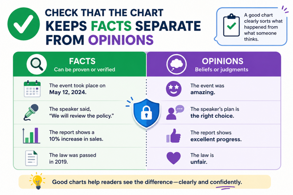
This is a key QA step because mixed language can make a chart feel stronger than it really is. It can also make a careful reader wonder whether the team is guessing.
Facts come from sources. Opinions come from the reviewer’s judgment. Both can be useful, but they should not be blended in the same sentence. When a source says the system receives sensor data, say that.
When your team believes the sensor data is then cleaned before use, but the source does not clearly show it, say that review is needed. That kind of honesty makes the chart more useful.
The chart should show what the source proves and what the reviewer thinks
A good row does not just say, “This is met.” That may be easy to write, but it does not help the next person.
The row should explain why the claim part is supported. It should point to the exact source and describe the match in plain words.
For example, if the claim part mentions a model that ranks outputs, the chart should not simply say the product includes AI.
It should show the source that describes the ranking step. If the source only says the product uses machine learning, that may not be enough. The chart should make that gap visible.
Use notes to control risk, not to hide it
The notes column is not a place to smooth over weak spots. It is a place to make smart review easier. If a source is strong, say why.
If a source is thin, say what is missing. If the claim part needs engineer review, say which detail should be checked.
This matters a lot for startup teams because many invention details live in people’s heads. A founder may know why the model works. An engineer may know where the data flow happens.
But unless that detail is written down, the chart may not carry it well. PowerPatent helps teams capture those details earlier, then connect them to attorney-reviewed patent work. You can see how the process works at https://powerpatent.com/how-it-works.
Check that the chart does not reveal more than it should
Before sharing a claim chart, think carefully about who will read it. A chart can contain sensitive product details, code logic, model behavior, market plans, lab results, and internal strategy.
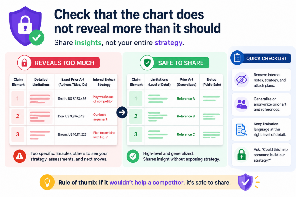
Even when the chart is accurate, it may still share too much.
This does not mean you should hide useful information from the right people. It means you should match the chart to the audience. An internal attorney review may need deep technical detail.
A business review may only need the main match and risk areas. An outside party may need an even more controlled version.
The safest chart is the one built for the right reader
Do not send the same chart to everyone just because it is done. During QA, ask whether each detail is needed for that reader to make a decision.
If not, consider moving it to a private note, a separate attorney file, or a more limited version.
This is especially important when the chart includes unpublished inventions. It also matters when the chart discusses future product features, private customer tests, unreleased model behavior, or competitive analysis.
A chart can be helpful and still be too open for the wrong audience.
Redaction should be thoughtful, not random
Removing information is not enough if the remaining text becomes confusing. A redacted chart should still read clearly.
The reader should understand the point, even if some details are held back. Replace removed text with a short note that explains the type of information that was withheld, when possible.
For example, instead of leaving a blank cell, the chart may say that the exact model process is withheld from this version and is available for attorney review. That is cleaner than a mystery gap. It protects the detail while keeping the chart usable.
Founders should not have to choose between moving fast and protecting what matters.
PowerPatent gives startup teams a cleaner way to organize sensitive invention material, work with real attorneys, and avoid messy handoffs. Learn more at https://powerpatent.com/how-it-works.
Check that the chart matches the latest claim version
One of the easiest ways to create confusion is to review the wrong claim version. Claims change. Drafts move.
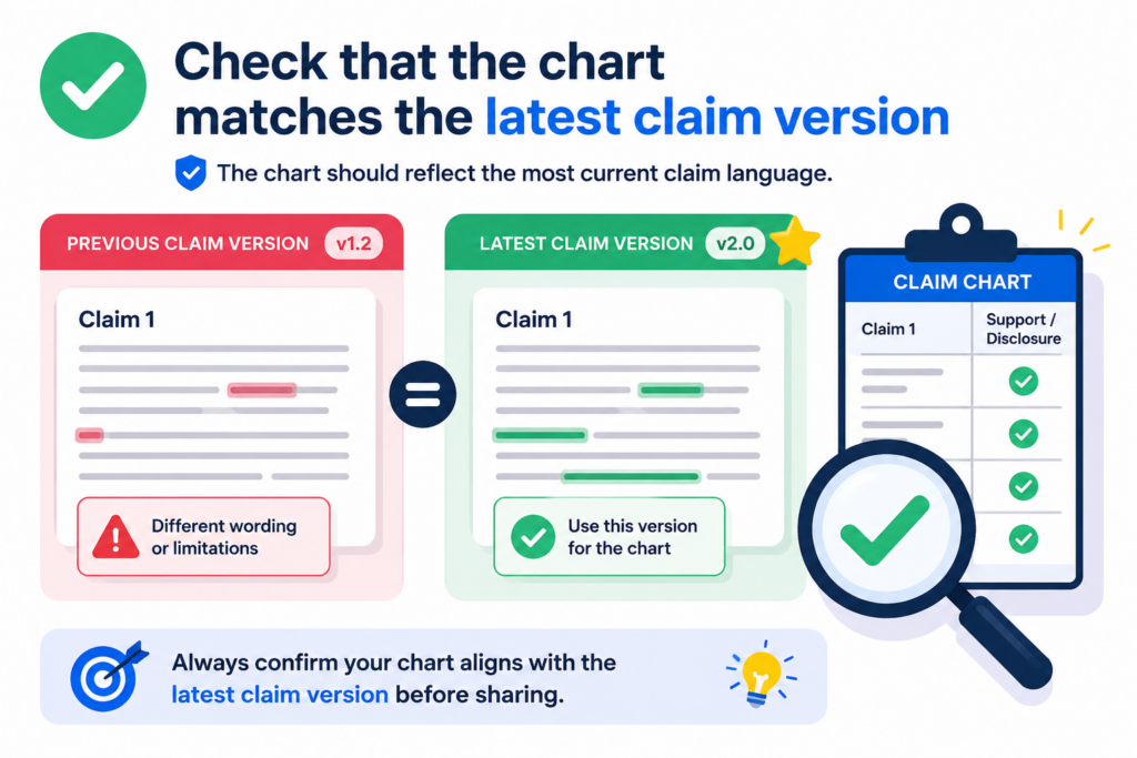
Language gets edited. A chart that was correct last week may be off today if the claim wording changed.
Before sharing, confirm that the chart maps to the exact claim version being reviewed. Check the claim number, date, draft name, and any version label. If the chart is based on an older draft, say so clearly. Do not make the reader guess.
A small claim edit can change the whole chart
Even a small word change can affect support. A claim that once said “receive data” may later say “receive real-time data.”
A claim that once said “train a model” may later say “update a model after deployment.” These changes may look small, but they can create new proof needs.
That is why QA should include a fresh read of the claim language. Do not only skim the chart. Read the claim part in each row, then read the support beside it. Ask whether the row still works with the latest words.
Version labels should be boring and exact
Do not rely on file names like “final,” “final new,” or “final updated.” Those names fail fast.
Use dates, version numbers, or clear labels that tell the reader which claim set is being mapped. The chart should also show who prepared it and when it was last reviewed.
This is not busywork. It protects the team from review loops. It also helps the attorney see what changed and why.
When a claim chart is clean, versioned, and easy to trace, the whole patent process becomes smoother.
PowerPatent is designed for teams that build quickly and revise often. It helps capture invention changes without turning patent work into a heavy, slow process.
For a founder-friendly view of how it works, visit https://powerpatent.com/how-it-works.
Check that the chart does not confuse product features with invention support
A product can be impressive and still not support every part of a claim. This is a common issue in claim charts for startups.
The team knows the product is strong, so the chart starts to lean on the general product story instead of the exact invention details.
A claim chart is not a pitch deck. It is not there to make the product sound exciting. It is there to map claim language to support.
That support may come from the product, but it may also come from design notes, technical plans, experiments, source code, architecture diagrams, or early prototypes.
The chart should show the invention, not just the user benefit
Product language often talks about what the user gets. Claim language often focuses on how the system does it. Those are not the same.
A product page may say the tool saves time, improves accuracy, or automates review. That may be useful context, but the chart still needs to show the technical steps that create that result.
If the claim part is about a data pipeline, do not rely only on a customer-facing sentence about faster results.
If the claim part is about a model update process, do not rely only on a marketing line about smarter predictions.
The support should point to the mechanism, not just the outcome.
Ask how the feature works under the hood
During QA, keep asking one simple question: how does this actually work? That question helps separate surface claims from real support.
It pushes the chart toward useful proof. It also helps founders spot invention details they may have taken for granted.
Many technical teams are so close to the invention that they forget what is new. They may think a key workflow is obvious because they built it. But that workflow may be exactly what should be captured in a patent filing.
PowerPatent helps founders pull those details out of the build process and turn them into stronger patent material with attorney support. See the workflow at https://powerpatent.com/how-it-works.
Check that screenshots, figures, and diagrams are tied to the right claim parts
Visual proof can make a claim chart much easier to understand. A screenshot can show a user flow. A diagram can show a system structure.
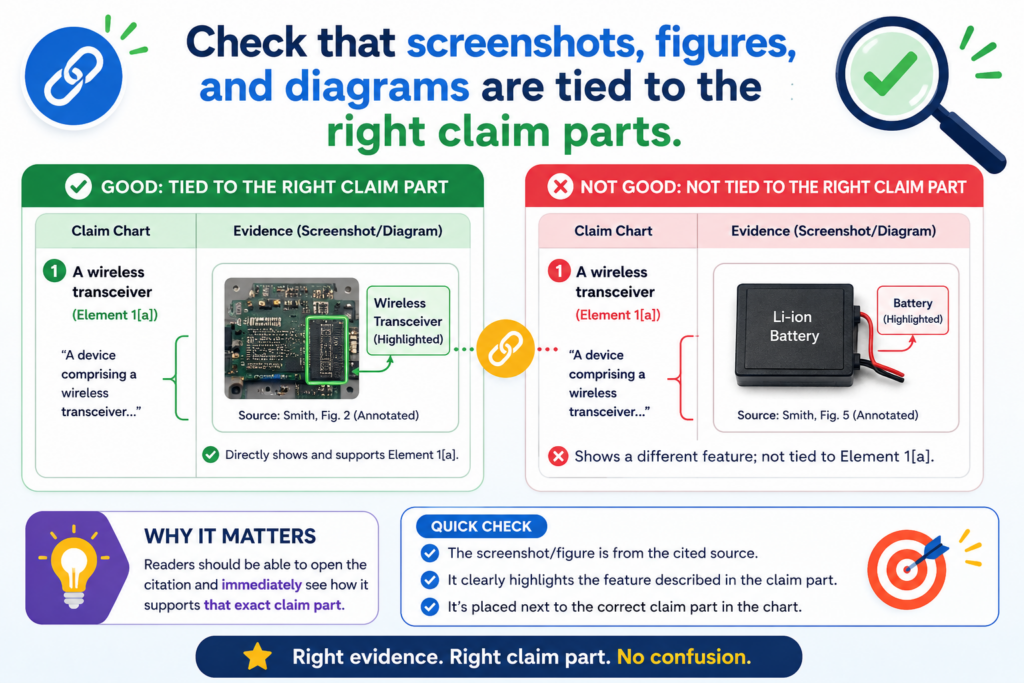
A figure can show data movement. But visuals can also create confusion when they are not tied to the exact claim part.
A screenshot alone is rarely enough. The chart should explain what the reader is seeing and why it matters. If the image shows a screen where a user selects a setting, say that.
If the diagram shows a model receiving two inputs, say that. Do not make the reader decode the visual on their own.
Visuals should clarify the row, not decorate the chart
During QA, remove visuals that do not help prove the point. Keep the ones that make the match easier to see. If a figure is included, label it clearly.
If a screenshot is used, name the product version, screen, date, and relevant feature. If the visual was taken from a private demo, say that in the source note.
A strong visual should answer a question. It should not just make the chart look full. When a visual is too broad, add a short explanation that points the reader to the important part.
Make sure cropped images do not remove needed context
Cropping can help focus the reader, but it can also remove useful facts.
If you crop a screenshot, make sure the remaining image still shows enough context to be trusted. If the full image is needed, keep it in the source folder and cite it clearly.
For diagrams, check that arrows, labels, and boxes match the written support. A mismatch between a diagram and a row note can cause real confusion.
If the diagram is outdated, do not use it without a note. If it shows a planned feature rather than a built feature, say that clearly.
PowerPatent helps teams turn rough technical assets into cleaner invention records.
That includes the kind of diagrams, flows, and feature notes that can make patent work faster and less stressful. To see how PowerPatent supports founders, visit https://powerpatent.com/how-it-works.
Check that every gap has an owner and a next step
A claim chart with gaps is not a failure. A claim chart with hidden gaps is the problem. The point of QA is not to make the chart look perfect. The point is to make it useful enough for the next decision.
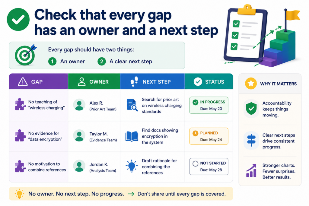
When a gap appears, the chart should say what needs to happen next. Maybe an engineer needs to confirm a data step. Maybe a founder needs to provide an early design note.
Maybe the attorney needs to review whether claim wording should change. Maybe the team needs to find a better source.
A gap without a next step creates delay
The worst note is one that says “unclear” and stops there. That tells the reader there is a problem, but not how to solve it.
A better note explains what is unclear and who can help. It also says what kind of proof would close the gap.
For example, if a claim part needs support for a ranking step, the next step may be to locate the model spec or ask the engineering lead to confirm where ranking occurs.
If a claim part needs support for a device connection, the next step may be to find the system diagram or test log.
Treat the chart as a work tool, not a static file
A good claim chart should move the work forward. It should show what is strong, what is weak, and what needs action. When every gap has an owner, the team can fix issues before the chart is shared more widely.
This approach is especially helpful for startups because speed matters. Patent work can slow down when details are missing, scattered, or unclear.
PowerPatent helps founders avoid that by giving them a clearer path from invention details to attorney-reviewed patent filings.
Learn how it helps technical teams protect what they build at https://powerpatent.com/how-it-works.
Check that the chart uses the same meaning from start to finish
A claim chart becomes hard to trust when the same word is used in different ways. This happens often when several people help build the chart. One person may use “model” to mean a trained AI model.
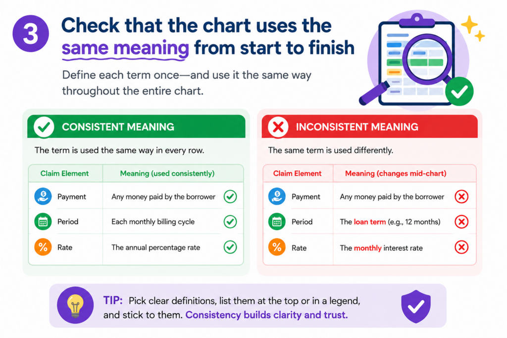
Another may use it to mean a product model or a data model. One person may use “module” to mean a real software part. Another may use it as a loose label for a feature.
This may seem small, but it can create real confusion. A reader may think two rows refer to the same thing when they do not.
Or they may think the chart proves one technical point when it actually proves another. Before sharing, read the full chart for meaning, not just grammar.
The chart should not change terms without a reason
If the claim uses “server,” the chart should not switch between “platform,” “cloud,” “backend,” and “system” unless those words are clearly tied together.
If the chart uses a product name in one row and a code name in another, the connection should be clear. If a feature has an internal name and an external name, explain both once, then use one main name after that.
This does not mean the chart must copy the exact same word forever. It means the reader should never wonder whether a new word means a new thing.
Build a simple term check before sharing
A useful QA move is to scan the left column and right column for repeated terms. Look for words tied to people, systems, data, models, devices, steps, outputs, and storage. Then ask whether each word is used in a steady way.
For example, if one row says the invention “stores a confidence score” and another row says it “saves a trust value,” the chart should explain whether those are the same.
If they are different, say how. If they are the same, use one term and avoid making the reader solve a puzzle.
This kind of cleanup is not cosmetic. It helps founders, engineers, and attorneys stay aligned.
PowerPatent was built for that kind of clean handoff, where technical details can move into patent work without getting lost in unclear language. You can see the process at https://powerpatent.com/how-it-works.
Check that the chart does not rely on broad labels like “AI,” “automation,” or “platform”
Broad words can make a claim chart sound modern, but they often do not prove much. Words like “AI,” “automation,” “cloud,” “engine,” “platform,” “workflow,” and “smart system” can be useful in normal business talk. In a claim chart, they can hide the real question.
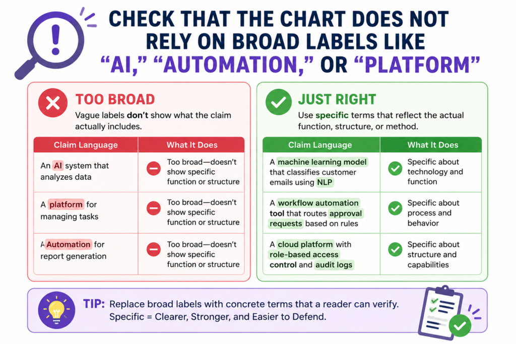
A claim chart should show what the system does. It should not stop at a label. If the product uses AI, what does the AI receive? What does it process?
What does it output? If a workflow is automated, which step is done without manual input? If a platform connects users, what data moves, where does it go, and what changes because of it?
The reader should see the action behind the label
During QA, treat broad terms as warning lights. They may be fine in a short note, but they should not carry the proof. Each broad term should lead to a specific action, source, or technical detail.
If the chart says “AI engine,” the row should explain the model behavior that matters. If the chart says “automated matching,” the row should show how matching is performed.
This step is especially important for deep tech startups. The real invention often lives below the marketing layer.
It may be in how data is cleaned, how a model is updated, how a device reacts, how a signal is filtered, how a chip saves power, or how a system handles edge cases.
Replace labels with working facts
A strong claim chart turns big words into working facts. Instead of saying the platform “uses AI to improve results,” the chart might say the model receives sensor values, compares them to a trained pattern, and returns a ranked output.
Instead of saying the workflow is “automated,” the chart might say the server triggers the next step when a threshold is met.
That kind of writing gives the reader something they can check. It also helps the attorney see what may be worth protecting. Founders often understate their best ideas because they talk in product labels.
PowerPatent helps teams pull out the real technical steps and turn them into stronger patent material with real attorney support. Learn more at https://powerpatent.com/how-it-works.
Check that the chart does not skip the order of steps
Many claims depend on order. One step happens before another. One value is created and then used. One signal is received and then filtered.
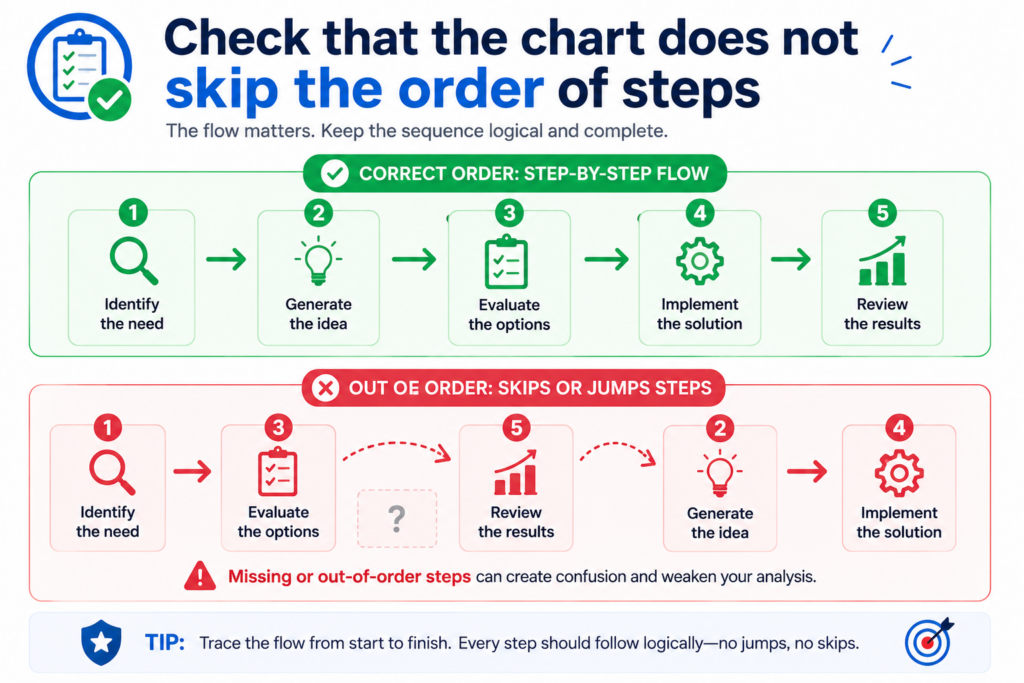
One model is trained and then applied. If the chart does not show the right order, it may make a weak match look stronger than it is.
Before sharing, review each row that describes a process. Ask whether the evidence shows the same order as the claim.
A source that shows all the pieces may still be weak if it does not show how those pieces connect.
The order should be clear enough to follow without a meeting
A reader should be able to trace the flow from the chart itself. If the claim says data is received, cleaned, scored, and displayed, the support should not jump straight from data input to final display.
It should explain the middle steps or flag that those steps still need support.
This matters because many startup products are built in layers.
A feature may look simple on the screen, but under the hood it may involve several services, queues, models, and checks. The chart should not flatten that structure too much.
Time, sequence, and triggers should be checked carefully
During QA, look for words that show order. Words like “after,” “before,” “in response to,” “based on,” “then,” and “when” can change what support is needed.
If the claim says one action happens “in response to” another, the chart should show the trigger. If the claim says an output is generated “based on” a score, the chart should show the link between the score and the output.
If that link is not in the source, do not guess. Mark the row for follow-up. A founder or engineer may be able to confirm it quickly. But until it is confirmed, the chart should not present it as proven.
PowerPatent helps founders avoid this kind of last-minute scramble.
By capturing invention flow, product logic, and technical changes earlier, teams can build a stronger record before the patent work becomes urgent. See how PowerPatent works at https://powerpatent.com/how-it-works.
Check that the chart handles missing information in a calm and useful way
Missing information is normal. It does not mean the invention is weak. It usually means the team has not yet pulled the right source, asked the right person, or written down the detail in a clean way.
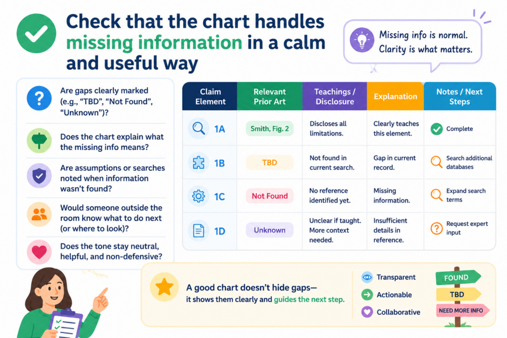
The real issue is how the chart handles the missing piece.
A rushed chart may ignore the gap. A careful chart makes the gap easy to see and easy to fix. This is a major part of QA because it turns uncertainty into action.
A good gap note should help the next person solve the problem
Do not write vague notes that create more work for the reader. A note like “need more info” is better than nothing, but it is not very helpful. The chart should say what kind of information is missing.
Is it a source for a model input? A screenshot of a screen state? A code file showing a rule? A test result that proves a device behavior? A system diagram showing data flow?
The more exact the note is, the faster the team can close the gap. This keeps review moving and prevents the same question from coming back again and again.
Missing support can reveal a better patent story
Sometimes a gap is not just a problem. It is a clue. When the team cannot find support for a claim part, it may mean the claim language is too broad.
It may mean the invention is different from what the draft says. It may also mean the most important part of the invention has never been written down.
That last point matters. Many founders build first and document later. That is understandable, but it can make patent work harder. If the best invention detail only lives in an engineer’s memory, the team should capture it while it is fresh.
PowerPatent gives founders a cleaner way to collect those details and move them into attorney-reviewed patent work. See the founder-friendly flow here: https://powerpatent.com/how-it-works.
Check that the chart is not trying to do too many jobs at once
A claim chart can support many kinds of decisions, but one chart should not try to serve every reader at the same time.
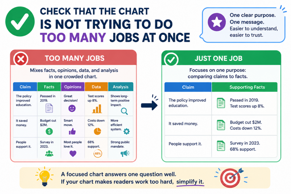
When a chart tries to be a legal review, product brief, investor note, source list, technical deep dive, and strategy memo all in one file, it becomes heavy. The reader loses the thread.
Before sharing, ask whether the chart has become overloaded. If it has, split the work. Keep the main chart focused on claim support.
Move extra notes, business context, or deep technical records into separate files or linked materials.
The main chart should stay focused on the match
The heart of the chart is simple. It should show the claim part, the matching support, the source, and any useful review note.
Anything that does not help that task should be questioned. Long background sections may feel helpful, but they often bury the key point.
This does not mean context is bad. Context can be very useful, especially for complex technology. But context should support the chart, not swallow it.
Keep side issues out of the main path
A chart can quickly get clogged with debates about market size, competitor intent, product roadmap, customer value, or filing strategy.
Those topics may matter, but they do not always belong inside the chart. If they are needed, place them in a short cover note or separate review memo.
The cleaner the chart, the easier it is for the attorney or team lead to spot the real issues. This saves time and helps avoid mistakes.
PowerPatent is built around that same idea: keep the process clear, keep the founder in control, and bring in real attorney oversight where it matters most. Learn how it works at https://powerpatent.com/how-it-works.
Check that the chart has a clean final-read path
The last QA step before sharing should be a full read from the reader’s point of view. Do not review only the row you edited last.
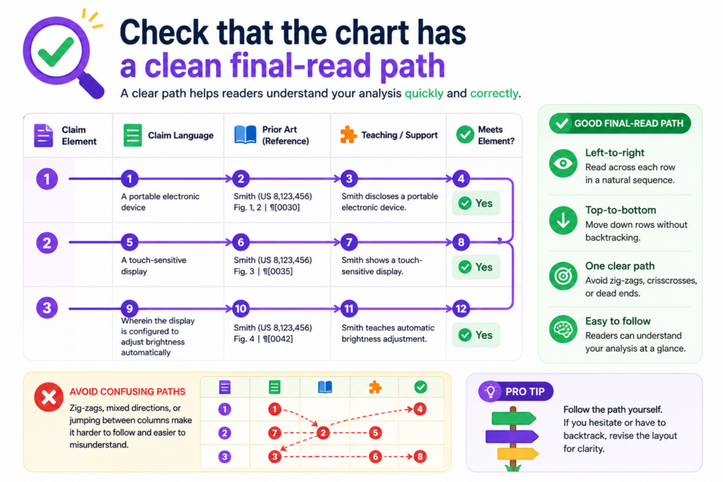
Do not assume the chart works because the sources are strong. Read it like someone seeing it for the first time.
Start with the title and purpose note. Then move through each claim part in order. Ask whether the chart tells a clear story.
Ask whether the reader can understand what is supported, what is uncertain, and what needs action. Ask whether the chart feels calm, exact, and useful.
The final read should catch friction before the reader does
Friction shows up in small ways. A source name may be unclear. A sentence may run too long. A row may refer to a figure that is not attached.
A note may mention an engineer by first name only. A term may change halfway through. A gap may be flagged without a next step.
None of these issues may ruin the chart alone. But together, they can make the work feel messy. The final read is where you remove that drag.
Share only when the chart helps the next decision
A claim chart is ready to share when it helps the next person act. The founder should be able to see the big picture.
The engineer should be able to confirm technical points. The attorney should be able to review support without chasing basic facts. The business team should be able to understand risk without getting buried in detail.
That is the standard. Not perfect. Useful. Clear. Trusted.
For startups, this level of care can make patent work feel less scary and more practical. You do not need to become a patent expert.
You need a process that captures what matters, keeps the details organized, and gives real attorneys the right material to work with.
PowerPatent helps founders do exactly that. See how it works here: https://powerpatent.com/how-it-works.
Check that the chart explains the “why this matters” without turning into a pitch
A claim chart should not read like sales copy. It should not try to hype the product or make the invention sound bigger than the support allows. But it should still help the reader understand why each point matters.
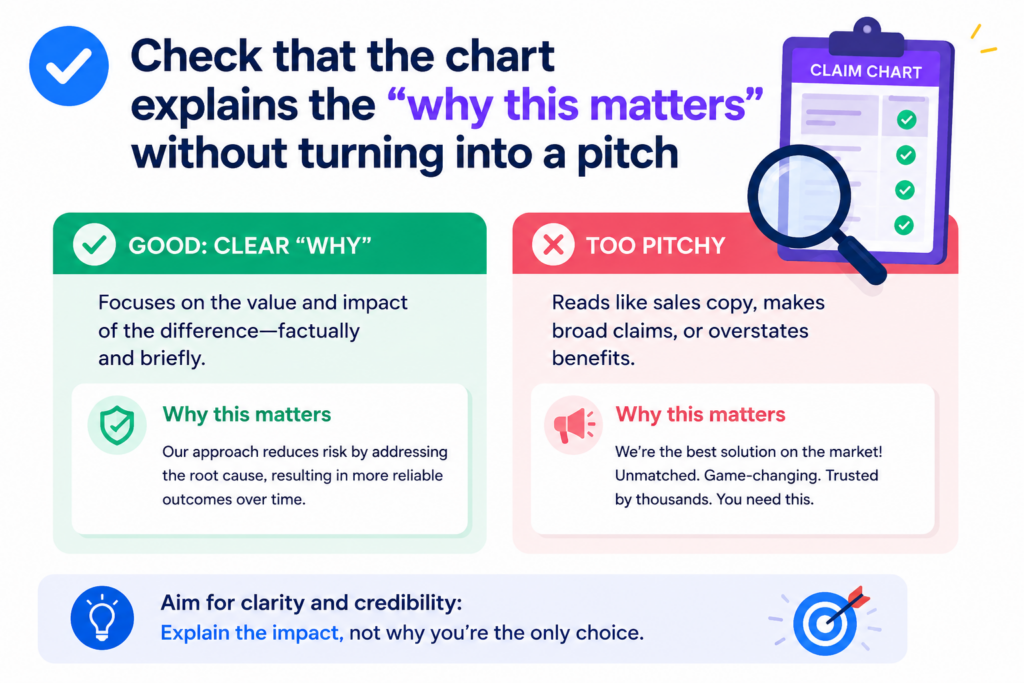
A chart with no context can feel cold and hard to use. A chart with too much selling can feel weak. The right balance is calm, clear, and useful.
The goal is to show the match and make the value easy to see. If a claim part covers a special way of reducing errors, the chart should explain how the support shows that.
If a claim part covers a faster data path, the chart should connect the evidence to that data path. The reader should understand the technical reason the row matters without feeling like they are reading an ad.
The best context makes the proof easier to understand
Context should help the reader see the link between the claim and the source. It should not distract from the link. A short note can explain that a certain module is the part of the product that performs the scoring step.
Another note can explain that a diagram shows the same flow as the claim language, but with the company’s internal feature names.
This is useful because many claim charts are built from mixed source material. One source may use engineering words.
Another may use product words. Another may use early research words. The chart has to connect these without making the reader work too hard.
Keep value statements tied to real evidence
A weak chart says the invention is powerful, fast, smart, or unique without showing why. A strong chart shows the steps, support, and results that make those ideas believable.
If you mention speed, cite the test, log, or system design that supports faster processing. If you mention accuracy, point to the model output, evaluation note, or comparison result. If you mention lower cost, show the design choice that creates that benefit.
This is also how founders can tell a stronger patent story. The best patent work does not come from vague claims about being better. It comes from clear proof of how the invention works.
PowerPatent helps founders capture those real details, shape them into stronger patent material, and review them with real attorneys. See how that process works at https://powerpatent.com/how-it-works.
Check that the chart protects attorney review instead of replacing it
A claim chart can make attorney review faster and better, but it should not pretend to be the final word. Before sharing, check whether the chart is framed as a review tool, not a final legal answer.
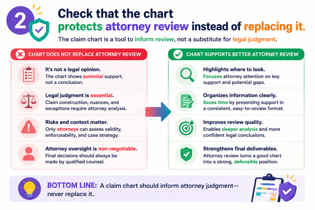
This is especially important when non-attorneys, engineers, product leads, or founders helped prepare it.
The chart can show technical support. It can flag gaps. It can organize sources. It can help everyone see the invention more clearly.
But an attorney should still review the chart before it is used for serious patent decisions, partner discussions, licensing talks, or filing strategy.
The chart should make expert review easier
A strong chart gives the attorney a clean starting point. It shows where the team thinks each claim part is supported.
It names the sources. It explains unclear areas. It does not bury the attorney in messy files or force them to rebuild the logic from scratch.
This is a big deal for startups because attorney time should be used well. Founders should not pay for avoidable confusion.
The cleaner the chart is before review, the more time the attorney can spend on judgment, strategy, and strengthening the patent work.
Do not use the chart as a shield against hard questions
Sometimes teams use a chart to feel done. They see filled cells and assume the issue is closed. That is risky.
A full chart is not always a strong chart. It may still have weak evidence, unclear wording, missing source details, or claim parts that need a deeper look.
During QA, ask whether the chart invites review or shuts it down. A healthy chart makes it easy to ask better questions. It does not hide uncertainty. It does not pressure the reader to agree. It supports careful review.
PowerPatent is built for this balance. It gives founders smart software to organize invention details, while real patent attorneys help review and guide the work.
That way, teams can move fast without treating patent quality like an afterthought. Learn more at https://powerpatent.com/how-it-works
Conclusion
A claim chart is ready to share when it is clear, honest, sourced, and easy to act on. It should show the match, name the proof, flag the gaps, and guide the next step without making the reader guess. For founders, this is not just a document check. It is a way to protect speed, reduce risk, and build stronger patent work from the start.
When your invention details are organized before attorney review, the whole process feels less stressful and far more useful. PowerPatent helps teams do that with smart software and real attorney oversight: https://powerpatent.com/how-it-works