A patent claim is only useful when you can connect it to real proof. That proof may come from a product page, a user guide, a teardown, source code notes, app screens, API calls, model behavior, or test results. This is where claim charting matters.
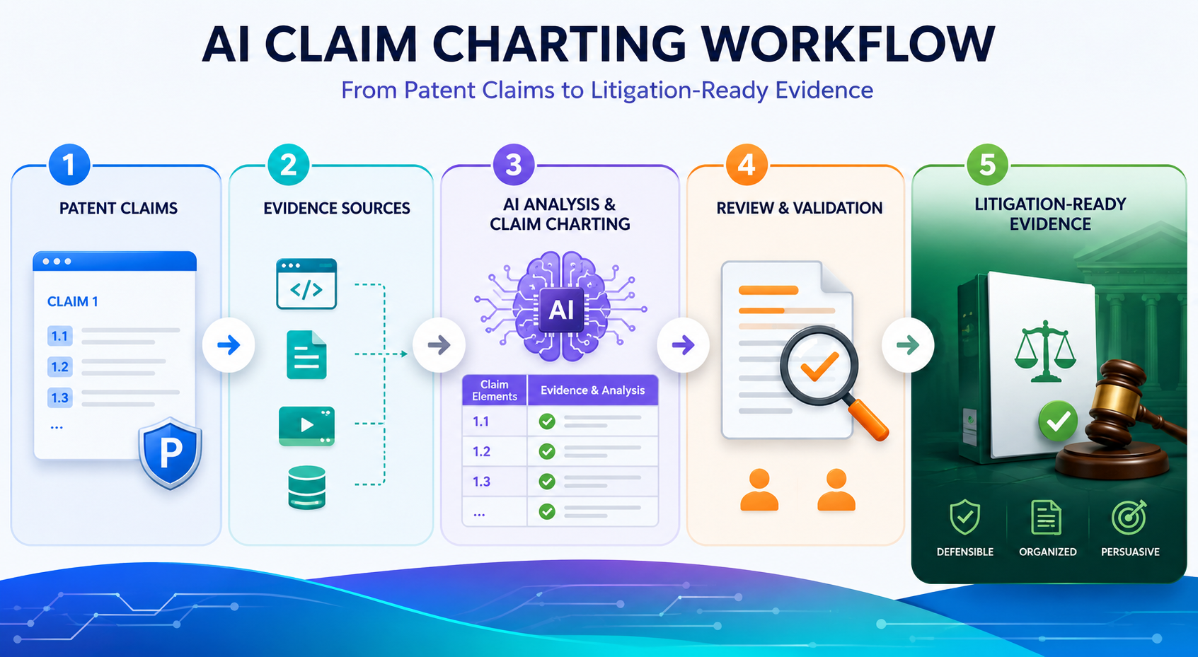
Why Claim Charting Is the Bridge Between a Patent and Real-World Proof
A patent claim is not a story. It is not a pitch deck. It is not a broad idea written in fancy words.
A patent claim is a set of limits. Each part of the claim must be shown in the target product, system, method, platform, or service. If one required part is missing, the claim chart may fall apart.
That is why claim charting is such a serious task. It turns a patent from a document into a working proof map.
It answers a simple but powerful question: where is each part of the claimed invention found in the accused product?
For a founder, this matters because patents are not just filed to sit in a folder. They can help protect a market, support funding, guide deals, shape licensing, and defend a company when bigger players move close.
But none of that works well if the evidence is weak, scattered, or hard to explain.
A strong claim chart does not start with evidence. It starts with clean claim understanding.
Before anyone opens a product manual, scans a website, studies an app, or runs tests, the claim must be understood in plain words. This step is often skipped.
Teams rush into collecting screenshots and links, then later realize the proof does not match the claim language.
A better workflow starts with claim breakdown. Each claim is split into parts. These parts are often called claim elements.
In simple terms, each element is one thing the product must show. The goal is not to make the claim sound more complex. The goal is to make it easier to prove.
For example, if a claim talks about receiving data, processing that data, generating a score, and sending an alert, the chart must treat each action with care. It is not enough to show that the product uses data.
The evidence must show the right flow. Data comes in. Something happens to it. A result is made. That result is used in a way that matches the claim.
The first AI task is to help break the claim into parts without changing its meaning.
AI can be very useful here because it can read long claim text and suggest a clean structure. It can separate each step, identify key terms, and point out words that may need extra attention.
But the AI should not rewrite the claim in a way that changes the meaning.
This is where human review matters. A patent attorney or trained reviewer should check the breakdown before evidence work begins.
The point is not to make the claim easier to prove by stretching it. The point is to understand what must actually be shown.
PowerPatent is built around this kind of smart division of labor. Software helps speed up the heavy reading and organizing, while real attorney oversight helps reduce costly mistakes.
That mix is what many technical founders need when they want strong work without slow, old-school drag. You can see how that model works here: https://powerpatent.com/how-it-works
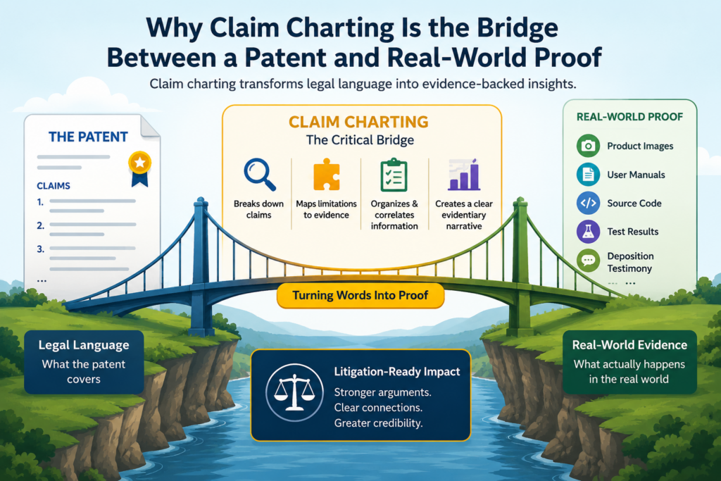
How AI Changes the Claim Charting Workflow Without Replacing Legal Judgment
AI does not make claim charting magic. It does not remove the need for careful review. It does not turn weak evidence into strong evidence. What it can do is remove a lot of slow manual work.
In a traditional workflow, a team may spend days reading claims, searching for product proof, copying text from manuals, taking screenshots, tracking source links, and formatting charts.
This is painful work. It is also easy to make mistakes because the details are dense and repetitive.
AI helps by acting like a fast research and drafting assistant. It can scan large amounts of text. It can find phrases that may match claim elements.
It can compare product documents against claim language. It can flag gaps. It can create first-pass chart entries. It can help keep wording consistent across many claims.
But the final judgment still belongs to people. This is especially true when the chart may be used in licensing talks, investor diligence, patent sale discussions, or litigation planning. In those settings, the chart must be clear, grounded, and defensible.
The best AI workflow keeps humans in control at every key decision point.
There is a big difference between AI-assisted claim charting and AI-controlled claim charting. AI-assisted work means the tool helps find, sort, and draft.
A person still decides what the evidence means. AI-controlled work means the tool makes too many choices with too little review. That is risky.
A good workflow has review gates. The claim breakdown is reviewed. The search sources are reviewed. The evidence is reviewed. The final chart language is reviewed. Each step has a clear owner.
This matters because claim charting is not only about finding similar words. A product document may use different language than the patent.
A manual might describe a feature in marketing terms. A code comment might explain a function in engineer terms. A support article might show real use but not the full technical path.
AI can spot possible matches, but it may miss the deeper meaning. It may also over-match language that sounds close but does not prove the claim. Human review keeps the chart honest.
The safest use of AI is to speed up the search while slowing down the decision.
That may sound strange, but it is the key. Use AI to search faster. Use AI to organize faster. Use AI to draft faster.
But when it is time to decide whether evidence truly supports a claim element, slow down.
Ask whether the source is reliable. Ask whether the evidence shows the required feature directly or only suggests it. Ask whether the product version is clear. Ask whether the date matters.
Ask whether the evidence can be found again later. Ask whether someone outside the team could understand the link between the claim and the proof.
That last point is critical. A claim chart is not just for the person who made it. It may be read by an attorney, a founder, a board member, a buyer, a license target, a judge, or a technical expert.
If the chart only makes sense to the person who built it, it is not ready.
What Litigation-Ready Evidence Really Means in a Claim Chart
Litigation-ready does not mean aggressive. It does not mean stuffed with every screenshot the team can find. It means the evidence is clear, traceable, and tied to the claim with care.
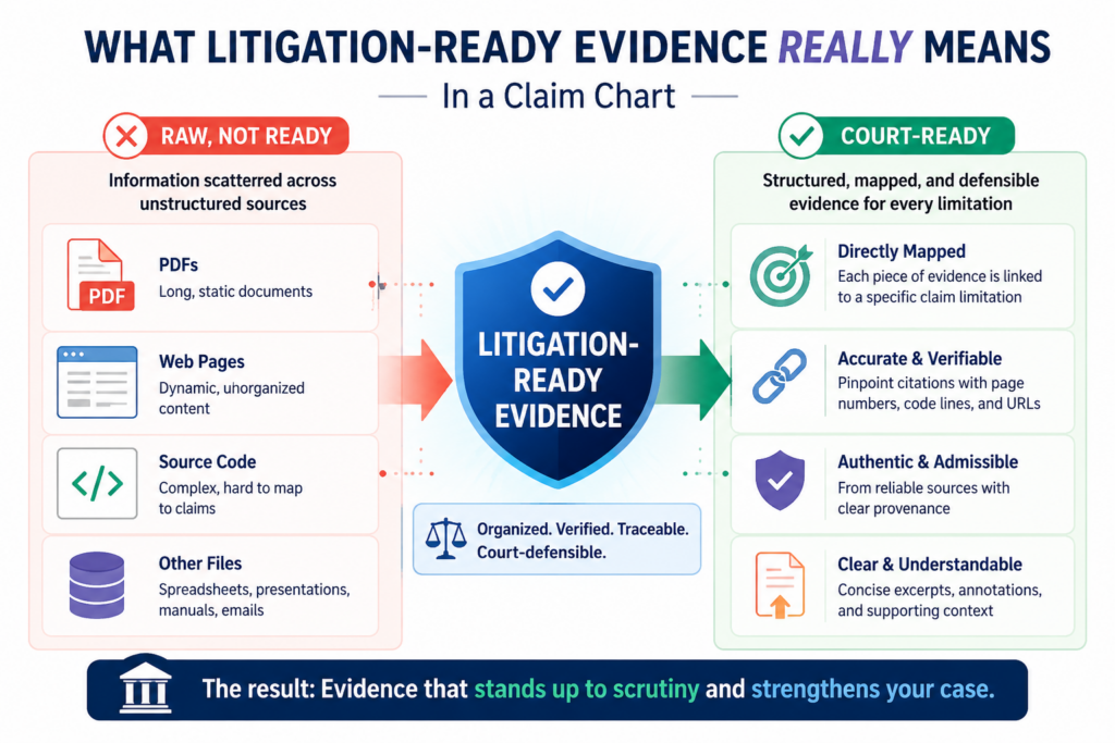
A litigation-ready chart shows where the proof came from. It shows what product or service version the proof relates to.
It keeps the original source link or document reference. It uses clean excerpts. It avoids overclaiming. It explains the match in plain terms.
This is important even if the startup is not planning to sue anyone. Many patent conversations happen before any lawsuit. A strong chart can support licensing talks.
It can help show value during fundraising. It can help a buyer understand why the patent matters. It can help a company decide whether to invest more in a patent family.
Poor charts create the opposite effect. They raise doubts. They invite pushback. They force the team to redo work under pressure. They may make a good patent look weak because the proof is not organized.
Good evidence must be specific enough to carry the weight of the claim element.
A claim chart should not rely on vague proof. If a claim element says a system “generates a risk score based on sensor data,” then a general product page saying “we use smart analytics” may not be enough. It might be useful as background, but it does not carry the main proof.
Better evidence would show that the product receives sensor data, processes that data, creates a risk score, and uses that score in a system output.
The proof might come from a technical guide, API documentation, dashboard screen, developer notes, public demo, patent filing by the target company, or controlled testing.
The source depends on the technology. For software, proof may live in user flows, network calls, documentation, SDKs, app screens, logs, or behavior under test.
For AI systems, proof may include model inputs, outputs, training flow descriptions, inference behavior, architecture notes, or product claims about automated decisions.
For hardware, proof may come from teardown photos, chips, boards, manuals, datasheets, and lab tests.
The evidence note should explain the link without sounding like a legal brief.
A good chart entry does not just paste evidence. It tells the reader why the evidence matters. The explanation should be short, direct, and tied to the claim language.
For example, the note may say that the product guide shows the system receiving a file from a user, the processing screen shows the file being analyzed, and the output report shows a generated score.
That kind of explanation helps the reader move from claim text to product proof.
AI can help draft these notes, but the reviewer should make them sharper. Remove weak claims. Cut vague words. Avoid dramatic language. Use plain proof. The tone should feel calm and confident.
This is also where PowerPatent’s approach fits well for founders. Technical teams need speed, but they also need review from people who understand patents.
The mix of smart software and real attorney oversight can help teams turn complex invention work into stronger, cleaner patent assets. Learn more here: https://powerpatent.com/how-it-works
The Core Workflow Starts With the Patent Claims, Not the Target Product
Many teams start claim charting by studying the target product first. That feels natural. The product is visible.
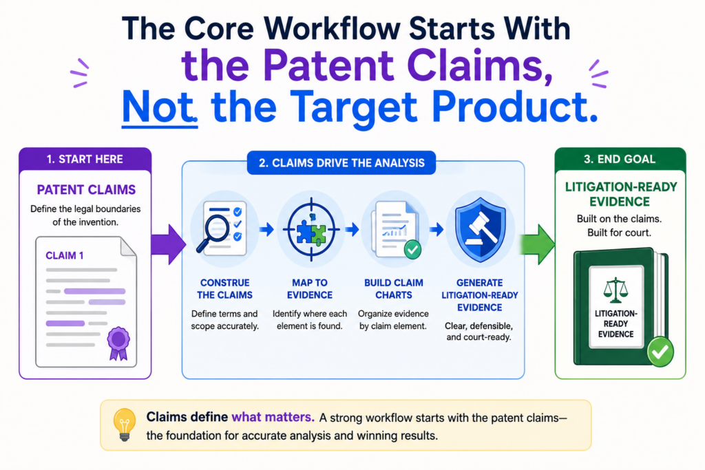
The website is easy to read. The app is easy to open. The demo is easy to watch. But this can lead the team in the wrong direction.
The claim controls the chart. The product does not. The goal is not to show that the target product is impressive or similar in a broad way. The goal is to show that the product includes each required claim element.
Starting with the claim keeps the work focused. It also prevents a common mistake: collecting evidence that looks useful but does not prove the actual claim.
A chart can be full of strong-looking screenshots and still fail if those screenshots do not match the claim requirements.
A clean claim map makes the rest of the workflow faster and less painful.
The claim map is the working base. It should include the claim number, each claim element, key terms, possible proof needs, and early notes about what kind of source may show each element.
For a method claim, the map may track each step in order. For a system claim, it may track components and how they interact. For a computer-readable medium claim, it may track instructions and actions performed by software.
For an AI claim, it may track data inputs, model operations, outputs, feedback loops, or deployment behavior.
This map helps the AI search better because the tool has clearer targets. It also helps human reviewers spot gaps early. If an element needs proof of timing, the team can search for timing proof.
If an element needs proof of a specific output, the team can look for output proof. If an element needs proof of communication between two systems, the team can focus on architecture or network evidence.
The claim map should separate what is known from what still needs proof.
This is a simple habit, but it saves a lot of time. Do not treat every early match as proof. Mark some items as confirmed, some as possible, and some as missing. That way the team does not confuse hope with evidence.
AI can help label these states, but people should confirm them. A possible match might later become strong proof. It might also disappear after review. The chart should make room for that.
This is especially useful for founders because early patent work often happens while the company is moving fast. Product details change. Public pages change.
Competitors change. Claims may be drafted, revised, or continued into future filings. A clear map helps the team stay organized while the business keeps moving.
Building the Evidence Library Before Drafting the Chart
A claim chart should not be built from random saved screenshots and pasted links. Before drafting the chart, the team should build an evidence library. This library is the source bank for the chart.
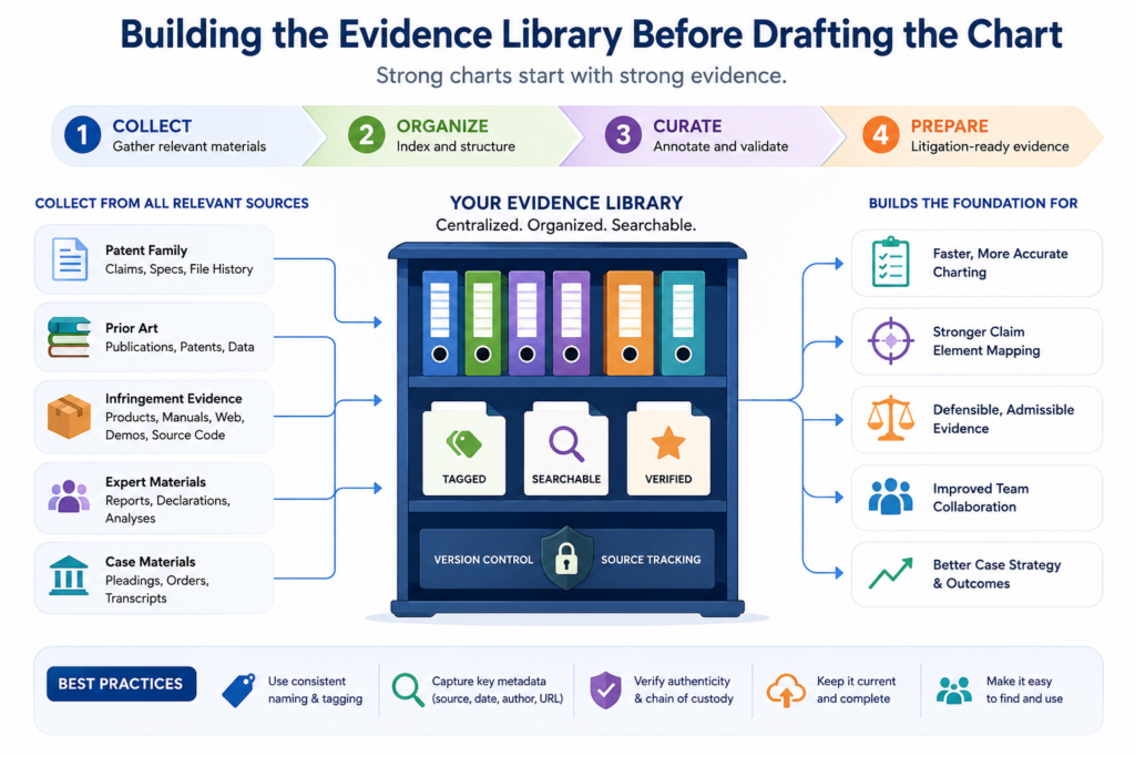
The evidence library should include the key documents, pages, images, test results, and notes that may support the claim. Each item should be saved in a way that can be reviewed later. Links alone are not enough because web pages can change.
Screenshots alone are not enough because they may lack context. The best practice is to keep the source, the capture date, the product version when known, and a short note about why the item matters.
This may sound slow, but it makes the chart much stronger. It also makes AI more useful. AI works better when the input set is clean.
If you feed it messy files, duplicate pages, and unclear screenshots, it will create messy outputs.
The evidence library should be organized around claim needs, not source type.
A weak library is organized like a junk drawer. It has a folder for screenshots, a folder for PDFs, a folder for links, and a folder for notes. That structure may store files, but it does not help prove claims.
A stronger library is organized by claim element or proof theme. For example, one group may hold evidence about data intake.
Another may hold evidence about model processing. Another may hold evidence about alerts, reports, or system outputs. This makes review much easier.
AI can help tag evidence as it comes in. It can suggest which claim elements a source might support. It can extract key lines from technical documents. It can summarize long manuals.
It can identify product features that seem relevant. But the reviewer should still check whether the source truly says what the AI thinks it says.
Evidence must be preserved in a way that future readers can trust.
A chart may be reviewed months or years after the first evidence search. By then, the source page may be gone.
The product may have changed. The company may have updated its docs. A litigation-ready workflow plans for this from the start.
Each saved item should answer basic questions. Where did it come from? When was it captured? What product does it describe?
What part of the claim may it support? Is it public, tested, purchased, reverse engineered, or provided through another lawful source?
The chart does not need to dump every detail into each cell. But the backup file should be strong enough that someone can trace the evidence path. That traceability is what turns a chart from a rough draft into a serious asset.
Founders often think of patents as paperwork. In reality, strong patent work is business leverage. It helps turn technical effort into something the company can use.
PowerPatent helps founders move faster without losing the careful review that patents need. See how the process works here: https://powerpatent.com/how-it-works
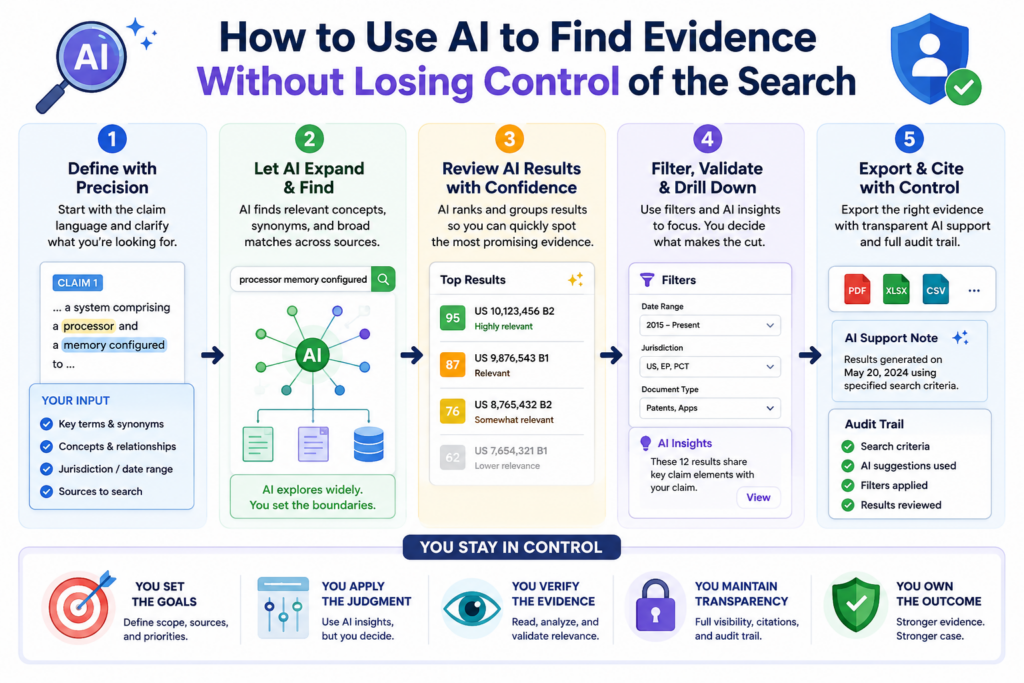
How to Use AI to Find Evidence Without Losing Control of the Search
AI can make evidence search much faster, but only when the search is guided. A loose search gives loose results. A clear search gives useful leads.
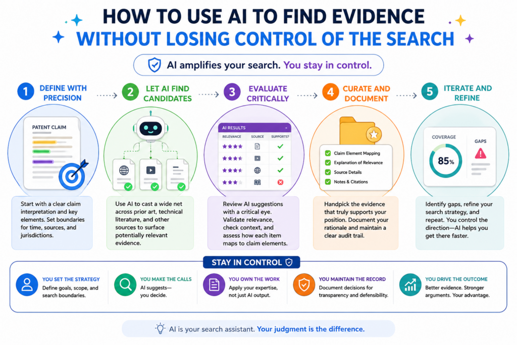
The best way to start is to feed the AI the claim map, the target product name, known product pages, public manuals, support docs, white papers, app store pages, release notes, videos, and any other sources the team can lawfully review.
Then the AI can look for parts of the product that may match each claim element.
This is not the same as asking AI, “Does this product infringe?” That question is too broad and too risky. A better question is, “Which source passages may show this claim element, and why?” That keeps the work grounded in evidence.
AI should be used like a smart search partner. It can help find the needle faster. It should not be allowed to invent the needle.
The search should begin with the easiest public sources and then move deeper only when needed.
Most teams should begin with public product pages, public help docs, developer guides, technical blogs, demo videos, API pages, app screens, patent filings, standards documents, conference talks, and public code repos when available. These sources are easier to collect and easier to explain.
If the public record is thin, the team may need product testing, device inspection, sample use, data capture, or expert review. For software, this may mean watching how the product behaves during real use.
For hardware, it may mean studying the device, parts, signals, or manuals. For AI tools, it may mean testing input and output behavior and comparing it to public claims about how the system works.
AI helps in each layer, but the job changes. With public text, AI can read and match. With screenshots, it can help describe what is shown.
With test notes, it can help organize results. With code or logs, it can help find functions, calls, or data paths that may matter.
The AI prompt should force source-based answers, not guesses.
The strongest prompt style is narrow and evidence-based. The AI should be told to cite only the provided sources, separate strong proof from weak hints, and mark missing proof clearly. This keeps the output useful.
A good AI-assisted search result should not say, “The product likely does this.” It should say, “This page states X, this screen shows Y, and this may support claim element Z because the claim requires this action.” That difference matters.
The reviewer should also ask the AI to show negative results. When the tool cannot find proof for an element, that is useful. Missing proof tells the team where to search next. It also keeps the chart honest.
This is one reason founders should avoid treating AI as a shortcut around good patent work. AI can save time, but only a strong workflow turns that saved time into better protection.
PowerPatent combines smart software with real attorney oversight, so teams can move fast while still building work that can be checked. You can see the process here: https://powerpatent.com/how-it-works
How to Match Each Claim Element to Evidence in a Way People Can Understand
A claim chart has one main job. It must make the match between claim language and product proof easy to follow. The reader should not have to guess why a screenshot or excerpt is included.
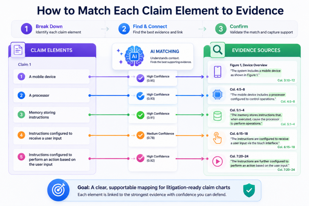
The simplest structure is often the strongest. One column shows the claim element. One column shows the evidence. One column explains the match.
Other columns may track source, date, product version, confidence, reviewer notes, or gaps. The format can change, but the purpose does not change.
The chart should walk the reader from words to proof. Every entry should answer the same basic question: where is this part of the claim shown in the product?
A strong chart uses direct proof first and support proof second.
Direct proof is evidence that clearly shows the claim element. Support proof helps explain the context. Both can matter, but they should not be mixed up.
For example, a product page saying “our platform sends real-time alerts” may support an alert element. But a user guide showing the exact alert setting, alert trigger, and alert output may be stronger direct proof.
A demo video may show the feature in use. An API guide may show how the alert is created. A test result may confirm what happens during use.
The chart should lead with the strongest proof. Extra proof can help, but only if it adds value. Too much weak proof can make a chart feel padded.
A strong chart is not the longest chart. It is the chart that makes the clearest case with the best evidence.
The explanation should be plain enough for a non-engineer and accurate enough for an expert.
This balance is hard, but it is worth the effort. The chart may be read by people with different levels of technical skill.
Some may know the product deeply. Others may only need to understand the business risk or patent value.
The explanation should use plain words. It should avoid puffed-up claims. It should not say more than the evidence supports. It should not hide the ball with complex terms.
For a software claim, a good note may say that the documentation shows the system receiving user data, the dashboard shows an analysis step, and the report screen shows the result sent to the user.
That is simple, but it still tracks the claim.
AI can draft these plain-language notes quickly. A reviewer should then tighten them. The final note should feel like a careful human wrote it, because a careful human should be responsible for it.
How to Handle Missing Evidence Without Weakening the Whole Chart
Every claim chart has gaps at some point. That is normal. The danger is not the gap. The danger is pretending the gap is not there.
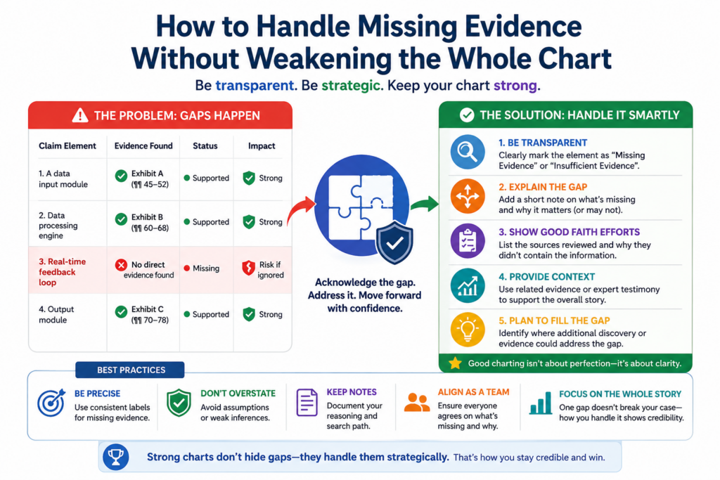
A missing element can mean several things. The product may not have that feature. The feature may exist but not be visible from public sources. The evidence may be in a source the team has not reviewed yet.
The claim may require a detail that is hard to observe. The target product may use a different design path. The team may need expert testing or a different claim.
A clean workflow treats missing proof as a signal. It does not panic. It does not stretch bad evidence. It marks the gap and builds a search plan.
Gaps should be labeled in a way that helps the team decide the next move.
A weak gap note says, “Need more evidence.” That does not help much. A better note says what is missing and what source might prove it.
For example, the note may say that public pages show the platform creates a score, but no source yet shows that the score is based on sensor data. That tells the team the exact missing link.
The next search can focus on technical docs, demo flows, API inputs, data sheets, or test design.
Another note may say that the product appears to send alerts, but the current evidence does not show that the alert is sent after the claimed condition is met. That tells the team timing is the issue.
This type of gap tracking is very useful in AI workflows. The AI can create a gap list across all claims. It can group gaps by source type.
It can suggest search terms. It can help rank which gaps matter most. But again, people must decide what the gaps mean.
A gap is sometimes a claim strategy problem, not just an evidence problem.
This is especially important for startups building patent portfolios. Sometimes the issue is not that the team lacks proof.
Sometimes the claim is too narrow, too tied to a hidden step, or aimed at a version of the market that is hard to observe.
That does not mean the patent is bad. It may mean the team needs more claims, better continuation strategy, different claim scope, or claims that read on visible product behavior.
For founders, this is a major point. The way a patent is written can affect how easy it is to prove later.
That is why patent work should not be treated as a last-minute filing task. Good patent strategy starts with how the invention may be used, copied, detected, and defended.
PowerPatent helps technical teams think through these issues with software that makes the process faster and attorney oversight that helps keep the work serious. Learn more here: https://powerpatent.com/how-it-works
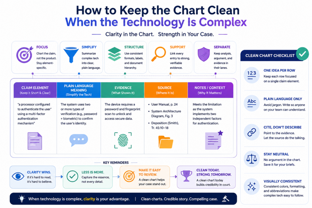
How to Keep the Chart Clean When the Technology Is Complex
Complex technology does not require confusing writing. In fact, the more complex the invention is, the cleaner the chart must be.
This matters a lot for AI, robotics, chips, cloud systems, cybersecurity, data tools, biotech software, and other deep tech fields. The product may involve many layers.
There may be models, services, devices, APIs, edge systems, user interfaces, databases, and background processes. A messy chart can quickly become unreadable.
The goal is to make the proof path simple without making the technology wrong. That means each chart entry should focus on the part of the system that matters for that claim element.
Complex systems should be explained through flow, not buzzwords.
Many weak charts use big words to sound technical. That does not help. A stronger chart shows the flow.
For example, instead of saying that a platform uses “advanced AI orchestration,” the chart should explain what happens. The system receives an image. It extracts features.
It sends those features to a model. The model returns a class label. The platform uses that label to trigger a workflow. That flow is much easier to understand.
The same idea works for cloud claims. Show the client action, the server action, the stored data, the processing step, and the output.
For chip claims, show the component, the signal, the operation, and the result. For cybersecurity claims, show the event, the detection rule, the risk score, and the response.
AI can help turn dense source material into a flow description. But the flow must be checked by someone who understands the technology and the claim.
Diagrams can help, but the chart must still carry the proof.
A simple diagram can make a complex chart easier to read. It can show system parts, data movement, model steps, or user flow. But a diagram is not a replacement for evidence. It is a guide.
If the team creates a diagram, it should be based on actual sources. The chart should point back to those sources. The reader should be able to tell which parts are proven and which parts are inferred.
This is where careful wording matters. If the evidence directly shows a step, say so. If the evidence suggests a step, say that. If the step is inferred from testing, explain the test. If the step still needs confirmation, mark it as a gap.
A clean chart builds trust because it does not overstate. It lets the proof do the work.
How AI Can Help With Product Testing Notes and Technical Evidence
Not all evidence comes from documents. Sometimes the best proof comes from using the product and recording what happens. This is common when public materials do not show enough detail.
Product testing can be simple or advanced. It may involve creating an account, using a feature, capturing screens, recording inputs and outputs, reviewing network traffic where lawful, testing different conditions, or inspecting a device.
The key is to record the work in a way that can be repeated and understood.
AI can help turn raw testing notes into clean chart support. It can organize steps, summarize results, connect test outputs to claim elements, and flag missing details.
But the raw testing record still matters. If the test record is sloppy, the AI summary will not fix it.
Testing should be planned around the claim elements before the product is touched.
A strong test plan starts with the claim map. The team should ask what behavior needs to be observed. If the claim requires a certain input, the test should use that input.
If the claim requires a result based on a condition, the test should create or observe that condition. If the claim requires sending an output, the test should capture where the output goes.
This keeps testing from becoming a random product tour. It also makes the results easier to use in the chart.
For example, if a claim requires generating a score based on two data types, the test should record both data inputs, the system action, and the resulting score.
If the claim requires updating a model based on user feedback, the test should capture the feedback event and any later change in system behavior.
If the claim requires a device sending a signal after detecting motion, the test should record the motion event and the signal response.
AI can help turn test logs into readable evidence summaries.
Raw logs, screenshots, and notes can be hard to read. AI can help create a clean test timeline. It can match screenshots to test steps.
It can identify which claim element each test result may support. It can also point out where the test does not prove enough.
The reviewer should then compare the AI summary against the raw record. This is important. The summary should not add facts that were not recorded. It should not make the test sound stronger than it was. It should not hide failed tests.
In a serious claim chart, failed or unclear tests can still be useful because they show what needs to be tested again. They also help the team avoid false confidence.
For founders, this kind of disciplined workflow can feel heavy at first. But it is far better than trying to fix a weak record later. Strong patent work rewards early care.
PowerPatent helps make that care easier by pairing smart tools with real attorney review, so the process feels more like building and less like paperwork. See how it works here: https://powerpatent.com/how-it-works
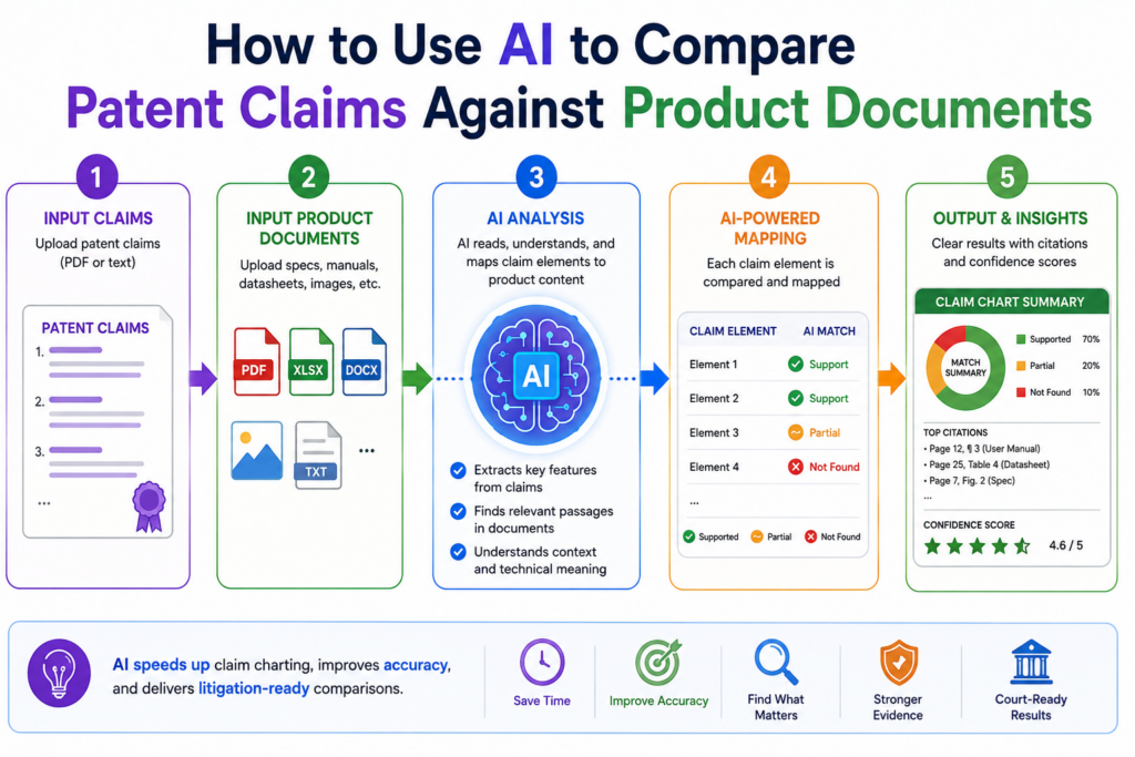
How to Use AI to Compare Patent Claims Against Product Documents
AI is very good at comparing long text against other long text. That makes it useful when the target product has public manuals, help pages, API docs, white papers, developer guides, or technical blog posts.
These sources can hold strong evidence, but they are often long and hard to review by hand.
The right workflow is simple. The team gives the AI the claim elements and the source documents. The AI then looks for passages that may support each element.
It can pull out matching text, explain why the passage may matter, and flag parts of the claim that still have no support.
This can save a huge amount of time. A human may need hours to read a full technical guide. AI can scan it fast and point the reviewer to the pages that deserve attention.
But the final chart should never copy AI output without review. The AI is a filter, not the final judge.
The comparison should focus on meaning, not just matching words.
Patent claims often use words that do not appear in product documents. A claim may say “transmitting a notification,” while the product guide says “sending an alert.”
A claim may say “training data,” while the technical blog says “labeled examples.” A claim may say “remote computing system,” while the product docs say “cloud service.”
AI can help find these meaning-based matches. This is useful because simple keyword search may miss them.
But meaning-based matching also creates risk. Sometimes two phrases sound close but do not prove the same thing. The reviewer must check the context.
A strong AI comparison should show both the source text and the reason for the match. The reviewer should be able to see the logic right away. If the reason feels weak, the passage should not be treated as proof.
The best review question is whether the source would still make sense to a neutral reader.
A claim chart should not depend on wishful reading.
A neutral reader should be able to look at the source and understand why it supports the claim element. The reader may not agree with every conclusion, but the link should be clear.
This is where many weak charts fail. They paste a product quote that sounds impressive, then stretch it to cover claim language that the quote does not really show.
That may feel good in the short term, but it creates trouble later.
AI can help by ranking evidence strength. It can mark a source as direct, partial, background, or missing.
This helps the team avoid mixing strong proof with weak hints. It also makes attorney review faster because the reviewer can focus on the parts that matter most.
For startups, speed matters. But speed only helps if it produces work that can be trusted.
PowerPatent helps founders use smart software with real attorney oversight, so patent work can move fast without becoming loose. You can see how the process works here: https://powerpatent.com/how-it-works
How to Draft Claim Chart Language That Sounds Clear, Calm, and Serious
A claim chart should not sound like a sales pitch. It should not sound angry. It should not sound vague. The best tone is clear, calm, and serious.
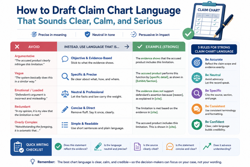
The reader should feel that the chart was made by people who know the technology, understand the claim, and respect the evidence.
That tone builds trust. It also makes the chart easier to use in serious business talks.
Good chart language is plain. It says what the evidence shows. It connects the evidence to the claim. It avoids loaded words unless they are needed. It does not overstate. It does not hide gaps.
The chart should explain the match in the same order as the claim.
Order matters because it helps the reader follow the logic. If the claim has three steps, the explanation should walk through those steps in order.
If the claim describes parts of a system, the explanation should identify those parts before describing how they work together.
This is especially important for method claims. If the claim requires receiving data, processing data, and sending a result, the chart should not jump straight to the result.
It should first show the received data, then the processing, then the result. That makes the proof path easier to trust.
AI can help draft the first version of this explanation. It can turn source text into chart notes. It can make the language shorter.
It can keep the tone steady across many entries. But the reviewer should edit for accuracy and strength.
Weak words should be replaced with proof-based words.
Some words make a chart weaker. Words like “probably,” “seems,” “clearly,” and “obviously” can create problems. “Probably” and “seems” may show uncertainty. “Clearly” and “obviously” may sound like the writer is trying too hard.
Better language points to the source. Instead of saying the product obviously performs a step, the chart can say the user guide shows that the product performs the step.
Instead of saying the platform likely uses a model, the chart can say the technical paper describes a model used for that function.
The goal is not to sound bold. The goal is to sound grounded. Evidence should carry the weight. The writing should help the reader see it.
This kind of writing is also useful for founders when they are building their own patent records. Clean, plain explanations help attorneys understand the invention faster.
They help teams avoid confusion. They help turn technical work into assets the business can use.
How to Review AI Output for Hallucinations, Gaps, and Overreach
AI can produce helpful work, but it can also create false confidence. It may cite a source that does not support the claim. It may blend facts from different documents.
It may assume a missing step. It may use a strong tone for weak evidence. It may summarize a product feature in a way that changes the meaning.
That is why AI output must be reviewed with care. The review should not be rushed. The whole point of using AI is to save time on the heavy lift, so people can spend more time on judgment.
A good review asks three simple questions. Does the source say what the AI says it says? Does that source support the claim element? Is there any missing link between the evidence and the claim?
The reviewer should check the source before checking the AI’s explanation.
Start with the original evidence. Read the passage. Look at the screenshot. Watch the video clip. Review the test note.
Then compare it to the AI summary. This order matters because it prevents the AI from shaping the reviewer’s view too much.
If the AI says a document proves a data processing step, the reviewer should look at the actual document and ask whether it truly shows processing or only suggests that processing may happen.
If the AI says a screen shows a generated output, the reviewer should check whether the output is generated by the claimed system or simply entered by the user.
This kind of review catches many mistakes.
AI overreach often hides in small connecting words.
The risky words are often small. Words like “therefore,” “based on,” “using,” “after,” and “in response to” can matter a lot.
A claim may require that one action happens because of another action. If the evidence only shows both actions separately, that may not be enough.
For example, a product guide may show that a system receives data. Another page may show that the system sends alerts.
But the claim may require that the alert is sent based on a certain analysis of that data. If the chart does not prove that link, the entry may be weak.
AI may connect the dots too quickly. A human reviewer must ask whether the dots are truly connected by the evidence.
This is one of the biggest reasons to pair AI tools with attorney review. Founders need speed, but they also need someone to catch the hidden risks.
PowerPatent helps with that balance by combining smart software and real patent attorney oversight. Learn how it works here: https://powerpatent.com/how-it-works
How to Build a Claim Chart That Supports Licensing and Business Talks
Not every claim chart is made for court. Many are made for business. A startup may use a chart to support licensing talks, investor diligence, partnership talks, patent sales, or internal strategy.
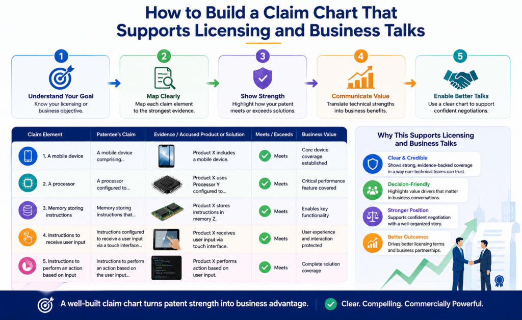
In these settings, the chart must still be strong, but it may need to be easier to read.
A business-facing chart should help the reader understand the value fast. It should show the claim, the product match, and the strongest evidence.
It should avoid burying the reader in too much detail. The backup record can hold more support, but the main chart should stay focused.
This is not about dumbing down the work. It is about making the work usable. Busy people need a clear path through the proof.
The chart should show why the patent matters without turning into a pitch deck.
A claim chart is not a marketing document. Still, it can help tell a business story. It can show that the patent covers a feature that matters in the market.
It can show that the feature is used in real products. It can show that the claim is not just theoretical.
For a founder, this can be powerful. A patent is easier to value when people can see what it maps to. Investors may not read a full patent.
Buyers may not study every claim. But a clear chart can help them understand the link between the protected idea and the market.
The chart should stay evidence-based. It can include context, but the context should not crowd out the proof. A short note about why the feature matters may be useful. A long sales argument is not.
A clean chart can help a startup look more prepared and more serious.
Strong IP work sends a signal. It shows that the company is not only building fast, but also protecting what it builds.
It shows that the team has thought about copying risk. It shows that the patent portfolio is tied to real products and real market behavior.
This can matter in hard conversations. A startup may be small, but a clean evidence record can make it look organized and credible.
It can also help the company avoid weak threats or unclear claims. That is important because careless patent talk can hurt trust.
The best approach is to be firm, factual, and well prepared. A strong chart helps with that. It gives the team a shared record they can review before taking any next step.
How to Make Claim Charts Easier for Attorneys to Review
Attorney review is much easier when the chart is clean before it arrives. This saves time, reduces cost, and improves the quality of the final work.
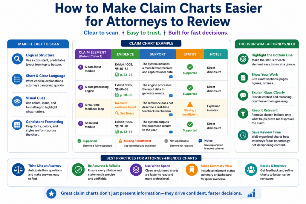
A messy chart forces the attorney to do basic cleanup before they can give useful judgment.
They may have to find missing source links, check unclear screenshots, separate claim elements, remove weak evidence, and figure out what the team was trying to show. That wastes time.
A clean chart lets the attorney focus on the hard questions. Does the evidence support the claim? Are there claim construction issues?
Are there missing elements? Are there better claims? Is there a stronger evidence source? Is the chart ready for the next business or legal step?
The review package should make the evidence path easy to follow.
The attorney should receive the claim chart, the claim map, the evidence library, source links, saved copies, product version notes, test notes, and any known gaps. The reviewer should not have to hunt for basic support.
Each chart entry should point to its source. Each source should be easy to open. Each screenshot should have context.
Each quote should be tied to a document, page, or capture. If testing was done, the test setup should be clear.
This level of order helps the attorney work faster. It also helps the team get better feedback. Instead of spending the first review round fixing the file, the attorney can focus on strategy.
AI can create an attorney review summary, but the team should keep it honest.
An AI-generated review summary can be helpful. It can show which elements have strong support, which have partial support, and which still need work.
It can list the main sources and open questions. It can make the first attorney review more efficient.
But the summary should not hide weakness. If evidence is missing, say so. If a source is only background, say so.
If testing is incomplete, say so. A good attorney would rather see a clear gap than a false claim of support.
This is the heart of a strong AI claim charting workflow. AI helps move fast. Humans keep the work careful. Attorneys bring the judgment needed when the stakes are high.
That is also the idea behind PowerPatent. Founders should not have to choose between slow traditional processes and risky do-it-yourself patent work.
PowerPatent gives technical teams a faster way to turn inventions into stronger patent assets with smart software and real attorney oversight. See how it works here: https://powerpatent.com/how-it-works
How to Turn Raw Evidence Into a Clean Litigation-Ready Record
A claim chart is only as strong as the record behind it. The chart is the front page of the proof. The evidence record is the foundation under it.
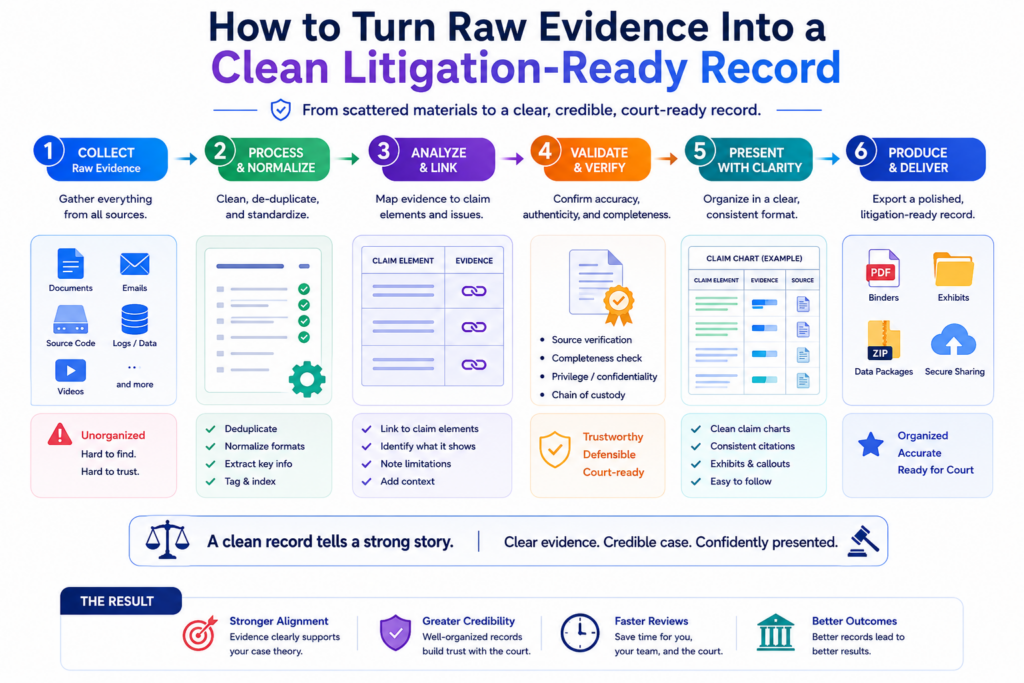
When that foundation is weak, the chart may look fine at first glance but break under real review.
Raw evidence usually starts messy. A team may have screenshots, links, notes, videos, PDFs, source snippets, product pages, test logs, and emails. Some of it is useful.
Some of it is only background. Some of it may be old, unclear, or not tied to the right product version.
The goal is to clean that raw evidence without losing the original context. That means every important source should be saved, labeled, and tied back to the claim element it may support.
The team should avoid treating a pasted excerpt as enough. The original source matters because future reviewers need to see where the proof came from.
A clean evidence record makes the chart easier to trust.
Trust comes from traceability. A reader should be able to move from the claim chart to the source document without confusion. If the chart says a guide shows a feature, the file should include the guide.
If the chart relies on a screenshot, the record should show where and when the screenshot was captured. If the chart relies on a product test, the record should explain how the test was run.
This does not mean the chart has to be packed with every detail. Too much detail can make the chart hard to read. The chart should stay clear. The backup record can hold the deeper proof.
AI can help by naming files, grouping sources, tagging claim elements, extracting key passages, and creating source summaries. But the team should still check the record by hand.
The source name should match the file. The capture date should be clear. The product version should be noted when known. The excerpt should not be taken out of context.
A litigation-ready record should survive time, review, and pressure.
Time is one of the biggest threats to evidence. A web page can change. A help article can be removed. A product interface can be redesigned.
A company can update a feature name. A demo video can disappear. If the team only keeps live links, it may lose key proof later.
A better workflow saves stable copies when allowed, records capture dates, and keeps enough context for future use. For a web page, that may mean a saved PDF, a screenshot with the URL visible, and a note showing the date captured.
For a test, that may mean inputs, steps, outputs, screen captures, and logs. For a manual, that may mean the file itself plus page numbers or section names.
This care may feel small when the team is moving fast. But it can save major pain later. A startup should not wait until a deal, dispute, or diligence request to organize its proof. Strong records are easier to build early than repair late.
How to Use Confidence Levels Without Making the Chart Look Weak
Not every piece of evidence has the same strength. Some proof is direct. Some proof is partial. Some proof only gives background. A good workflow should show that difference clearly.
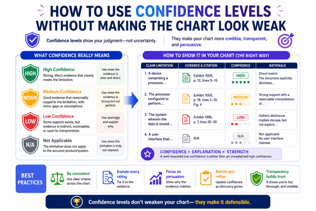
Confidence levels help the team make better decisions. They also help reviewers focus.
If every chart entry is treated the same, weak evidence may hide beside strong evidence. That creates risk. A confidence system makes the work more honest.
The goal is not to make the chart look uncertain. The goal is to make the review smarter. When the team knows which parts are strong and which parts need work, it can improve the chart faster.
Confidence should be based on proof quality, not hope.
A high-confidence entry should have direct evidence that clearly supports the claim element.
A medium-confidence entry may have useful evidence but still need one more link. A low-confidence entry may show only a hint or background fact.
The team should avoid raising confidence just because the product “must work that way.”
That may be true from an engineering view, but the chart needs evidence. If the proof is not visible yet, the confidence should reflect that.
AI can help suggest confidence levels, but this is one of the places where human review is essential. AI may be impressed by matching words. A reviewer must judge whether the source truly proves the claim element.
Confidence levels are most useful when they lead to action.
A confidence label should not sit there like a decoration. It should tell the team what to do next. If an element is high confidence, the team may move it to attorney review.
If it is medium confidence, the team may search for a stronger source. If it is low confidence, the team may decide whether more work is worth it.
For example, if the chart has strong proof of data intake and output but only weak proof of internal processing, the next action is clear.
The team needs better evidence of the processing step. That may come from technical docs, testing, expert review, or another public source.
This is where AI can create real leverage. It can scan the whole chart and show the weak spots. It can suggest source types. It can help draft search prompts.
It can compare new evidence against the missing elements. But it should not be used to make weak proof sound strong.
PowerPatent’s model fits this reality. Founders need fast tools, but they also need a process that keeps the work honest.
Smart software can speed up the search and drafting, while real attorney oversight helps protect the quality of the final patent work. You can see how that works here: https://powerpatent.com/how-it-works
How to Chart AI and Machine Learning Claims Without Getting Lost
AI and machine learning claims can be hard to chart because many important steps are hidden. The model may run in the cloud.
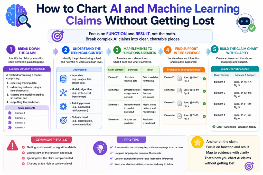
Training details may not be public. The product may show outputs but not the model path. Marketing pages may talk about “AI” without explaining what the system actually does.
That makes the workflow even more important. The team should separate what is visible from what is inferred.
It should not treat broad AI language as proof of a specific claim step. A product saying it uses AI does not prove every model-related element.
For AI claims, the chart often needs to track inputs, model operations, outputs, feedback, training, updates, deployment, and user actions. Not every claim includes all of these, but the chart should follow the claim language closely.
AI claim charting should focus on observable behavior first.
Observable behavior is what the product actually shows during use or what public sources clearly describe.
This may include uploaded data, prompts, images, sensor readings, user choices, model outputs, rankings, scores, recommendations, labels, alerts, or reports.
If the claim can be mapped to observable behavior, the chart becomes much stronger.
For example, a claim that focuses on receiving an image, classifying the image, and showing a label may be easier to chart than a claim that requires proving a specific hidden training method.
This does not mean hidden steps are impossible to prove. It means they require better sources.
Those sources may include technical papers, model cards, developer docs, public code, patent filings, product tests, expert analysis, or discovery later in a case. The chart should be clear about which type of proof is being used.
The hardest AI charting problem is proving what happens inside the system.
Many AI systems are black boxes from the outside. You may see the input and the output, but not the internal path. The chart must be careful here.
If the claim requires a neural network, the chart should not rely only on a general statement that the product is “smart.” It needs evidence that the system uses the claimed type of model or a source that supports that conclusion.
If the claim requires training on a certain kind of data, the chart needs proof of that data use. If the claim requires updating based on feedback, the chart needs evidence that feedback changes the system in the claimed way.
AI can help review technical sources for these clues. It can also help compare observed behavior against claim steps.
But it should never fill hidden gaps with guesses. In AI claim charting, the difference between a fair inference and an unsupported leap can be very important.
How to Use Claim Charts to Improve Future Patent Filings
Claim charts are not only useful after a patent is granted. They can also make future patent filings stronger. This is especially true for startups that are still building and filing new applications.
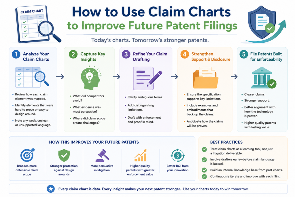
When a team charts claims against real products, it learns which claim features are easy to prove and which are hard to see.
That lesson can shape future filings. It can help the team write claims that cover real market behavior, not just internal technical details.
This is a big point for founders. A patent can be technically brilliant but hard to use if the key steps are hidden. A stronger filing strategy thinks early about detection.
It asks how a copied product would be spotted. It asks what evidence would show use. It asks which features customers, APIs, docs, devices, or outputs would reveal.
Claim charting can show where the patent portfolio needs more coverage.
A claim chart may reveal that one claim is strong against a target product while another is not. It may show that the invention has several valuable angles that are not yet claimed.
It may reveal that a competitor uses a similar outcome through a different path. These insights can guide continuation filings, new claims, or new patent applications.
For example, a startup may have claims focused on backend processing, but the visible product behavior is mostly in the user interface and API outputs. Future claims may need to cover those visible layers.
Another startup may have claims focused on model training, but the market value is in real-time inference. Future filings may need to cover deployment and use.
This is where a claim chart becomes more than a legal tool. It becomes a product and business strategy tool.
Strong patent drafting starts with how the invention may be copied.
Founders often describe their invention from the builder’s point of view. That is natural. They know how the system works inside. But patent strategy should also look from the outside.
How would a competitor copy the value? What would customers see? What would public docs show? What behavior would prove use?
These questions can lead to stronger patents because they help connect claim language to real-world proof. They also help avoid claims that depend only on secrets locked inside a competitor’s system.
PowerPatent helps founders move through this kind of thinking without slowing the company down.
The platform combines guided software with real patent attorney review, so technical teams can protect what they are building with more speed and more confidence. Explore how it works here: https://powerpatent.com/how-it-works
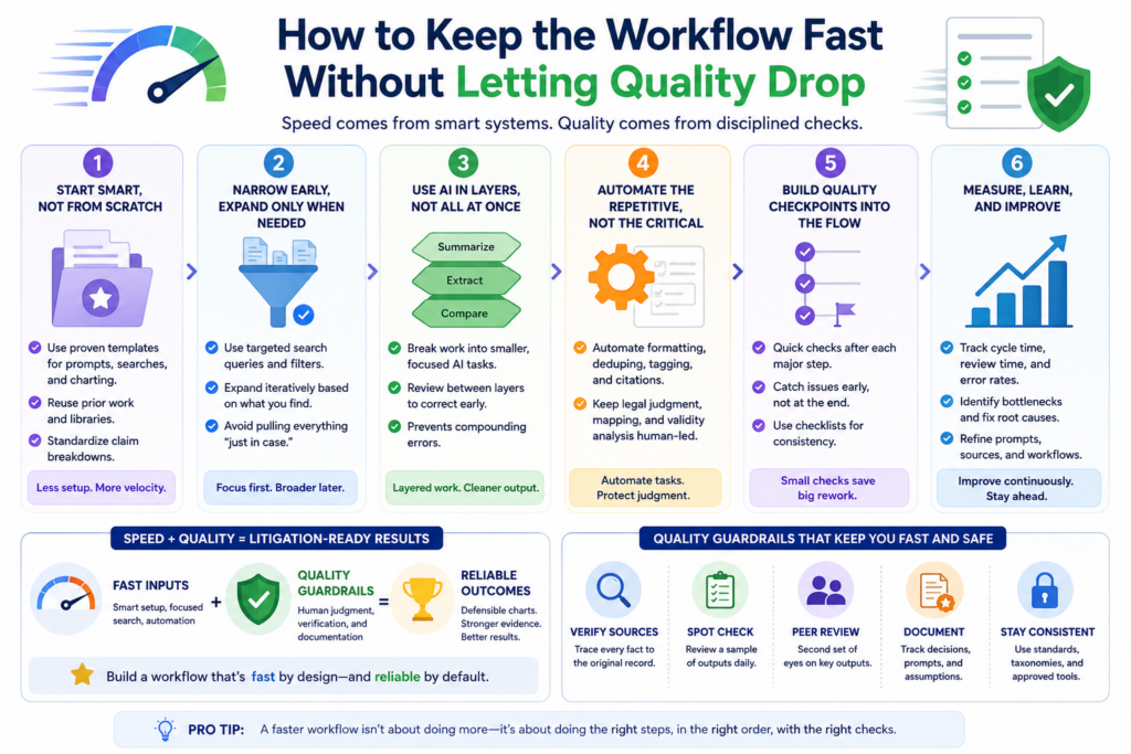
How to Keep the Workflow Fast Without Letting Quality Drop
Speed matters. Founders do not have months to waste. Engineers do not want to stop building just to sit in long patent meetings.
Business teams need answers fast when a deal, investor question, or market threat appears.
AI claim charting can help a team move much faster. But speed without control creates fragile work. The workflow must be designed so the fast parts are handled by software and the judgment parts are handled by people.
The fastest strong workflow is not the one that skips steps. It is the one that removes waste. It avoids duplicate searches.
It keeps sources organized. It uses AI to draft and compare. It uses clear review gates. It gives attorneys clean files instead of messy piles.
Quality improves when each step has a clear purpose.
The claim breakdown clarifies what must be proven. The evidence search finds possible proof. The evidence library preserves sources.
The chart draft connects claim elements to evidence. The confidence review shows weak spots. The attorney review checks the legal and strategic strength.
When each step has a purpose, the workflow becomes easier to manage. The team does not need to argue about what to do next. The chart itself shows the next move.
AI helps most when the workflow is already clear. It can speed up reading, searching, matching, tagging, drafting, summarizing, and gap finding. But if the team has no process, AI may only create faster confusion.
The best workflow feels simple to the founder and serious to the reviewer.
That is the balance to aim for. The founder should not feel trapped in patent busywork. The reviewer should not receive vague notes and broken links. The system should make it easy for each person to do the right job.
A founder may provide product context, invention details, competitor names, and business goals. AI may help process claims and evidence. Engineers may confirm technical facts.
Attorneys may review claim scope, evidence strength, and legal risk. Each person adds value where they are strongest.
This is the future of better patent work. Not slow. Not sloppy. Not fully automated in a risky way. Just faster, cleaner, and more useful.
That is why PowerPatent exists. It helps founders turn inventions into stronger patent assets with smart software and real attorney oversight.
For deep tech teams that need speed, control, and confidence, this can be a better way to protect what they are building. See the process here: https://powerpatent.com/how-it-works
Conclusion
A strong AI claim charting workflow does more than save time. It turns patent claims into clear proof, and it helps founders see where their protection is strong, where evidence is thin, and what to fix before pressure hits.
The winning mix is simple: use AI to search, sort, compare, and draft, then use careful human review to keep the work honest. When your invention matters, your evidence should be clean, traceable, and ready for serious talks. PowerPatent helps founders move faster with smart software and real attorney oversight. Start here: https://powerpatent.com/how-it-works